MUSEO CASA ENZO FERRARI DESIGN BY JAN KAPLICKY & ANDREA MORGANTE
MUSEO CASA ENZO FERRARI DESIGN BY JAN KAPLICKY & ANDREA
MORGANTE
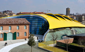
A Ferrari automotive museum designed by
the late Czech architect, Future System’s founder Jan Kaplický, has opened in
Modena, Italy.
Following Kaplický’s death in early 2009, the Enzo Ferrari
Museum has been completed by London practice Shiro Studio under the direction of former Future Systems
associate Andrea Morgante.
The museum comprises two buildings. The first is the early
nineteenth century former house and workshop of Ferrari’s father, renovated to
house a 40-metre-long gallery, while the second is a new glass-fronted
structure that curves around it.
COMPREHENSIVE PROJECT DESCRIPTION FROM ANDREA MORGANTE:
Enzo Ferrari Museum, Modena, Italy
In 2004 Future Systems won an international competition to
design a new museum in Modena, Italy. Dedicated to motor racing legend and
entrepreneur Enzo Ferrari (1898 – 1988), the museum comprises exhibition spaces
within the early nineteenth century house where the motor racing giant was born
and raised, and its adjoining workshop, as well as a separate, newly
constructed exhibition building.
Following the death of Jan Kaplicky in 2009, the office of
Future Systems was dissolved ¹. Andrea Morgante, formerly of Future Systems and
now director of Shiro Studio, was appointed to oversee the museum's completion.
The new building has been constructed to Kaplický's original design– it is sensitive
to the existing historical context, combines the latest in construction and
energy saving technology, and resonates in spirit, language and materials with
the cars it is intended to showcase. The fully restored house and workshop
provide additional exhibition space designed by Morgante.
New Exhibition Building
The sculpted yellow aluminium roof with its ten incisions –
intentionally analogous to those air intake vents on the bonnet of a car –
allows for natural ventilation and day lighting, and both celebrates and
expresses the aesthetic values of car design. With its 3,300 square metres of
double-curved aluminium, the roof is the first application of aluminium in this
way on such a large scale. Working together with boat builders whose familiarity
with organic sculpted forms and waterproofing made them the ideal partner, and
cladding specialists, the form is constructed from aluminium sheets fitted
together using a patented tongue and groove system. The bright Modena yellow of
the roof is Ferrari’s corporate colour, as seen on the Ferrari insignia where
it forms the backdrop to the prancing horse. It is also the official colour of
Modena.
Kaplický wanted to create a sensitive dialogue between the
two exhibition buildings that showed consideration for Ferrari’s early home and
underscored the importance of the museum as a unified complex made up of
several elements. The views out of the new exhibition building dramatically
frame the house and workshop, while views from outside the house and workshop immediately
reveal the function and content of the new exhibition building. The height of
the new exhibition building reaches a maximum of 12 metres – the same height as
the house – with its volume expanding below ground level. In addition, the new
building gently curves around the house in a symbolic gesture of appreciation.
The glass façade is curved in plan and tilts at an angle of
12.5 degrees. Each pane is supported by pre-tensioned steel cables and is able
to withstand 40 tonnes of pressure. The technical specification of these panes
and cables means that greater transparency in the façade is achieved with
maximum functionality. In the summer months a thermo-sensor activates the
windows in the façade and roof allowing cool air to circulate. The building also
employs photovoltaic technology and water recycling systems.
Visitors entering the new building have uninterrupted views
into the entire exhibition space: a large, open, white room, where the walls
and floor transition lightly into one another and are perceived as a single
surface. A stretched semi-transparent membrane spreads light evenly across the
roof, and in combination with the slits running from side to side which allow
air to escape and give a ribbed effect, recalls the language of a car interior.
A bookshop and café are situated to one side of the entrance and facilities to
the other. Both are painted the same Modena yellow as the roof and take the
form of blister-like pods. A gently sloping ramp gradually leads the visitor
around the building from the ground floor to the basement level, with display
stands designed by Morgante punctuating the circulation path. These stands lift
the cars 45 centimetres so that they can be viewed from different angles and
appreciated as works of art rather than objects simply placed in a room. Up to
twenty-one cars can be displayed in this open space at any one time.
Supplementary exhibition material is displayed in leather cases located along
the perimeter wall. At the bottom of the ramp and directly below the entrance,
an audiovisual room forms a permanent part of the exhibition. A flexible
teaching space and a conference room with a carved out opening allowing views
up into the entrance area are located next to it.
Restored House and Workshop
The two-storey house and workshop built by Ferrari’s father
in the 1830s has been completely refurbished. Later additions to the house and
workshop have been removed and, with the exception of two internal bracing
structures that have been inserted in accordance with Italian anti-seismic
regulations to give structural rigidity, no alterations have been made. The
main gallery space is located within what was the double height workshop. Here
Morgante has designed a contemporary exhibition display system, which
incorporates digital projections, objects owned by Ferrari, information panels
and other material.
The display system was conceived as a large-scale vertical
book that allows the visitor to read the different chapters of Ferrari’s life
through various media; a three-dimensional immersive biography. The system
takes the form of a sinuous wall separated into pages, so that as visitors
progress down the room, they are obliged to gradually discover each page and
chapter in sequence. At every point the next chapter is concealed so as to
maintain interest and create a sense of excitement. This organic landscape
stretches through the entire length of the 40 metre long space and soft,
low-level backlighting gently illuminates both it and the room, making the
space intimate in spite of its size. At the northern end of the main gallery,
in the original house, two smaller exhibition spaces are located next to one
another. Administrative spaces are situated directly adjacent to them and on
the first floor.
Photograph by Andrea
Morgante
Photograph by Andrea
Morgante
YOU MAY WATCH VIDEO FROM MUSEO CASA ENZO FERRARI
ENZO FERRARI IN THE TIME MACHINE
© Studio Cento29
Photograph by Andrea
Morgante
Photograph by Andrea
Morgante
© Studio Cento29
Photograph by Andrea
Morgante
Photograph by Andrea
Morgante
© Studio Cento29
© Studio Cento29
Photograph by Andrea
Morgante
© Studio Cento29
© Studio Cento29
© Studio Cento29
ANDREA MORGANTE
Shiro Studio is a London based design practice established
by Andrea Morgante in 2009, committed to the creation of unique architecture
and objects. We believe in integrity of materials, purity of perception,
coherence. We believe objects and architecture should be tactile, evocative and
unexpected. Nature's efficiency, digital fabrication and art are recurrent
trajectories of investigation that permeate our visual language and design
process.
Shiro means ‘white’ in Japanese, but here it implies a
philosophical translation where white is perceived as the purest creative
approach. Shiro is the infinitesimal fraction of time before an idea is
represented on a blank piece of white paper. It is here, in this tension
between inception and the beginning of the design process, that the purity and
integrity of creativity is found.
Andrea Morgante is a registered ARB RIBA Architect in the
UK. After working in 1997 with RMJM in London he joined Future Systems in 2001
where he became Associate Director, working closely alongside the late Jan
Kaplicky. In 2008 he collaborated with Ross Lovegrove, developing a number of
innovative self-sufficient energy projects. In 2012 Andrea completed the
construction of the Enzo Ferrari Museum in Italy.
Shiro Studio is continuously engaged in architecture and
product design. Since 2009 the studio has completed projects for, amongst
others, Ferrari, Alessi, M&C Saatchi, Peroni, D-Shape, Agape, Poltrona
Frau, Seiko Japan, Electa. Andrea's work has been extensively published on
numerous magazines and book, including Wallpaper, Casabella, IW, Casa Brutus,
The Independent, Architect's Journal, Blueprint, Icon, Interni, Stella Magazine.
JAN KAPLICKY
Jan
Kaplicky (18 April 1937 – 14 January 2009) was world-renowned Czech architect
who spent a big part of his life in the United Kingdom. He was the leading
architect behind the innovative design studio, Future System. He studied at
the collage of Applied Arts – Architecture and Design (VSUP) in Prague.
After the Soviet invasion he escaped to London in September 1968. In England
Kaplicky worked for Denys Lasdun and Partners (till 1971), next in the office
of Renzo Piano and Richard Rogers (till 1973). In the year 1979 Kaplicky set up
his own architectural think tank called Future Systems with David Nixon and
began to develop an architectural style that combined organic forms with high
tech futurism. In the year 1994 was Future System commissioned to build the new
media centre at Lord’s Cricket Ground, which won in the year 1999 the Stirling
Price by Royal Institute of British Architects (RIBA), the most prestigious
architecture award in the UK, and the World Architecture Awards in 2001. The
next Future System’s iconic project was Selfridges Building in Birmingham,
which won seven awards including RIBA Award for Architecture 2004. In February
2007 Kaplicky won international architectural competition for the new building
of the National Library of the Czech Republic in Prague, but the project was
subsequently cancelled.
http://kaplickycentre.org/en/archive/jan-kaplicky#.VE-6tSKsW0c
ARCHITECTURE
The
question was how to represent new thinking in a new way. How to show new types
of buildings that somebody would like and understand. Maybe even the desire to
shock a little bit. A new way of how to rediscover my shuttered identity. How
to find new form. How to be artistic. How to introduce new reality. How to
introduce the realism of the site. Photomontage is a relatively fast technique.
Certainly
a technique introduced many decades ago. It is also an attempt to watercolour
perspectives of the day. Of course this was a long time before it was possible
to use the computer for such processes. It was a personal product. I still
resent the anonymity of computer drawing. It still has little unique feeling.
Computer
images can promote bad architecture. The difference between good or bad is
almost zero. But the unique personal touch is returning. We are almost there
with Future Systems´ unique computer-generated photomontage. It is after all
the year 2002. The third millennium. (source: Jan Kaplicky. 2002. Confessions:
Principles Architecture Process Life. Great Britain: Wiley Academy.)
Below Photograph Had Taken by Andrea
Morgante


.jpg)


.jpg)


