

THE FONDATION BEYELER: A PASSION FOR ART
THE PERMANENT COLLECTION

THE
FONDATION BEYELER: A PASSION FOR ART
THE
PERMANENT COLLECTION
Hildy
and Ernst Beyeler’s collection of around 300 works by more than 70 artists
provides an extensive overview of classic modern and contemporary art. Starting
with late and Post-Impressionist works by Paul Cézanne, Vincent van Gogh and
Claude Monet, it continues via Cubism with Pablo Picasso and Georges Braque to
other characteristic groups of works by Joan Miró, Piet Mondrian, Vasily
Kandinsky, Henri Matisse, and Paul Klee. American Expressionism is represented
by artists like Mark Rothko and Barnett Newman. The collection’s time-frame
comprises works by Georg Baselitz, Anselm Kiefer and Neo Rauch. Among the new
acquisitions are works by Louise Bourgeois, Lucio Fontana, Franz West, Philippe
Parreno, Felix González-Torres, Gerhard Richter and more. A number of
sculptures from Africa, Alaska and Oceania provide an exciting counterpoint to
the works of European and American origin.
The
collection was built up over more than fifty years, in parallel to the activities
of the Galerie Beyeler. Early on, Hildy and Ernst Beyeler started setting aside
works they could not or did not wish to sell. They held their first exhibitions
at the Galerie Beyeler in the 1940s with Japanese woodcuts, drawings by
Impressionist and Post-Impressionist artists, and graphic works by
Toulouse-Lautrec. The gallery soon became known as a leading specialist in
modern art. The Beyelers’ successful activities as art dealers, for example
their purchase of Improvisation 10 , which Vasily Kandinsky painted in 1910,
laid the foundation stone for the present collection. Another important factor
was their personal relationship with a number of artists, for example their
friendship with Picasso, several of whose masterpieces can now be seen in one
of the main exhibition rooms at the Fondation Beyeler. Works by Picasso and a
group of works by Paul Klee are among those that determined the collection’s
character from the outset.
The
idea of setting up a non-profit-making foundation emerged in the 1970s, but did
not at first take concrete shape. All that Hildy and Ernst Beyeler wished to do
initially was to adorn their home with art and to keep some of their favourite
works for themselves rather than selling them. In 1989, at the invitation of
the Spanish Ministry of Culture, the previously unknown collection was publicly
displayed for the first time in the Centro de Arte Reina Sofía in Madrid, where
it attracted international attention. Since then, the Beyelers have extended it
through carefully selected acquisitions.
The
Beyeler Collection’s distinctive character derives from its concentration on a
particular period. Thanks to its selectiveness and the high quality of the
exhibits, it represents more than merely the subjective viewpoint of a
collector, providing an impressive survey of 20th-century art.
Most of
the works in the Beyeler Collection are paintings but it also includes a few
sculptures. It ends with works by Baselitz, Kiefer and Rauch. Conceptual art,
the second main development in modern art, and more recent trends are
intentionally not represented in the permanent collection. Instead, they are
dealt
with in the context of temporary exhibitions designed to create a dialogue with
contemporary art and to make the museum a dynamic forum for the presentation of
artists’ ideas.
Another
priority of the Fondation Beyeler, alongside its permanent collection, its
architecture and its temporary exhibitions, is to teach visitors more about
art. Private and public guided tours and viewings of individual works are
organized. Events involving other artistic disciplines also serve to enhance
visitors’ appreciation of art. These events, which are very popular, add a
further facet to the comprehensive range of activities offered by the Fondation
Beyeler.
https://www.fondationbeyeler.ch/en/museum/


HENRI MATISSE
Nu Bleu I, 1952
Gouache Painted Paper Cut-Outs onPpaper on Canvas
Dimensions: 106.3 x 78.0 cm
Dimensions: 106.3 x 78.0 cm
Fondation Beyeler, Riehen/Basel, Sammlung Beyeler
© Succession Henri Matisse / ProLitteris, Zürich
/ Foto: Robert Bayer

HENRI MATISSE
Algue Blanche Sur Fond Rouge et Vert, 1947
Gouache Painted Paper Cut-Outs, Verso: Pencil Drawing
Dimensions: 52.5 x 40.5 cm
Dimensions: 52.5 x 40.5 cm
Fondation Beyeler, Riehen/Basel, Sammlung Beyeler
© Succession Henri Matisse / ProLitteris, Zürich
/ Foto: Robert Bayer

HENRI MATISSE
Nu Bleu, la Grenouille, 1952
Gouache Painted Paper Cut-Outs on Paper on Canvas
Dimensions: 141.0 x 134.5 cm
Dimensions: 141.0 x 134.5 cm
Fondation Beyeler, Riehen/Basel, Sammlung Beyeler
© Succession Henri Matisse / ProLitteris, Zürich
/ Foto: Robert Bayer

HENRI MATISSE
Océanie, le Ciel, 1946-1947
Screen Print on Unbleached Linen, Piece 4/30
Dimensions: 173.0 x 364.0 cm
Dimensions: 173.0 x 364.0 cm
Fondation Beyeler, Riehen/Basel, Sammlung Beyeler
© Succession Henri Matisse / ProLitteris, Zürich
/ Foto: Robert Bayer


SARAH MORRIS
Damselfly [Origami], 2009
Household Gloss Paint on Canvas
Dimensions: 289.0 x 289.0 cm
Dimensions: 289.0 x 289.0 cm
Fondation Beyeler, Riehen/Basel
© Sarah Morris / Foto: Robert Bayer

SARAH MORRIS

SARAH MORRIS
Banco Aliança [Rio], 2013
Household Gloss Paint on Canvas
Dimensions: 214.0 x 214.0 cm
Dimensions: 214.0 x 214.0 cm
Fondation Beyeler, Riehen/Basel
© Sarah Morris / Foto: Robert Bayer


FRANCIS BACON
Portrait of George Dyer Riding a Bicycle, 1966
Oil on Canvas
Dimensions: 198.0 x 147.5 cm
Dimensions: 198.0 x 147.5 cm
Fondation Beyeler, Riehen/Basel, BeyelerCollection
© The Estate of Francis Bacon. All rights reserved /
ProLitteris, Zürich /
Foto: Peter Schibli

FRANCIS
BACON: THE LOGIC OF SENSATION BY GILLES DELEUZE
Author’s
Preface to the English Edition:
Francis
Bacon's painting is of a very special violence. Bacon, to be sure, often
traffics in the violence of a depicted scene: spectacles of horror,
crucifixions, prostheses and mutilations, monsters. But these are overly facile
detours, detours that the artist himself judges severely and condemns in his
work. What directly interests him is a violence that is involved only with
color and line: the violence of a sensation (and not of a representation), a
static or potential violence, a violence of reaction and expression. For
example, a scream rent from us by a foreboding of invisible forces: "to
paint the scream more than the horror ..." In the end, Bacon's Figures are
not racked bodies at all, but ordinary bodies in ordinary situations of
constraint and discomfort. A man ordered to sit still for hours on a narrow
stool is bound to assume contorted postures. The violence of a hiccup, of the
urge to vomit, but also of a hysterical, involuntary smile Bacon's bodies,
heads, Figures are made of flesh, and what fascinates him are the invisible
forces that model flesh or shake it. This is the relationship not of form and
matter, but of materials and forces making these forces visible through their
effects on the flesh. There is, before anything else, a force of inertia that
is of the flesh itself: with Bacon, the flesh, however firm, descends from the
bones; it falls or tends to fall away from them (hence those flattened sleepers
who keep one arm raised, or the raised thighs from which the flesh seems to
cascade). What fascinates Bacon is not movement, but its effect on an immobile
body: heads whipped by the wind or deformed by an aspiration, but also all the
interior forces that climb through the flesh. To make the spasm visible. The
entire body becomes plexus. If there is feeling in Bacon, it is not a taste for
horror, it is pity, an intense pity: pity for the flesh, including the flesh of
dead animals ....
There
is another element in Bacon's painting: the large fields of color on which the
Figure detaches itself - fields without depth, or with only the kind of shallow
depth that characterizes post-cubism. These large shores are themselves divided
into sections, or crossed by tubes or very thin rails, or sliced by a band or
largish stripe. They form an armature, a bone structure. Sometimes they are
like a ship's rigging, suspended in the sky of the field of color, upon which
the Figure executes its taunting acrobatics.
These
two pictorial elements do not remain indifferent to one another, but instead
draw life from one another. It often seems that the flat fields of color curl
around the Figure, together constituting a shallow depth, forming a hollow
volume, determining a curve, an isolating track or ring at the core of which
the Figure enacts its small feats (vomiting in a sink, shutting the door with
the tip of its foot, twisting itself on a stool). This kind of situation finds
its equivalent only in theater, or in a Beckett novel such as Le Depeupleur -
"inside a flattened cylinder .... The light .... Its yellowness"2 —
or else it is found in visions of bodies plunging in a black tunnel [44]. But
if these fields of color press toward the Figure, the Figure in turn presses
outward, trying to pass and dissolve through the fields. Already we have here
the role of the spasm, or of the scream: the entire body trying to escape, to
flow out of itself. And this occurs not only in Bacon's sinks, but through his
famous umbrellas which snatch part of the Figure and which have a prolonged,
exaggerated point, like vampires: the entire body trying to flee, to disgorge
itself through a tip or a hole. Or else, on the contrary, it will flatten
itself and stretch itself into a thick mirror, lodging its entirety into this
width until it separates and dissipates like a lump of fat in a bowl of soup.
The Figures themselves always present scrubbed zones and blurred ones which
attest to this dissipation. As of 1978-9, we can speak of a few paintings —
still rare with Bacon — in which the Figure has in effect disappeared, leaving
a trace or a geyser, a jet of water [82], of vapor, sand, dust, or grass [see
86, 88, 97]. This new period, which seems so rich in possibilities for the
future, is an abstraction which is purely Bacon's. It consummates the double
motion, of the fields of color toward the Figure, and of the Figure toward the
fields.
Bacon
is a very great colorist. And with him, color is related to many different
systems, two most importantly one of which corresponds to the Figure/flesh, and
the other to the color field/section. It is as though Bacon has reassumed the
entire problem of painting after Cezanne. Cezanne's "solution" -
basically a modulation of color by means of distinct touches that proceed
according to the order of the spectrum - in effect gave birth or rebirth to two
problems: how, on the one hand, to preserve the homogeneity or unity of the
background as though it were a perpendicular armature for chromatic
progression, while on the other hand also preserving the specificity or
singularity of a form in perpetual variation? This was the new problem for Van
Gogh as much as for Gauguin - a problem with two pressing dangers, since the
ground could not be allowed to remain inert, nor could the form become murky or
dissolve into grisaille. Van Gogh and Gauguin rediscovered the art of the
portrait, "the portrait through color," by restoring to the
background vast monochrome fields that are carried toward infinity, and by
inventing new colors for the flesh that are "far from nature" -
colors that seem to have been baked in a kiln, and which rival ceramics. The
first aspect has not ceased to inspire experiments in modern painting: those
great, brilliant monochrome fields that take life not in variations of hue, but
in very subtle shifts of intensity or saturation determined by zones of
proximity. This would be Bacon's path: where these zones of proximity are
induced either by sections of fields of color, or by virtue of a white
stretched band or large stripe which crosses the field (an analogous structure
can be found in Barnett Newman). The other aspect, the colors of the flesh, was
to be resolved by Bacon along lines that Gauguin presaged: by producing broken
tones [tons rompus], as though baked in a furnace and flayed by fire. Bacon's
genius as a colorist exists in both of these ideas at once, while most modern
painters have concentrated on the first. These two aspects are strict
correlates in Bacon: a brilliant, pure tone for the large fields, coupled with
a program of intensification; broken tones for the flesh, coupled with a
procedure of rupturing or "fireblasting," a critical mixture of
complementaries. It is as though painting were able to conquer time in two
ways: through color as eternity and light in the infinity of a field, where
bodies fall or go through their paces; and in another way as passage, as
metabolic variability in the enactment of these bodies, in their flesh and on
their skin (thus three large male backs with varying chasms in value [63]). It
is a Chronochromie, in the spirit in which the composer Olivier Messiaen named
one of his works.
The
abandonment of simple figuration is the general fact of Modern painting and,
still more, of painting altogether, of all time. But what is interesting is the
way in which Bacon, for his part, breaks with figuration: it is not
impressionism, not expressionism, not symbolism, not cubism, not abstraction
.... Never (except perhaps in the case of Michelangelo) has anyone broken with
figuration by elevating the Figure to such prominence. It is the confrontation
of the Figure and the field, their solitary wrestling in a shallow depth, that
rips the painting away from all narrative but also from all symbolization. When
narrative or symbolic, figuration obtains only the bogus violence of the
represented or the signified; it expresses nothing of the violence of sensation
— in other words, of the act of painting. It was natural, even necessary, that
Bacon should revive the triptych: in this format he finds the conditions for
painting and for color exactly as he conceives them to be. The triptych has
thoroughly separate sections, truly distinct, which in advance negate any
narrative that would establish itself among them. Yet Bacon also links these
sections with a kind of brutal, unifying distribution that makes them
interrelate in a way that is free of any symbolic undercurrent. It is in the
triptychs that colors become light, and that light divides itself into colors.
In them, one discovers rhythm as the essence of painting. For it is never a
matter of this or that character, this or that object possessing rhythm. On the
contrary, rhythms and rhythms alone become characters, become objects. Rhythms
are the only characters, the only Figures. The triptych's function is precisely
to this point to make evident that which might otherwise risk remaining hidden.
What a triptych's three panels distribute in various ways is analogous to three
basic rhythms - one steady or "attendant" rhythm, and two other
rhythms, one of crescendo or simplification (climbing, expanding, diastolic,
adding value), the other of diminuendo or elimination (descending, contracting,
systolic, removing value). Let us consider every Bacon triptych: in any given
case, where is the attendant-Figure, where is the adjunctive or the reductive
Figure? A 1972 Triptych [70] shows a Figure whose back is
"diminished," but whose leg is already complete, and another Figure
whose torso has been completed, but who is missing one leg and whose other leg
runs. These are monsters from the point of view of figuration. But from the
point of view of the Figures themselves, these are rhythms and nothing else,
rhythms as in a piece of music, as in the music of Messiaen, which makes you
hear "rhythmic characters." If one keeps in mind the development of
the triptych, and this way Bacon has of effecting relationships between
painting and music, then one can return to the simple paintings. No doubt one
would see that each of them is organized as though a triptych, that each
already encompasses a triptych, each distributes rhythms, at least three, as
though so many Figures resonating in the field, and that the field separates
and unites them, superposes them, of a piece.
Note:
You may have to read whole book of Francis Bacon: The Logic of Sensation by
Gilles Deleuze. This part quoted by Gilles Deleuze book Preface of the English
edition.

FRANCIS BACON
Lying Figure, 1969
Oil on Canvas
Dimensions: 198.0 x 147.5 cm
Dimensions: 198.0 x 147.5 cm
Fondation Beyeler, Riehen/Basel, Beyeler Collection
© The Estate of Francis Bacon. All rights reserved /
ProLitteris, Zürich /
Foto: Robert Bayer

FRANCIS BACON
Sand Dune, 1983
Oil and Pastel on Canvas
Dimensions: 198.5 x 148.5 cm
Dimensions: 198.5 x 148.5 cm
Fondation Beyeler, Riehen/Basel, Beyeler Collection
© The Estate of Francis Bacon. All Rights Reserved /
ProLitteris, Zürich /
Foto: Peter Schibli

FRANCIS BACON
In Memory of George Dyer, 1971
Oil on Canvas
Dimensions: 198.0 x 147.5 x 2.5 cm Triptychon
Dimensions: 198.0 x 147.5 x 2.5 cm Triptychon
Fondation Beyeler, Riehen/Basel, Beyeler Collection
© The Estate of Francis Bacon. All rights reserved /
ProLitteris, Zürich /
Foto: Robert Bayer


EDGAR DEGAS
Trois Danseuses (Jupes Bleues, Corsages Rouges), Ca.
1903
Pastel on Paper on Cardboard
Dimensions: 94.0 x 81.0 cm
Dimensions: 94.0 x 81.0 cm
Fondation Beyeler, Riehen/Basel, Sammlung Beyeler
© Foto: Robert Bayer

EDGAR DEGAS

EDGAR DEGAS
Le Petit Déjeuner Après le Bain (Le Bain), Ca.
1895-1898
Pastel on paper on paper mounted on card
Dimensions: 82.5 x 79.0 cm
Dimensions: 82.5 x 79.0 cm
Fondation Beyeler, Riehen/Basel, Sammlung Beyeler
© Foto: Robert Bayer


PAUL KLEE
Die Vase, 1938, 122 (J 2)
Coloured Paste on Jute on Second Jute Mounted on
Stretcher; Original Frame Strips
Dimensions: 88.0 x 54.5 cm
Dimensions: 88.0 x 54.5 cm
Fondation Beyeler, Riehen/Basel, Beyeler Collection
© Foto: Peter Schibli

PAUL KLEE
Wald-Hexen, 1938,
145 (K 5)
Oil on Paper on
Burlap
Dimensions: 99.0 x 74.0 cm
Dimensions: 99.0 x 74.0 cm
Fondation Beyeler,
Riehen/Basel, Beyeler Collection
© Foto: Robert
Bayer

PAUL KLEE
Aufgehender Stern, 1931, 230 (V 10)
Oil on Canvas
Dimensions: 63.0 x 50.0 cm
Dimensions: 63.0 x 50.0 cm
Fondation Beyeler, Riehen/Basel, Beyeler Collection
© Foto: Robert Bayer

PAUL KLEE
Ohne Titel [Gefangen, Diesseits - Jenseits/Figur], um
1940
Oil, Drawing With Coloured Paste on Burlap With a
Paste Ground Mounted on Burlap
Dimensions: 48.0 x 44.0 cm Originaler Bildträger; 55.2 x 50.1 cm Tiefe 2 cm
Dimensions: 48.0 x 44.0 cm Originaler Bildträger; 55.2 x 50.1 cm Tiefe 2 cm
Fondation Beyeler, Riehen/Basel, Beyeler Collection
© Foto: Peter Schibli

PAUL KLEE
Nach der Über Schwemmung, 1936, 7 (7)
Coloured Paste and Watercolour on Ingres Paper Mounted
on Cardboard
Dimensions: 47.9 x 62.6 cm
Dimensions: 47.9 x 62.6 cm
Fondation Beyeler, Riehen/Basel, Beyeler Collection
© Foto: Robert Bayer

PAUL KLEE
Zeichen in Gelb, 1937, 210 (U 10)
Pastel on Cotton on Coloured Paste on Jute Mounted on
Stretcher;
Original Frame Strips
Dimensions: 83.5 x 50.3 cm
Dimensions: 83.5 x 50.3 cm
Fondation Beyeler, Riehen/Basel, Beyeler Collection


PAUL KLEE
Ein Weib für Götter, 1938, 452 (A 12)
Coloured Paste and Watercolour on Paper Mounted on
Cardboard
Dimensions: 44.3 x 60.5 cm
Dimensions: 44.3 x 60.5 cm
Fondation Beyeler, Riehen/Basel, Sammlung Beyeler
© Foto: Robert Bayer

PAUL KLEE
O! die Gerüchte!, 1939, 1015 (CD 15)
Tempera and Oil-Colour on Jute
Dimensions: 75.5 x 55.0 cm
Dimensions: 75.5 x 55.0 cm
Fondation Beyeler, Riehen/Basel, Sammlung Beyeler
© Foto: Peter Schibli

PAUL KLEE
MUMOM Sinkt Trunken in den Sessel, 1940, 301 (H 1)
Coloured Paste on Paper Mounted on Cardboard
Dimensions: 29.5 x 21.0 cm
Dimensions: 29.5 x 21.0 cm
Fondation Beyeler, Riehen/Basel, Sammlung Beyeler
© Foto: Peter Schibli

PAUL KLEE
Schlamm-Assel-Fisch, 1940, 323 (G 3)
Coloured Paste and Chalk on Paper Mounted on Cardboard
Dimensions: 34.0 x 53.5 cm
Dimensions: 34.0 x 53.5 cm
Fondation Beyeler, Riehen/Basel, Sammlung Beyeler
© Foto: Cantz Medienmanagement, Ostfildern


ROY LICHTENSTEIN
Girl With Tear III, 1977
Oil and Magna on Canvas
Dimensions: 117.0 x 101.5 cm
Dimensions: 117.0 x 101.5 cm
Fondation Beyeler, Riehen/Basel, Sammlung Beyeler
© ProLitteris, Zürich / Foto: Robert Bayer


ROY LICHTENSTEIN
Beach Scene with Starfish, 1995
Oil and Magna on Canvas
Dimensions: 300.5 x 604.0 cm
Dimensions: 300.5 x 604.0 cm
Fondation Beyeler, Riehen/Basel, Sammlung Beyeler
© ProLitteris, Zürich / Foto: Robert Bayer

ROY LICHTENSTEIN

MARK ROTHKO
Untitled (Plum and Dark Brown), 1964
Oil on Canvas
Dimensions: 236.5 x 212.5 cm
Dimensions: 236.5 x 212.5 cm
Fondation Beyeler, Riehen/Basel, Sammlung Beyeler
© Kate Rothko Prizel & Christopher Rothko /
ProLitteris, Zürich /
Foto: Robert Bayer


MARK ROTHKO
Untitled (Red-Brown, Black, Green, Red), 1962
Oil on Canvas
Dimensions: 206.0 x 193.5 cm
Dimensions: 206.0 x 193.5 cm
Fondation Beyeler, Riehen/Basel, Sammlung Beyeler
© Kate Rothko Prizel & Christopher Rothko /
ProLitteris, Zürich /
Foto: Peter Schibli

MARK ROTHKO
Untitled (Red, Orange), 1968
Oil on Canvas
Dimensions: 233.0 x 176.0 cm
Dimensions: 233.0 x 176.0 cm
Fondation Beyeler, Riehen/Basel, Sammlung Beyeler
© Kate Rothko Prizel & Christopher Rothko /
ProLitteris, Zürich /
Foto: Robert Bayer


MARK ROTHKO
Blue and Gray, 1962
Oil on Canvas
Dimensions: 193.0 x 175.0 cm
Dimensions: 193.0 x 175.0 cm
Fondation Beyeler, Riehen/Basel, Sammlung Beyeler
© Kate Rothko Prizel & Christopher Rothko /
ProLitteris, Zürich /
Foto: Robert Bayer


PAUL CÉZANNE
Sept Baigneurs, Ca. 1900
Oil on Canvas
Dimensions: 38.0 x 46.0 cm
Dimensions: 38.0 x 46.0 cm
Fondation Beyeler, Riehen/Basel, Sammlung Beyeler
© Foto: Robert Bayer

PAUL CÉZANNE

PAUL CÉZANNE
La Route Tournante en Haut du Chemin des Lauves, 1904-1906
Oil on Canvas
Dimensions: 65.0 x 81.0 cm
Dimensions: 65.0 x 81.0 cm
Fondation Beyeler, Riehen/Basel, Sammlung Beyeler
© Foto: Robert Bayer


CLAUDE MONET
La Cathédrale de Rouen: Le Portail (Effet du
Matin), 1894
Oil on Canvas
Dimensions: 107.0 x 74.0 cm
Dimensions: 107.0 x 74.0 cm
Fondation Beyeler, Riehen/Basel, Beyeler Collection
© Foto: Robert Bayer

CLAUDE MONET
Nymphéas, 1916-1919
Oil on Canvas
Dimensions: 200.0 x 180.0 cm
Dimensions: 200.0 x 180.0 cm
Fondation Beyeler, Riehen/Basel, Beyeler Collection
© Foto: Robert Bayer


CLAUDE MONET
Nymphéas, 1916-1919 ( Detail )


CLAUDE MONET
Le Bassin aux Nymphéas, Ca. 1917-1920
Oil on Canvas
Dimensions: Panel 3: 200.7 x 301.0 cm; Panel 2: 200.7 x 300.9 cm;
Dimensions: Panel 3: 200.7 x 301.0 cm; Panel 2: 200.7 x 300.9 cm;
Triptychon, je 200.7 x 301.0 cm; Panel 1: 200.6 x
300.7 cm
Fondation Beyeler, Riehen/Basel, Sammlung Beyeler
© Foto: Robert Bayer


PIET MONDRIAN
Composition No. VI (Composition 9, Blue Façade), 1914
Oil on Canvas
Dimensions: 95.5 x 68.0 cm
Dimensions: 95.5 x 68.0 cm
Fondation Beyeler, Riehen/Basel, Sammlung Beyeler
CH frei, © Mondrian/Holtzman Trust c/o HCR
International Warrenton,
VA USA / Foto: Peter Schibli


PIET MONDRIAN
Komposition mit Doppellinie und Blau, 1935
Oil on Canvas
Dimensions: 72.5 x 70.0 cm
Dimensions: 72.5 x 70.0 cm
Ohne Leisten und Grundplatte
Fondation Beyeler, Riehen/Basel, Sammlung Beyeler
CH frei, © Mondrian/Holtzman Trust c/o HCR
International Warrenton,
VA USA / Foto: Robert Bayer

PIET MONDRIAN
Rautenkomposition Mit Acht Linien Und Rot (Picture No.
III), 1938
Oil on Canvas
Dimensions: 100.5 x 100.5 cm; 103.0 x 103.0 cm
Dimensions: 100.5 x 100.5 cm; 103.0 x 103.0 cm
Fondation Beyeler, Riehen/Basel, Sammlung Beyeler
CH frei, © Mondrian/Holtzman Trust c/o HCR
International Warrenton, VA USA /
Foto: Robert Bayer

PIET MONDRIAN
Komposition mit Gelb und Blau, 1932
Oil on Canvas
Dimensions: 55.5 x 55.5 cm
Dimensions: 55.5 x 55.5 cm
Fondation Beyeler, Riehen/Basel, Sammlung Beyeler;
Erworben Mit
Einem Beitrag von Hartmann P. und Cécile
Koechlin-Tanner, Riehen
CH frei, © Mondrian/Holtzman Trust c/o HCR
International Warrenton,
VA USA / Foto: Robert Bayer


PABLO PICASSO
Femme Assise (Dora), 1938
Pen and Ink, Gouache and Coloured Chalk on Paper
Dimensions: 76.5 x 56.0 cm
Dimensions: 76.5 x 56.0 cm
Fondation Beyeler, Riehen/Basel, Sammlung Beyeler
© Succession Picasso / ProLitteris, Zürich
/ Foto: Peter Schibli

PABLO PICASSO
Femme Assise Dans Une Chaise (Dora), 1938
Pen and ink on Paper
Dimensions: 65.0 x 50.0 cm
Dimensions: 65.0 x 50.0 cm
Fondation Beyeler, Riehen/Basel, Sammlung Beyeler
© Succession Picasso / ProLitteris, Zürich
/ Foto: Peter Schibli

PABLO PICASSO
Profil de Femme (Jacqueline), 1969
Linocut With Ink and Coloured Pen
Dimensions: 75.0 x 62.0 cm
Dimensions: 75.0 x 62.0 cm
Fondation Beyeler, Riehen/Basel, Sammlung Beyeler
© Succession Picasso / ProLitteris, Zürich
/ Foto: Robert Bayer

PABLO PICASSO
Mandoliniste, 1911
Oil on Canvas
Dimensions: 100.5 x 69.5 cm
Dimensions: 100.5 x 69.5 cm
Fondation Beyeler, Riehen/Basel, Sammlung Beyeler
© Succession Picasso / ProLitteris, Zürich
/ Foto: Robert Bayer

PABLO PICASSO
Le Sauvetage, 1932
Oil on Canvas
Dimensions: 130.0 x 97.5 cm
Dimensions: 130.0 x 97.5 cm
Fondation Beyeler, Riehen/Basel, Sammlung Beyeler
© Succession Picasso / ProLitteris, Zürich
/ Foto: Robert Bayer

PABLO PICASSO
La Femme Qui Pleure, 1937
Oil on Canvas
Dimensions: 55.0 x 46.0 cm
Dimensions: 55.0 x 46.0 cm
Fondation Beyeler, Riehen/Basel, Sammlung Beyeler
© Succession Picasso / ProLitteris, Zürich
/ Foto: Robert Bayer

PABLO PICASSO
Femme (Époque des "Demoiselles d'Avignon"), 1907
Oil on Canvas
Dimensions: 119.0 x 93.5 cm
Dimensions: 119.0 x 93.5 cm
Fondation Beyeler, Riehen/Basel, Sammlung Beyeler
© Succession Picasso / ProLitteris, Zürich
/ Foto: Robert Bayer

PABLO PICASSO
L'Enlèvement des Sabines, 1962
Oil on Canvas
Dimensions: 161.5 x 130.0 cm
Dimensions: 161.5 x 130.0 cm
Fondation Beyeler, Riehen/Basel, Sammlung Beyeler
© Succession Picasso / ProLitteris, Zürich
/ Foto: Robert Bayer

PABLO PICASSO
Vase de Fleurs Sur Une Table, 1969
Oil on Canvas
Dimensions: 116.0 x 89.0 cm
Dimensions: 116.0 x 89.0 cm
Fondation Beyeler, Riehen/Basel, Sammlung Beyeler
© Succession Picasso / ProLitteris, Zürich
/ Foto: Robert Bayer

PABLO PICASSO
2. PRIMITIVISM & CUBISM 1906
- 1915
Source: Oxford University Press
In his paintings immediately
prior to the early Cubist paintings of 1908, Picasso had initiated the
breakdown of illusionistic space that he was to pursue with an apparently
greater intellectual rigour through Cubism, a style that over the course of
a decade secured his prominent place in the history of 20th-century art. For
Picasso, however, the restraint of Cubism was preceded by works
exhibiting a raw intensity and violence in part stimulated by his reading of
non-Western art, and aligned with European currents of primitivism (see Primitivism, §2). This dialogue of apparently contrasting
positions, between the intellect and the emotions, between forms of classicism
and expressionism and between the conscious
and the unconscious, provided the dynamic of much of Picasso’s work.
Picasso and Fernande Olivier
spent the summer of 1906 in Gosol, a remote Catalan village in the Pyrenees
where he came to terms with his experience of Iberian sculptures from Osuna,
which he had seen in the Louvre in the spring. He began in his work to make
reference to forms of archaic art and to make expressive use of distortion with
insistently rhythmical repetitions and contrasts. In Gosol, Picasso made his first
carved sculptures. The resistance of wood produced simplified forms akin to
those in his paintings. Gauguin’s work in the same medium, the most immediate
European precedent available to Picasso, had been known to him through Paco
Durio, a previous tenant in the Bateau-Lavoir; its primitivism had been given
authority by the retrospective held at the Salon d’Automne in 1906, and it
offered access to another major stimulus, the art of the Pacific Islands. At
the same Salon ten paintings by the recently deceased Cézanne were exhibited.
Resolving his response to the achievements of these two artists preoccupied
Picasso over the next year and helped define his later work. On his return to
Paris, Picasso quickly completed his portrait of Gertrude Stein (1906;
New York, Met.; for illustration see Stein, (3)), which had
been left partly obliterated in the spring after over 80 sittings, giving her a
mask-like visage of monumental chiselled forms compressed within a shallow
space. The Stein portrait stands as a crucial shift from observation to
conceptualization in Picasso’s practice.
(I) ' LES DEMOISELLES D'AVIGNON '
The primitivism of Les
Demoiselles d’Avignon (1907; New York, MOMA) was more shocking still.
While it gestated from a series of preparatory drawings and underwent major
overpaintings during its production, it does not so much summarize Picasso’s
previous work as reframe his understanding of painting; he called it his ‘first
exorcism picture’. This radical picture, seen by friends in his studio and designated
by various appellations, was put aside and shown publicly only in 1916, when it
was given its present title by Salmon. It was purchased by the couturier
Jacques Doucet in 1924 and acquired by the Museum of Modern Art, New York, in
1939 at the time of Picasso’s retrospective. Embedded in its matrix are the
vestiges of Picasso’s encounters with 19th-century artists: Ingres, Manet,
Delacroix, Cézanne and Gauguin. Initially conceiving it as a narrative brothel
scene, Picasso changed it to a vertical format, adopted a more discontinuous
sense of space for the setting, removed the male visitors and reorientated the
women to confront the (implicitly male) viewer. Controversy surrounded its
stylistic disjunctures, confused by Picasso’s own equivocal statements. Rubin
(1984) has argued that Picasso reworked the painting in late June and early
July after a visit to the African and Oceanic collections in the Musée
d’Ethnographie du Trocadéro in Paris. Although the painting has defeated most
efforts to specify African or Pacific sources, it records Picasso’s
reassessment of Gauguin’s primitivism and attests to the revelations accorded
by forms of non-Western carving in terms of conceptual principles of
representation and an emotively powerful evocation of magic and ritual. Linking
eroticism and the fear of death, the Demoiselles fixed an image that
was savage in style and violent in its dismemberment of the female body.
In paintings such as Mother
and Child (1907; Paris, Mus. Picasso, 19) and wood-carvings such
as Figure (1907; Paris, Mus. Picasso, 238), Picasso probed the
fetishistic and conceptually simplifying aspects of primitivism. Although the
juxtaposition of discordant elements in the Demoiselles gave way to
internal pictorial coherence, in general his work of the following year
displays an astonishing diversity of handling. Picasso sundered and isolated
illusionistic conventions, using bright hues contrasted with subdued greys and
earth colours, striated hatchings against angular crumpled planes, and rhythmic
repetitions paired with bar-like outlines. In still-lifes painted in spring and
summer 1908 and landscapes executed in August at La Rue-des-Bois, Picasso
continued to reflect on the work both of Cézanne, which he had studied in depth
at the retrospective held at the Salon d’Automne of 1907, and of Henri
Rousseau, whom Picasso and Olivier fêted with a banquet in November.
By October 1907, and probably
earlier in the spring of that year, Apollinaire had introduced Georges Braque
to Picasso. In the winter of 1908–9 Picasso repainted his monumental Three
Women (St Petersburg, Hermitage). Possibly in response to Braque’s
Cézanne-influenced landscapes from the summer, in this work and a number of
still-lifes Picasso imposed a more consistent control both on the surface and
on illusions of space, after the example of Cézanne but with a greater concern
for physicality. In contrast to Picasso’s usual assertive individualism, the
invention of Cubism was such a joint effort
that even he and Braque sometimes had difficulty in distinguishing each other’s
work; Braque later described their relationship as that of mountaineers roped
together.
You may
visit to read and see whole news to click above link about Pablo Picasso.

PABLO PICASSO
Nu Couché Jouant Avec un Chat, 10.5./11.5. 1964
Oil on canvas
Dimensions: 114.0 x 194.5 cm
Dimensions: 114.0 x 194.5 cm
Fondation Beyeler, Riehen/Basel, Sammlung Beyeler
© Succession Picasso / ProLitteris, Zürich
/ Foto: Robert Bayer


THE FONDATION BEYELER

THE
FONDATION BEYELER
THE
ARCHITECTURE
The
Fondation Beyeler consists of three parts: the Berower Park, acquired by the
Riehen authorities in 1976, the 18th-century Berower Villa, which houses the
restaurant and offices, and the museum recently built by Renzo Piano. In 1991,
the Genovese architect Renzo Piano–who was awarded the renowned Pritzker Prize
in 1998– was invited to develop an architectural concept for the Fondation.
Piano described the assignment as follows: “A museum should attempt to
interpret the quality of the collection and define its relationship with the
outside world. This means taking an active, but not an aggressive role.” Two
years later following a referendum held in Riehen, permission was given to
build the museum. Construction work began the following year and continued
until autumn 1997.
THE
MUSEUM BUILDING
The
elongated building covers the whole breadth of the narrow plot of ground
situated between a busy main road and a protected area of farmland. It combines
two contrasting motifs: long, solid walls and a light, apparently floating
glass roof. All the external walls are clad with red porphyry from Argentina.
The
building is supported by four 127 metre-long parallel load-bearing walls placed
at intervals of about seven metres. The two end façades are made of glass and
look out over the park. On the road side, the museum is completed by a
windowless wall that protects the building and on the inside of which the Art
Shop, cloakroom, toilets, etc. are located. Piano has described this wall as a
kind of “backbone” or “formative zone” from which the architecture of the whole
building develops. On the opposite wall there is a winter garden with a view of
the surrounding countryside.
Located
between the longitudinal walls, the exhibition rooms dedicated to the permanent
collection are arranged in a well-proportioned pattern that can be altered if
necessary. The rooms are not organised in any strict linear order, but visitors
feel a natural inclination to move in a certain direction. Another distinctive
characteristic of the Fondation Beyeler is the absolute serenity of the
exhibition rooms, which is unmarred by any technical or design details and is
enhanced by the sensitive interplay between the walls, the ceiling and the
light-coloured French oak floor.
About
one-third of the total exhibition space is reserved for temporary exhibitions
that are presented directly beside the permanent collection. A staircase in the
adjacent winter garden leads down to the museum’s lower level, where there is a
311 square metres multi-purpose room that can also be used for temporary
exhibitions.
A large
glass roof lets daylight into the whole building. Unlike conventional top
lighting, this roof allows the zenithal daylight to filter into the building’s
interior in its natural state instead of homogenising it and making it diffuse
and milky. There are also three systems with artificial light sources that
illuminate the rooms when there is insufficient light from outside. With his
museum for the Fondation Beyeler, Renzo Piano has created a building of
restrained elegance that serves art without being self-effacing. This
characteristic is discussed in detail in the book “Renzo Piano–Fondation
Beyeler. A Home for Art,” which places the building in the context of
international museum architecture. Basel’s international reputation as a centre
of fine architecture is considerably enhanced by the Fondation Beyeler.
THE
EXTENSION
Less
than two years after the Fondation Beyeler’s inauguration, the museum was
extended by 12 metres (between September 1999 and May 2000). The total
exhibition space was increased by 458 square metres to 3,764 square metres,
offering more flexibility for the organisation of exhibitions. Additional space
was created on the lower level for events, seminars, new media and offices. At
the same time, the museum’s grounds were extended to the north so that the
building now stands in the centre of them geographically as well as in other
respects.
http://www.fondationbeyeler.ch/en/Museum/Impressions/Architecture


THE FONDATION BEYELER
DIRECTOR SAM KELLER


THE FONDATION BEYELER
DIRECTOR SAM KELLER & ARVO PART
YOU MAY LISTEN ARVO PART - FRATRES


THE FONDATION BEYELER
ERNST BEYELER


THE FONDATION BEYELER DESIGN BY RENZO PIANO


THE FONDATION BEYELER


JOHN MIRO
1. LIFE & WORK - (I) CHILDHOOD AND WORK, TO 1919
Miró came from a family of craftsmen. His father
Miquel, the son of a blacksmith, was a goldsmith from the vicinity of Tarragona
in southern Catalonia; his mother, Dolors Ferrà, was the daughter of a
carpenter from Mallorca. He initially obeyed his family’s wishes that he follow
a business career by studying at the Escuela de Comercio in Barcelona from 1907
to 1910, but in 1911 an attack of typhus, coupled with nervous depression,
enabled him to abandon the course. He recuperated in his parents’ country house
at Montroig, south of Tarragona, a peaceful place to which he often returned in
later life and in which his artistic vocation and devotion to nature were
confirmed. Plants, insects, simple forms of life; the stars, sun, moon and sea,
especially the Mediterranean; the cultivated countryside itself, together with
elements of rural existence, all later found their way into his work.
In 1907 Miró began his artistic training in Barcelona
at the Escuela de Artes y Oficios de la Lonja, where Picasso had studied 12
years earlier; his teachers were Modest Urgell (1839–1919) and Josep Pascó
(1855–1910). In 1912 he entered the escuela de arte run by the great teacher
Francesc Galí (1880–1965), and there met the potter Josep Llorens Artigas, with
whom he formed a lifelong friendship. Galí noticed that Miró had an aptitude
for colour but difficulty in delineating shapes, and therefore blindfolded him
so that he would acquaint himself with the forms by touching them before
drawing them or modelling them in clay. Miró’s first paintings date from this
period, for example The Peasant (1914; Paris, Gal. Maeght, see 1981
exh. cat., p. 49). In 1915 Miró left the Escuela Galí and began attending
drawing classes at the Círculo Artístico de Sant Lluc, where Artigas was again
a fellow student and where he met Joan Prats (1891–1970), who became another
great friend. In 1918 Miró became one of the first members of the Grupo
Courbet, an association of artists founded by Artigas with other students from
Sant Lluc.
Between 1915 and 1918 Miró briefly painted in a manner
that he himself described as Fauve, using strong, bright colours. His
tendencies, however, to geometry, broad brushwork and a clarity of construction
distanced his work from the earlier movement. During this period he painted
figures, as in his portrait of V. Nubiela (1917; Essen, Mus.
Flkwang), as well as landscapes and views of villages in the province of
Tarragona, for example The Road from En Güell (1917; New York, MOMA).
1918 was a decisive year: Miró held his first one-man show in the Barcelona
gallery run by Lluís Dalmau, a key figure in the Catalan avant-garde, who in
1912 had dared to exhibit the Paris Cubist painters. It was vital to Miró’s
development that Barcelona was then a very lively cultural centre that attracted
foreign artists seeking refuge from World War I.
Miró remained faithful to the brilliance of colour of
his early work, but under the influence of Paul Cézanne and Cubism he
continued to emphasize the underlying construction of his pictures. In his
works of 1918 to 1922 he introduced a meticulousness and precision of drawing,
not out of an interest in illusionism or
in a slavish adherence to perceived reality but as a means of concentrating
attention on particular details. This new tendency is especially evident in
paintings such as Vegetable Garden with Donkey (1918; Stockholm, Mod.
Mus.) and Montroig, the Church and the
Village (1919; Spain, priv. col., see 1986 exh. cat. by R. S. Lubar and
others, no. 16). The self-portrait sometimes known as Young Man in Red
Shirt (1919; Paris, Mus. Picasso) and subsequent works, such
as Standing Nude (1921; Chicago, IL, Alsdorf Found.), display
a stylization and flatness, which can perhaps be traced to the Romanesque
paintings that had greatly impressed him in the Museu d’Art de Catalunya in
Barcelona. The general sense is of containment, as opposed to the almost
uncontrolled colour and violence of the previous period.
You may
visit to read and see more painting from John Miro to click above link.


JOAN MIRÓ
Peinture (Personnage: Les frères Fratellini), 1927
Oil on Canvas
Dimensions: 130.0 x 97.5 cm
Dimensions: 130.0 x 97.5 cm
Fondation Beyeler, Riehen/Basel, Sammlung Beyeler
© Successió Miró / ProLitteris, Zürich / Foto:
Robert Bayer

JOAN MIRÓ
L'Étreinte du Soleil à L'amoureuse, 1952
Oil on Canvas
Dimensions: 22.0 x 16.0 cm
Dimensions: 22.0 x 16.0 cm
Fondation Beyeler, Riehen/Basel, Sammlung Beyeler
© Successió Miró / ProLitteris, Zürich / Foto:
Peter Schibli

JOAN MIRÓ
Peinture, 1930
Oil, Charcoal and Plaster on Canvas
Dimensions: 231.0 x 150.2 cm
Dimensions: 231.0 x 150.2 cm
Fondation Beyeler, Riehen/Basel, Sammlung Beyeler
© Successió Miró / ProLitteris, Zürich / Foto:
Robert Bayer

JOAN MIRÓ
Composition (Petit univers), 1933
Gouache on Card
Dimensions: 39.5 x 31.5 cm
Dimensions: 39.5 x 31.5 cm
Fondation Beyeler, Riehen/Basel, Sammlung Beyeler
© Successió Miró / ProLitteris, Zürich / Foto:
Robert Bayer

JOAN MIRÓ
Danseuse Espagnole, 1945
Oil on Canvas
Dimensions: 146.5 x 114.5 cm
Dimensions: 146.5 x 114.5 cm
Fondation Beyeler, Riehen/Basel, Sammlung Beyeler
© Successió Miró / ProLitteris, Zürich / Foto:
Robert Bayer


KASIMIR MALEWITSCH
Suprematistische Komposition, 1915
Oil on Canvas
Dimensions: 80.4 x 80.6 cm
Dimensions: 80.4 x 80.6 cm
Fondation Beyeler, Riehen/Basel, Sammlung Beyeler
© Foto: Robert Bayer

MAX ERNST
Naissance D'une Galaxie, 1969
Oil on canvas
Dimensions: 92.0 x 73.0 cm x 2 cm
Dimensions: 92.0 x 73.0 cm x 2 cm
Fondation Beyeler, Riehen/Basel, Sammlung Beyeler
© ProLitteris, Zürich / Robert Bayer

SAM FRANCIS
Round the World, 1958-1959
Oil on Canvas
Dimensions: 276.5 x 321.5 cm
Dimensions: 276.5 x 321.5 cm
Fondation Beyeler, Riehen/Basel, Sammlung Beyeler
© ProLitteris, Zürich / Foto: Peter Schibli


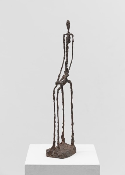
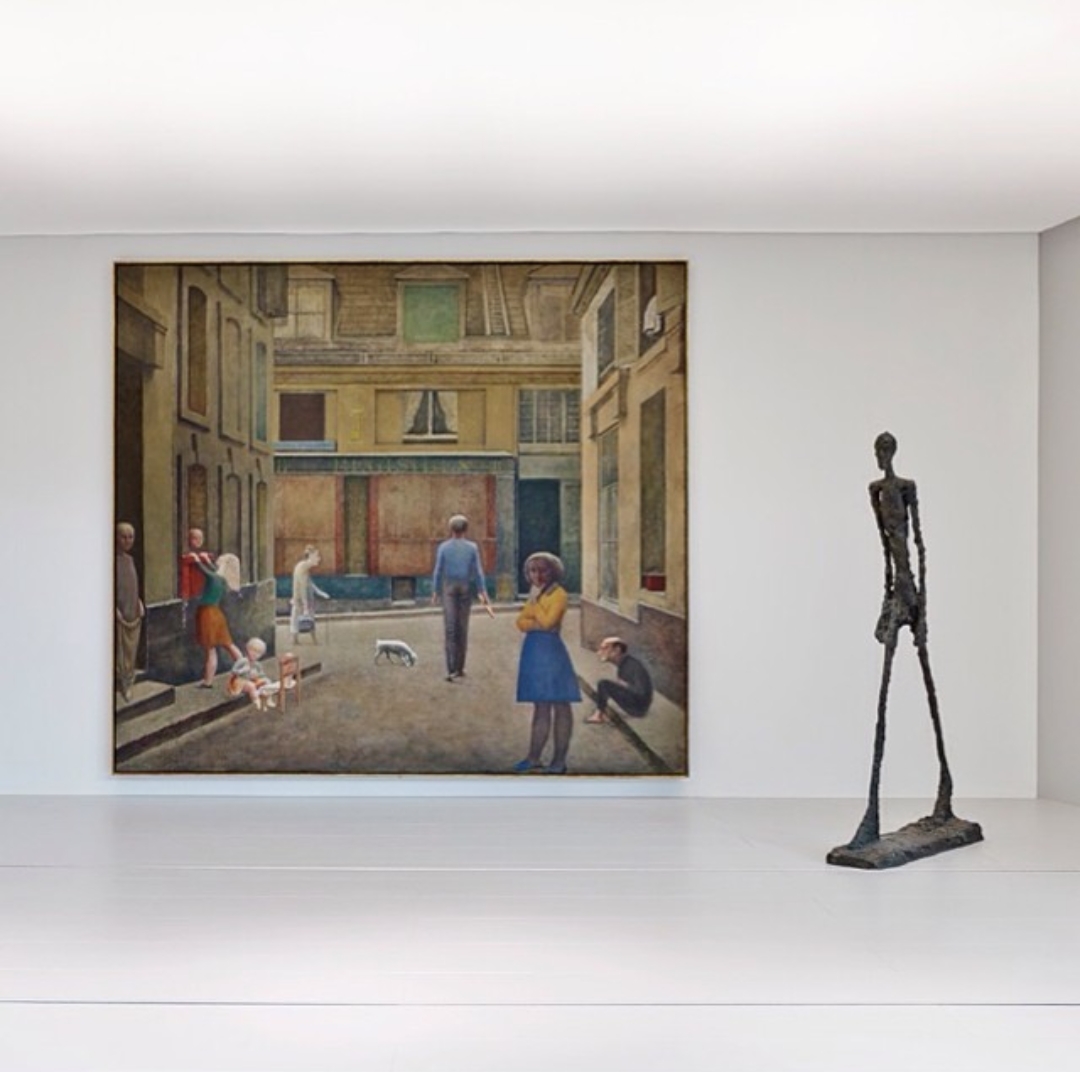
ALBERTO GIACOMETTI
Isaku Yanaihara, 1961
Oil on Canvas
Dimensions: 100.0 x 81.0 cm
Dimensions: 100.0 x 81.0 cm
Fondation Beyeler, Riehen/Basel, Sammlung Beyeler
© ProLitteris, Zürich / Foto: Peter Schibli


ALBERTO GIACOMETTI
Grande Femme IV, 1960
Bronze, Piece 3/6; Inscription: "Susse Fondeur
Paris, Cire perdue"
Fondation Beyeler, Riehen/Basel, Sammlung Beyeler
© ProLitteris, Zürich / Foto: Robert Bayer

ALBERTO GIACOMETTI
Grande Femme III, 1960
Bronze, Piece 6/6; Inscription: "Susse Fondeur
Paris"
Fondation Beyeler, Riehen/Basel, Sammlung Beyeler
© ProLitteris, Zürich / Foto: Robert Bayer


ALBERTO GIACOMETTI
L'Homme Qui Marche Sous la Pluie, 1948
Bronze, piece 1/6; Alexis Rudier Fondeur, Paris
Fondation Beyeler, Riehen/Basel, Sammlung Beyeler
© ProLitteris, Zürich / Foto: Robert Bayer

ALBERTO GIACOMETTI
Femme Assise, 1949 - 1950
Bronze, Piece 2/6;
Inscription: "Susse Fondeur Paris"
Fondation Beyeler, Riehen/Basel, Sammlung Beyeler
© ProLitteris, Zürich / Foto: Robert Bayer

ALBERTO GIACOMETTI
Femme de Venise VIII, 1956
Bronze, Piece 6/6; Inscription: "Susse Fondeur
Paris"
Fondation Beyeler, Riehen/Basel, Sammlung Beyeler
© ProLitteris, Zürich / Foto: Robert Bayer


ALBERTO GIACOMETTI
Aïka, 1959
Oil on Canvas
Dimensions: 92.0 x 72.8 cm
Dimensions: 92.0 x 72.8 cm
Fondation Beyeler, Riehen/Basel, Beyeler Collection
© ProLitteris, Zürich / Foto: Peter Schibli


VINCENT VAN GOGH
Champ Aux Meules de Blé, 1890
Oil on Canvas
Dimensions: 50.0 x 100.0 cm
Dimensions: 50.0 x 100.0 cm
Fondation Beyeler, Riehen/Basel, Sammlung Beyeler
© Foto: Robert Bayer

VINCENT VAN GOGH
Champ de Blé Aux Bleuets, 1890
Oil on Canvas
Dimensions: 60.0 x 81.0 cm
Dimensions: 60.0 x 81.0 cm
Fondation Beyeler, Riehen/Basel, Sammlung Beyeler
© Foto: Peter Schibli


JEAN DUBUFFET: METAMORPHOSES OF LANDSCAPE
Landscape runs like a defining leitmotif throughout
Jean Dubuffet’s multifarious oeuvre. From his earliest phase right up to his
late period he constantly developed it in unexpected but consistent ways. The
retrospective at the Fondation Beyeler focuses on Dubuffet’s innovative concept
of landscape, which also served him as a springboard for addressing many other
subjects.
Dubuffet has often been quoted to the effect that
“Everything is landscape,” and landscape does indeed dominate his artistic
practice and ideas: in both, anything can metamorphose into landscape at any
time. It is this special capacity for metamorphosis, together with an intense
delight in experimentation, that singles out the multi-faceted character of
Dubuffet’s work. In his paintings, the shapes and textures of landscape can
emerge even from bodies and faces. His art is governed by a unique interaction
between nature and creatures that can even transform objects into landscape.
With Dubuffet a landscape is not, therefore, a faithful depiction of actual
appearances but their translation into mental images: landscape gives visible
form to the immaterial world inhabited by the human mind. Instead of seeking
beautiful idyllic landscapes, Dubuffet explores raw, naked earth, occasionally
reaching down into its geological substructure. Sometimes he will fashion his
landscapes and figures from actual natural elements, such as sand and gravel,
making them the real material of his pictures. Natural landscape becomes a free
and open field for artistic practice.
You may
visit to read and see more painting from Jean Dubuffet Exhibition news at
Fondation Beyeler to click above link.


JEAN DUBUFFET
Automobile à la Route Noire, 1963
Oil on Canvas
Dimensions: 195.0 x 150.0 cm
Dimensions: 195.0 x 150.0 cm
Fondation Beyeler, Riehen/Basel, Beyeler Collection
© ProLitteris, Zürich / Foto: Peter Schibli

JEAN DUBUFFET
Ponge Feu Follet Noir, 1947
Oil on Canvas on Pavatex
Dimensions: 132.5 x 99.5 cm
Dimensions: 132.5 x 99.5 cm
Fondation Beyeler, Riehen/Basel, Beyeler Collection
© ProLitteris, Zürich / Foto: Peter Schibli

JEAN DUBUFFET
Argument et Contexte, 1977
Acrylic on Glued Paper Mounted on Canvas (66 Sections)
Dimensions: 201.0 x 249.0 cm
Dimensions: 201.0 x 249.0 cm
Fondation Beyeler, Riehen/Basel, Beyeler Collection
© ProLitteris, Zürich / Foto: Robert Bayer

JEAN DUBUFFET
Site Avec Trois Personnages, 1974
Vinyl Paint on Cut-Out Pressed Wood
Dimensions: 269.5 x 446.7 cm
Dimensions: 269.5 x 446.7 cm
Fondation Beyeler, Riehen/Basel, Beyeler Collection
© ProLitteris, Zürich / Foto: Robert Bayer

JEAN DUBUFFET
Incitations Divergentes, 1976
Acrylic on Glued Paper on Canvas (28 Sections)
Dimensions: 173.0 x 291.0 cm
Dimensions: 173.0 x 291.0 cm
Fondation Beyeler, Riehen/Basel, Beyeler Collection
© ProLitteris, Zürich / Foto: Robert Bayer

JEAN DUBUFFET
Corps de Dame - Pièce de Boucherie, 1950
Oil on Canvas
Dimensions: 116.0 x 89.0 cm
Dimensions: 116.0 x 89.0 cm
Fondation Beyeler, Riehen/Basel, Beyeler Collection
© ProLitteris, Zürich / Foto: Robert Bayer

JEAN DUBUFFET
Chassé Croisé, 1961
Oil on Canvas
Dimensions: 81.0 x 100.0 cm
Dimensions: 81.0 x 100.0 cm
Fondation Beyeler, Riehen/Basel, Sammlung Beyeler
© ProLitteris, Zürich / Foto: Robert Bayer

PHYSIOGNOMIC
ILLEGIBILITY
JEAN
DUBUFFET’S POSTWAR PORTRAITS BY KENT MITCHELL MINTURN
From
the summer of 1946 to the fall of 1947, Jean Dubuffet produced a series of
comical, irreverent portraits depicting some of the most important literary
figures of his day, including Antonin Artaud, Joë Bousquet, Marcel Jouhandeau,
Henri Michaux, Jean Paulhan, Francis Ponge, and Jules Supervielle. While many
of these individuals are not widely known by AngloAmerican readers, at the time
they constituted—to borrow the title of Gaëtan Picon’s canonical postwar
study—a veritable Panorama of New French Literature.1 Some were former
Résistant figures being lauded as heros, while others were coming under fire in
the postwar period for having contributed to German publications during the
Occupation. Jean-Paul Sartre, for reasons that will become clear, represents
perhaps the most conspicuous absence from Dubuffet’s panthéon. In October of
1947, Dubuffet exhibited his portraits in Paris at the Galerie René Drouin
under the sardonic title, Les gens sont bien plus beaux qu’ils croient: vive
leur vraie figure [People Are Much More Beautiful Than They Think: Long Live
Their True Face].2
According
to most accounts, Dubuffet’s foray into the genre of portraiture was the direct
result of the elaborate weekly lunches he attended, along with an array of
other artists and literati, at the home of the wealthy American expatriate and
patron of the arts, Florence Gould. Dubuffet himself seems to be the source of
this oft-repeated origin story. In a letter to Gould dated August 4, 1946, he
confesses, “What an adventure you have thrown me into! Nothing was farther from
my thoughts than doing portraits! Now it’s all I think about . . . and it’s all
your handiwork . . .”3 In hindsight, however, Dubuffet’s statement to Gould rings
hollow for two reasons. First, because portraiture was on the artist’s mind
long before he began attending Gould’s lunches. Several academic and highly
naturalistic portraits from Dubuffet’s prewar (or “pre-history,” as he
preferred to call it) period still exist—e.g., one of his father, Georges
Dubuffet, 1919, another of his maternal Grandmother, 1919, and one of his
lifelong friend, the surrealist novelist Georges Limbour, 1920 [Fig. 18].
During the thirties, Dubuffet coupled his interest in portraiture with his
passion for theater and created life-sized paper maché portrait-masks of his
friends René Ponthier (a local musician), André Claude (the manager of
Dubuffet’s wine business), and Robert Polguère (an antique dealer), 1935 [Fig.
19], as well as whimsical puppets and portraits of his wife, Lili Carlu. And
secondly, because in his statement to Gould cited above, Dubuffet fails to
admit that his postwar portraits are closely related to the large number of
anonymous figures and “personnages” he painted during the Occupation and in the
months immediately following the Liberation, many of which were displayed at
Mirobolus, Macadam, et Cie., his second solo show at the Galerie René Drouin in
May of 1946. These earlier figures demonstrate Dubuffet’s interwar and
immediate postwar interest in what might be called the illegible, immensurable,
or de-standardized body—in short, the body that resists classicizing
anthropomorphism, anthropocentrism, and anthropometry.

THE
ILLEGIBLE, IMMENSURABLE, DE-STANDARDIZED BODY
Dubuffet’s
rejection of the legible, standardized body is readily apparent in several
paintings he finished just before he embarked on his Portraits series,
including: Volonté de puissance [Will to Power], 1946 [plate 9], and Archétypes
[Archetypes], 1945 [Fig. 20]. In my estimation these heavily impastoed “haute
pâte” [thick paste] works, which introduce base materials (e.g., sand, asphalt,
and pebbles) into high art, are not simply attempts to shock, or to achieve
succès de scandale, by returning figuration to a more “primitive” or infantile
state (as many of Dubuffet’s early critics and detractors claimed). They also
reflect, albeit negatively, an historically specific phenomena—namely, the
classicizing “rappel à l’ordre” and nationalistic “retour à la terre”
mentalities rampant in France at the time.4 Dubuffet’s writings from this
period are replete with explicit and implicit denunciations of this return to
classicism via the Renaissance. For instance in “Causette” [“Little Chat”], the
text that he wrote to accompany his portrait show, Dubuffet lambastes this
return of “Greekeries, post-Greekeries, and neo-Greekeries” in contemporary
art, and elsewhere describes himself as staunchly “anti-Humanist.”5
These
sentiments are expressed visually in Dubuffet’s Volonté de puissance [Will to
Power], a painting from the Mirobolus, Macadam, et Cie. series, which not
incidently takes its title from the Nietzschean phrase appropriated by the
Third Reich. When juxtaposed with one of Nazi artist Arno Breker’s sculptures,
Der Sieger [The Victor], 1939 [Fig. 21], which exemplifies the neo-classical
body officially sanctioned by the Third Reich, and by extension Vichy, during
the war, the target of Dubuffet’s attack becomes clear. The figure’s rough,
hirsute body is the polar opposite of the polished, intact body depicted by
Breker. In place of wholeness and perfection, Dubuffet presents us with a
grotesquely flattened, disproportionate, and incomplete figure. It is difficult
to discern if he is missing arms, or if they have been tied behind his back.
Between the figure’s squat legs genitals dangle unceremoniously, like a cow’s
udder.
Macadam
connotes the idea of the horizontal vector of the ground, or, more precisely,
an asphalt road, which is normally seen from above. Here that ground has
been raised to a fronto-parallel viewing position. Dubuffet’s “return to the
soil” is diametrically opposed to the Nazis’; it no longer takes the form of a
glorified sublimated Teutonic body rooted in the soil of the German Motherland—or
the French, Vichy equivalent, an autochthonous Greco-Roman Mediterranean body.
Rather, Dubuffet’s return to the soil is nothing more than, as he put it at the
time, “a rehabilitation of mud” for its own sake.6 Mud, soil, and sand are
non-precious substances materially speaking, but also semantically; in
Dubuffet’s hands they prevent his figures from taking on any higher symbolic
value. Further, the opacity of these base materials block both visual
penetration and interpretation, and undermine the observer’s attempts to read
anything “into” the figures. At the same time, when viewing this painting, it
is nearly impossible to miss the accidental “face” formed by the hair on the
figure’s chest and abdomen. By including this detail, Dubuffet emphasizes the fact
that faces are arbitrary, rather than transparent entrees into a figure’s true
inner character. As is evinced by his later objet trouvé driftwood sculpture,
Le vieux de la plage [The Old Man of the Beach], 1959 [plate 51], accidental
faces continued to intrigue the artist throughout his career.
Dubuffet’s
interwar and immediate postwar figures resist those classical Vitruvian ideals,
passed down through the Renaissance and resuscitated in France after World War
II, which seek to describe the human body as a perfectly proportioned,
measurable, and quantifiable constant. In many ways, Dubuffet’s figures are the
opposite of architect Le Corbusier’s contemporaneous neo-classicizing Plan of
the Modulor, 1945 [Fig. 22], based on the time-honored Golden Section ratio of
1:1.618. Somewhat surprisingly, Dubuffet and the architect were friends at the
time; the former gave the latter Danseuse de corde [Jump Roper], 1943 [plate
1], as a gift shortly after he painted it.7 Dubuffet’s Archetypes nullify Le
Corbusier’s “gold standard” of proportion and undermine the notion of the human
figure as an ideal form or universally recognized sign. The viewer cannot help
but ask: Of what are these figures archetypes? For what archetypical ideal do
they stand? And, if they are generalized archetypes, why do they contain
obvious particularities, such as the wrinkles around both figures’ eyes? This
oscillation between the general and the particular will be a defining strategy
of Dubuffet’s postwar portraits. Indeed, Dubuffet once admitted to Max Loreau,
the scholar in charge of editing the artist’s multi-volume catalogue raisonné,
that Archetypes was a direct predecessor to his Portraits series:
‘ ‘The
word archetype evokes for me something like a simplistic generic prototype
where any individual particularity is omitted. It should be noted that the
first painting of my series Mirobolus, Macadam et Cie., done in 1945, carries
the title Archetypes . . . This character of depersonalization is certainly a
constant of all my personages . . .The charm of my Portraits enterprise
consisted exactly in undergoing a treatment of depersonalization of the
effigies of the persons designated. This persistent drive to
depersonalize the persons seems to me to precede the paintings (and is
more or less conscious in my mind throughout their execution).8 ‘’
Dubuffet
was quick to add that his technique of depersonalization requires “imagination
from the viewer to recognize and complete the portrait.”9

PHYSIOGNOMIC
ILLEGIBILITY
“These
pleasantries signify nothing.”10 —CRITIC MICHEL ARVILLE, 1947
Dubuffet’s
postwar portraits, or “anti-portraits” as he preferred to call them, similarly
resist typification, standardization, and legibility. His goal, he explicitly
declared in 1947, was to “block any likeness,” and to “multiply the obstacles”
between the viewer and the portrayed individual, in hopes that his effigies
would remain “open to multiple interpretations.” “Those who have spoken about
my Portraits as an endeavor of psychological penetration,” he claimed,
“have understood nothing.”11
Given
Dubuffet’s stated goals, the crisis in legibility that accompanied his
Portraits show at the Galerie René Drouin comes at no surprise. Contemporary
critics were completely baffled, especially when discussing the role of mimesis
in Dubuffet’s series. Their reactions range from one end of the spectrum to the
other. Whereas one critic, René Guilly, felt Dubuffet’s portraits “resembled
the living individuals too much,” another declared that the paintings
“absolutely do not evoke the person represented.”12 Dubuffet’s sitters
similarly had mixed reactions. Francis Ponge, for example, was pleasantly
amused with his likeness, Francis Ponge, jubilation [Francis Ponge,
Jubilation], 1947 [Fig. 23], while Paul Léautaud, on the other hand, became so
enraged upon seeing his effigy he attempted to destroy it with the end of his
cane.13
Yet, if
we look at the critical reception as a whole there is one word that perennially
resurfaces in the writings of detractors and supporters alike: “physiognomy.”14
Commonly understood, physiognomy refers to the art or pseudo-science of
determining an individual’s temperament or character from his or her outward
facial features. It presupposes that the face is a text or code which can be
read or deciphered; as such, physiognomy can be thought of as a kind of applied
semiotics of the body. Although the idea of physiognomy dates to antiquity, it
was not systematized and codified until the publication of Giovanni Battista
Della Porta’s Della Fisionomia dell’Uomo in 1586; in the following centuries,
Della Porta’s work was refined and augmented, most notably, by Charles Le Brun
and Johann Caspar Lavater.15
While
it might be argued that there is nothing inherently remarkable about the word
“physiognomy” resurfacing in the critical literature surrounding Dubuffet’s
show—it is, after all, a term inextricably intertwined with the genre—we should
not lose sight of how loaded the word had become at this specific historical
moment in postwar Europe. In the second half of the 19th century, thanks to the
photographic travails of Alphonse Bertillon, Duchenne de Boulogne, and Francis
Galton among others, physiognomy was elevated to the status of a positivist
epistemology.16 And as the all-too-familiar story goes, 50 years later the
Nazis hijacked the idea of “scientific” physiognomy, combined it with dubious
notions about race and eugenics, or inherited characteristics, and used it for
their own reprehensible ends.17 Dubuffet’s rejection of physiognomy at this
particular moment, then, should not be taken lightly, nor should it be treated
as an isolated case. It is part of a wider phenomenon in postwar European
painting that extends beyond the scope of this essay. Indeed, a more complete
analysis of this issue would include a further consideration of postwar
portraits by Francis Bacon and Alberto Giacometti, and those by Dubuffet’s
friends, Jean Fautrier, Tal Coat, Henri Michaux, and Antonin Artaud, as well as
an investigation into the profound role the human face played in postwar
philosophical, literary, ethical, and cultural debates.18

BLOCKING
LIKENESS
In his
postwar Portraits, Dubuffet creates obstacles between the material signifier of
the painting and the signified sitter in three main ways. First and foremost,
Dubuffet blocks likeness by purposefully emphazing the materiality and opacity
of his painted surfaces. Physiognomic opacification in portaiture and the
deconstruction of the genre’s monopoly on mimesis and verisimilitude via this
strategy is nothing new in the history of modern art, in fact it very well may
be an essential facet of it—we need look no further than Paul Cézanne’s
portraits of his wife Mary-Hortense Fiquet, or Pablo Picasso’s 1906 Portrait of
Gertrude Stein. Yet, Dubuffet clearly takes things much further with his
heavily impastoed, monochromatic “pâte.” This “paste,” “dough,” or “pasta,” (as
it can be alternately translated) acts like a culinary substance which engages
senses other than the visual; the viewer must “devour” these paintings corporally,
rather than look at them from a cerebrally-detached distance. Dubuffet
encourages associations of this sort when, in the subtitle to his show, he
describes his Portraits as “cuite et confite dans la mémoire” or “cooked and
preserved in memory.” “Confite,” suggests conservation, but also something
gelatinous, and non-transparent. Likewise, culinary metaphors pepper the
artist’s introductory essay for the show. Critics, in turn, were inspired to
use similar metaphors when commenting on his portraits.19
The
French word for “material,” matière, can mean either the physical substance one
would use to build something, or the “contents” or “subject matter” (as in the
phrase Table des matières, a “Table of Contents”). At the formal level,
Dubuffet conflates these two ideas so that the materiality of the paint
confounds our attempts to look into the “contents” or “substance” of the
depicted individual. To the same ends, through his painterly process Dubuffet
combines the two meanings of the French word trait, which connotes both a mark,
such as a brushstroke or a drawn line, and a feature of someone’s personality
(in the same sense that the word is used in English to refer to a personality
“trait”). In Dubuffet’s portraits the incised trait remains at one with the thick
surface of the canvas, it no longer relates to any imagined internal
characteristic.20
Second,
as in his earlier Archetypes, Dubuffet oscillates back and forth between the
general and the particular.21 He includes the “accidental” and “insignificant”
in order to cancel out any trait “others might quite rightly have judged more
significant.”22 In each case Dubuffet begins with a very rudimentary plan, and
then adds just enough information to suggest the individual identity of the
sitter. For example, in Antonin Artaud aux houppes [Antonin Artaud with Tufts
of Hair], 1947 [Fig. 24], he adds the actor’s recognizable wild tufts of hair
and a careful line tracing his emaciated jawline, ruined by the electroshock
therapy he received in a psychiatric hospital in Rodez during the war. This
oscillation between general and particular prevents Dubuffet’s portraits from
becoming “caricatures” or theatrical “masks” that aim to fix a face in time. As
Benjamin Buchloh has observed, “ . . . both caricature and mask conceive of a
person’s physiognomy as fixed rather than a fluid field: in singling out
particular traits, they reduce the infinity of differentiated facial
expressions to a metonymic set.”23
Lastly,
in his portraits Dubuffet blocks likeness through a lively game of nominalism.
The artist often claimed that the act of titling a work was itself an essential
part of the artistic process, and once praised critic Renato Barilli for
rightly stressing the nominaliste side of his overall enterprise.24 As Norman
Bryson has argued, the practice of physiognomy traditionally relies on certain
“syllogisms” which seek to embed it within common language and “naturalize”
otherwise tenuous connections, as can be seen in the “Similarities Between the
Head of an Ox and a Man” illustration included in Charles Le Brun’s Conférence
sur l’expression générale et particulière, 1688 [Fig. 25].25 This kind of logic
was unfortunately alive and well in France in the postwar period [Fig. 26]. In
Dubuffet’s praxis, Michaux becomes a spider, René Bertele a wild cat, and
Georges Limbour is equated to a crustacean or chicken droppings [plate 11].
However, in contrast to the example from Le Brun’s book, or the more recent
page from a widely-read Parisian newspaper, Dubuffet’s animal-human connections
are obviously contrived and over the top, and accordingly, strike the viewer as
strange, unnatural, and even preposterous. He uses this effect of estrangement
to emphasize the schism that exists between the painted portrait and the actual
person.26 In the same manner, Dubuffet’s creative titling disrupts the genre of
portraiture’s long-standing promise of illuminating a connection between the
sitter’s image and his or her class, vocation, or ethnicity. For example, at
one point, he nominates Paul Léautaud the “Général d’Empire” even though
everyone knew he was, in fact, a writer. Georges Limbour becomes a “Mexican”
king, Edith Boissonnas a “Tibetan” demon, Henri Michaux a “Japanese” actor, and
Léautaud an “Indian” sorcerer, when, once again, audiences knew they were not
Mexican, Tibetan, Japanese, or Native American, respectively. This
enthnographic confusion was purposefully compounded by Dubuffet’s choice to
also exhibit six “L’Arbi” paintings, done in early 1947 during his first of
three trips to the Sahara, along with his portraits.27
You may
read whole essay from New York University web page writing by Kent Mitchell
Minturn to click above link.


WILHELM SASNAL
Anka, 2012
Oil on Canvas
Dimensions: 40.0 x 35.0 cm
Dimensions: 40.0 x 35.0 cm
Fondation Beyeler, Riehen/Basel
© Wilhelm Sasnal / Foto: Robert Bayer

WILHELM SASNAL
Kacper, 2012
Oil on Canvas
Dimensions: 40.0 x 35.0 cm
Dimensions: 40.0 x 35.0 cm
Fondation Beyeler, Riehen/Basel
© Wilhelm Sasnal / Foto: Robert Bayer

WILHELM SASNAL
Partisans, 2005
Oil on Canvas
Dimensions: 40.0 x 50.0 cm
Dimensions: 40.0 x 50.0 cm
Fondation Beyeler, Riehen/Basel
© Wilhelm Sasnal / Foto: Robert Bayer


GERHARD RICHTER: REAL & TANGIBLE ACCOMPLISHMENTS
AS A YOUNG MAN
While the years immediately following the end of World
War II were in many ways difficult, Richter also has fond memories of this
time, not least because he found he had access to books that had previously
been forbidden under Nazi control. Speaking to Robert Storr, Richter explained:
"It was very nasty, [but] when the Russians came to our village and
expropriated the houses of the rich who had already left or were driven out,
they made libraries for the people out of these houses. And that was fantastic."1 In
a later conversation with Jan Thorn-Prikker, Richter elaborated, "Cesare
Lombroso's Genius and Madness, Hesse, Stefan Zweig, Feuchtwanger, all that
middle-class literature. It was a wonderful, care-free time … made it easy to
forget the dark side of things."2 Dietmar Elger, having described Richter's mother
Hildegard's role in encouraging her son's interest in Nietzsche, Goethe,
Schiller and others, notes that it was an "endless supply of illustrated
books that prompted his own first drawings."3 In
an interview with Jeanne Anne Nugent, Richter recalls studying art "from
books and from the little folios with art prints that you used to get then – I
remember Diego Velázquez, Albrecht Dürer, Lovis Corinth […] It was simply a
matter of what was around, what we saw and bought for ourselves."4
It was around this time, at the age of 15 or 16, that
Gerhard's passion for art began in earnest, having an early epiphany during an
eight-week summer camp organized by the Russian-controlled State, where
"for the first time he spent a lot of time drawing."5 One
of the first drawings that Richter recalls and acknowledges producing6 as
a young man in 1946 was a nude figure copied from a book, which his parents are
said to have reacted to with both pride and embarrassment.7 He
recalls also having made landscapes and self-portraits, and perhaps more
unusually, often working in watercolours. In a 2002 interview with Storr, Richter
describes a watercolour drawing he produced whilst living in the village of
Waltersdorf of a group of people dancing. "Automatically I was an
outsider. I couldn't speak the dialect and so on. I was at a club, watching the
others dance, and I was jealous and bitter and annoyed. So in the watercolor,
all this anger is included, at 16. It was the same with the poems I was writing
– very romantic, but bitter and nihilistic, like Nietzsche and Hermann
Hesse."8
In 1947, while still studying stenography, accounting and Russian at college in nearby Zittau, Richter began attending evening classes in painting. Little has been documented about these first painting lessons, although Elger records that before completing the course, Richter realized that he had learnt all that he was likely to from the teachers there.9 A year later, Richter moved into a hostel for apprentices in Zittau, leaving his family home in Waltersdorf.
While clearly passionate about art, on completing his studies in Zittau in 1948, Richter did not assume his career would be as a painter, and for a while considered an eclectic array of professions, including forestry, dentistry and lithography. Looking for openings that would use his artistic skills for trade and commercial purposes if not in the fine art arena, his first position was as a member of a team producing banners for the German Democratic Republic government. Storr recounts that during his five months in this post, Richter never had the opportunity to actually paint any of the banners himself, instead being charged with the task of taking the old banners and cleaning them up ready for his colleagues to paint.10 In February 1950 he was taken on as an assistant set painter for the municipal theatre in Zittau. Richter had recently been involved with an amateur theatre group11, so it was perhaps through this, or even, as Storr proposes, through friends from his evening classes, that he was aware of and disposed to the role at the theatre. During his few months here, Elger notes that he enjoyed working on the sets for productions including Goethe's Faust and Schiller's William Tell among others. His career in the theatre came to an abrupt end, however, when the young Richter refused to do wall painting work on the theatre's staircases, and was promptly dismissed.12
Soon after leaving the theatre, he applied to study painting at the Dresden Art Academy [Hochschule für Bildende Künste Dresden]. It is unclear whether he had already been planning to do so whilst at the theatre, or whether his dismissal prompted fresh consideration of his future. But it was clearly an idea to which he was committed, as having had his first application rejected, he was advised by the examiners to find a job with a state-run organization in order to increase his chances of being accepted, which he duly did. As Elger explains, State employees tended to receive preferential treatment at that time, and the recommendation must have worked, as following eight months working as a painter at the Dewag textile plant in Zittau, he reapplied and was accepted onto the course.13 He returned to his birth city of Dresden in the summer of 1951, ready to begin his formal studies to be a painter.
You may
visit to read and see more painting from Gerhard Richter to click above
link.


GERHARD RICHTER
Doppelgrau, 2014
Enameled Glass, Two Parts, Overall
Dimensions: Glas Links 200.0 x 185.0 cm; Glas Rechts 200.0 x 215.0 cm
Dimensions: Glas Links 200.0 x 185.0 cm; Glas Rechts 200.0 x 215.0 cm
Fondation Beyeler, Riehen/Basel
© Gerhard Richter / Foto: Mark Niedermann

GERHARD RICHTER
12 Scheiben (Reihe), 2013
Glass and Steel
Fondation Beyeler, Riehen/Basel
© Gerhard Richter / Foto: Mark Niedermann

GERHARD RICHTER
Doppelgrau, 2014
Enameled Glass, Two Parts, Overall
Dimensions: Glas Links 200.0 x 185.0 cm; Glas Rechts 200.0 x 215.0 cm
Dimensions: Glas Links 200.0 x 185.0 cm; Glas Rechts 200.0 x 215.0 cm
Fondation Beyeler, Riehen/Basel
© Gerhard Richter / Foto: Mark Niedermann


ELLSWORTH KELLY
White Curves, 2001
Welded Aluminium and Stainless Steel Plate Over
Internal Truss Finished
With Gloss White Catalyzed Urethane Paint
Fondation Beyeler, Riehen/Basel, Sammlung Beyeler
© Nachlass Ellsworth Kelly / Robert Bayer

ELLSWORTH KELLY
Yellow White, 1961
Oil on Canvas
Dimensions: 213.4 x 141.5 cm
Dimensions: 213.4 x 141.5 cm
Fondation Beyeler, Riehen/Basel, Sammlung Beyeler
© Nachlass Ellsworth Kelly / Foto: Robert Bayer


ELLSWORTH KELLY
Blue Black Red Green, 2000
Oil on Canvas
Dimensions: 249.0 x 1219.0 cm
Dimensions: 249.0 x 1219.0 cm
Gemäss Maquette EK
Fondation Beyeler, Riehen/Basel, Sammlung Beyeler
© Nachlass Ellsworth Kelly / Foto: Robert Bayer

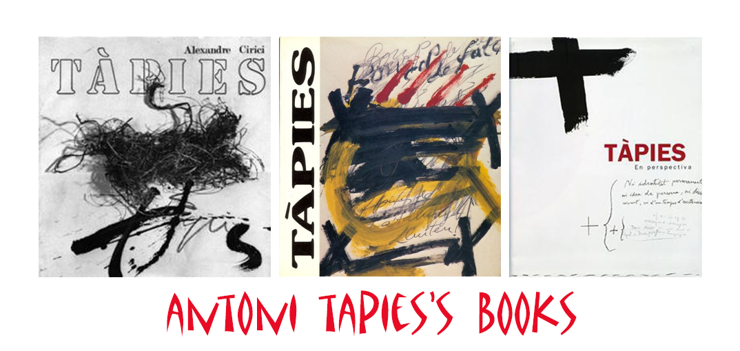

TAPIES’ POSTERS & THE PUBLIC SPHERE
"Tàpies’ poster production can be classified into
two broad groups. Firstly, the posters he produced for his own exhibitions.
Secondly, those that engage with the public sphere and which constitute
invaluable graphic and artistic testimony to certain needs and aspirations felt
by civil society, as well as other cultural realities forming part of our
recent past. Tàpies’ posters also provide documentary material of the highest
order, both on general issues (the abolition of the death penalty, amnesty and
human rights, protests against nuclear power, calls for peace or against
apartheid, etc.) and particular questions. However, above all his posters are
connected to events in the social, cultural and political history of Catalonia,
both during the last years of the Franco regime and during the period from the
restoration of democracy to the present, with posters dedicated to the Assembly
of Catalonia, commemorating the Catalan national day on 11 September and the
fifth centenary of the first book printed in Catalan, defending the Catalan
masters and music sung in Catalan, as well as those announcing or commemorating
other important events, such as the festivities of La Mercè, the establishment
of the Catalan broadcasting company in 1983 and the international recognition
of Catalan culture. To this we should also add a subgroup comprising the
artist’s homages to writers, poets, musicians, film directors and
intellectuals, and which introduce a new use of the poster as an open, public
letter."
Nuria
Enguita Mayo, exhibition
curator.
"Tàpies’ posters, which are imbued with a
yearning for a social Utopia, are closer in spirit to the Russian avant-gardes
of the twenties, a time when new art came to the fore and the artist was at the
service of the people and education. Tàpies offered up his artistic language to
the service of a social Utopia, dream and vindication, and he has continued for
more than four decades without interruption. 1960 to 2006 is the overall period
covered by this exhibition. Whilst these posters comprise a journey through
Tàpies’ painting over the last few decades, it is also true that his paintings
are ‘contaminated’ by the social purpose of the poster and that both his
pictorial work and his posters have become a form of public art. All Tàpies’
painting embodies a great manifesto in favour of freedom as the essential right
of people and nations, but in the poster this proclamation becomes a cry, a
guiding voice, a public message."
"Tàpies’ posters occupied an important position
in the Catalan public sphere as instruments vindicating democracy and Catalan
identity, whilst serving as ambassadors for Catalonia internationally. Over the
years, then, Tàpies’ posters reflected both the evolution of his own work and
the progress being made in terms of the cultural and social demands of the
country. It is true that many of Tàpies’ posters announce his exhibitions, but
even these have a certain air of the manifesto about them."
"Tàpies brings all the spirit and resources from
the language of painting to his posters. However, unlike other poster artists,
who more or less faithfully reproduce their habitual aesthetic, with Tàpies the
graphic force of the concept rises above all aesthetic considerations, so that
there is less material and more spirit. (...) In Tàpies’ posters we may find
such resources as drawing, collage, frottage, the pencil stroke, the forceful
application of a thick paintbrush, traces of such ‘poor’ materials as
cardboard, scratches using cane, angry spray paint and the mark of a tampon.
However, they nearly always reflect personal energy through calligraphy. His
posters are full of visual force and power and are designed for visual
interpretation: the impact of illuminated or capital letters, the presence of
the human element represented by fragments of the body such as the foot,
symbolising life as a path that we travel along by the action of walking (‘You
make your path as you walk’, Machado dixit), the senses (eyes, nose, mouth,
ears, hands) as a source of perceptive knowledge, letters and numbers,
hieroglyphics, newspapers, plays on words, the use of objects to produce a
striking graphic effect, which should be more convincing than the word. (...)
The high conceptual quality of Tàpies’ posters leads us to say that in many
cases these can be considered almost visual poetry; sketches for a concrete
poetry. The resources he uses are often those characteristic of graffiti, of
the impact of automatic writing and of the spontaneity with which he turns
concepts, matured and shaped decisively, into reality."
"Tàpies’ posters fully belong to the political
fabric and they show the artist, the intellectual, as a servant, a kind of
‘social worker’, or an ‘art worker’ at the service of the people, since the
forms of representation of a public domain that is autonomous and opposed to
the dominant forms must always reflect the roots of people’s real experiences.
With his posters, Tàpies erases the barriers between the political and the
poetic. He creates conceptual cartographies for an emancipating public domain
within the ideological context of an unrepeatable historical moment."
Excerpts from Pilar
Parcerisas’ prologue, ‘Tàpies’ Posters and the Public
Sphere’, Els cartells de Tàpies i l’esfera pública / Los
carteles de Tàpies y la esfera pública (Barcelona: Fundació Antoni Tàpies,
2006).
http://www.fundaciotapies.org/site/spip.php?rubrique632
You may
visit to read and see more painting from on news Antoni Tapies to click above
link.


ANTONI TÀPIES
Écriture Sur le Mur, 1971
Mixed Media on Canvas
Dimensions: 270.0 x 200.0 cm
Dimensions: 270.0 x 200.0 cm
Fondation Beyeler, Riehen/Basel, Sammlung Beyeler
© Fundació Antoni Tàpies, Barcelona / ProLitteris,
Zürich / Foto: Robert Bayer

ANTONI TÀPIES
Relleu Negre Per a Documenta, 1964
Mixed Media on Canvas
Dimensions: 275.0 x 230.0 cm
Dimensions: 275.0 x 230.0 cm
Fondation Beyeler, Riehen/Basel, Sammlung Beyeler
© Fundació Antoni Tàpies, Barcelona / ProLitteris,
Zürich / Foto: Robert Bayer


PHILIPPE PARRENO
Fireflies, 2014
Ink on Paper, Black Ink, Rohrer & Klinger
Dimensions: 29.3 x 20.8 cm
Dimensions: 29.3 x 20.8 cm
Fondation Beyeler, Riehen/Basel. Schenkung des
Künstlers.
© Beim Künstler / Foto: Robert Bayer

PHILIPPE PARRENO
Fireflies, 2014
Ink on Paper, Black Ink, Rohrer & Klinger
Dimensions: 29.3 x 20.8 cm
Dimensions: 29.3 x 20.8 cm
Fondation Beyeler, Riehen/Basel
© Beim Künstler / Foto: Robert Bayer

PHILIPPE PARRENO
Fireflies, 2014
Ink on Paper, Black Ink, Rohrer & Klinger
Dimensions: 29.3 x 20.8 cm
Dimensions: 29.3 x 20.8 cm
Fondation Beyeler, Riehen/Basel. Schenkung des
Künstlers.
© Beim Künstler / Foto: Robert Bayer

PHILIPPE PARRENO
Dwarf Sun, 2011
Ink on Paper
Dimensions: 21.0 x 29.6 cm
Dimensions: 21.0 x 29.6 cm
Fondation Beyeler, Riehen/Basel
© Beim Künstler / Foto: Robert Bayer


ANSELM KIEFER
Baum mit Palette, 1978
Oil and Lead on Canvas
Dimensions: 280.5 x 190.0 cm
Dimensions: 280.5 x 190.0 cm
Fondation Beyeler, Riehen/Basel, Sammlung Beyeler
© Anselm Kiefer / Foto: Robert Bayer

ANSELM KIEFER
Wege: Märkischer Sand, 1980
Acrylic and Sand on Photograph on Burlap
Dimensions: 255.5 x 363.0 cm
Dimensions: 255.5 x 363.0 cm
Fondation Beyeler, Riehen/Basel, Sammlung Beyeler
© Anselm Kiefer / Foto: Robert Bayer


WASSILY KANDINSKY
Improvisation 10, 1910
Oil on Canvas
Dimensions: 120.0 x 140.0 x 3.0 cm
Dimensions: 120.0 x 140.0 x 3.0 cm
Fondation Beyeler, Riehen/Basel, Beyeler Collection
© Foto: Peter Schibli

WASSILY KANDINSKY
Fuga (Fugue), 1914
Oil on Canvas
Dimensions: 129.5 x 129.5 cm
Dimensions: 129.5 x 129.5 cm
Fondation Beyeler, Riehen/Basel, Beyeler Collection
© Foto: Robert Bayer


FERNAND LÉGER
Les Deux Cyclistes, la Mère et L'enfant, 1951
Oil on Canvas
Dimensions: 162.0 x 114.0 cm
Dimensions: 162.0 x 114.0 cm
Fondation Beyeler, Riehen/Basel, Sammlung Beyeler
© ProLitteris, Zürich / Foto: Cantz
Medienmanagement, Ostfildern

FERNAND LÉGER
Le Passage à Niveau, 1912
Oil on Canvas
Dimensions: 94.0 x 81.0 cm
Dimensions: 94.0 x 81.0 cm
Fondation Beyeler, Riehen/Basel, purchased with a
donation by Kurt Schwank, Riehen
© ProLitteris, Zürich / Foto: Cantz
Medienmanagement, Ostfildern

FERNAND LÉGER
Les Perroquets (Les Acrobates), 1933
Oil on Canvas
Dimensions: 130.0 x 162.0 cm
Dimensions: 130.0 x 162.0 cm
Fondation Beyeler, Riehen/Basel, Sammlung Beyeler
© ProLitteris, Zürich / Foto: Robert Bayer

FERNAND LÉGER
Les Trois Femmes et la Nature Morte, 1921
Oil on Canvas
Dimensions: 60.0 x 92.0 cm
Dimensions: 60.0 x 92.0 cm
Fondation Beyeler, Riehen/Basel, Sammlung Beyeler
© ProLitteris, Zürich / Foto: Robert Bayer

FERNAND LÉGER
Composition I, 1930
Oil on Canvas
Dimensions: 141.0 x 291.0 cm
Dimensions: 141.0 x 291.0 cm
Fondation Beyeler, Riehen/Basel, Sammlung Beyeler
© ProLitteris, Zürich / Foto: Robert Bayer

FERNAND LÉGER
Nature Morte au Masque de Plâtre, 1927
Oil on Canvas
Dimensions: 88.5 x 130.0 cm
Dimensions: 88.5 x 130.0 cm
Fondation Beyeler, Riehen/Basel, Sammlung Beyeler
© ProLitteris, Zürich / Foto: Robert Bayer

FERNAND LÉGER
L'Horloge, 1918
Oil on Coarse Fabric
Dimensions: 50.7 x 61.5 cm
Dimensions: 50.7 x 61.5 cm
Fondation Beyeler, Riehen/Basel, Sammlung Beyeler
© ProLitteris, Zürich / Foto: Cantz
Medienmanagement, Ostfildern


FROM
ANTIQUARIAN BOOKSHOP TO THE FONDATION BEYELER
In
1952, Ernst Beyeler and his wife Hildy renamed their antiquarian bookshop at
Bäumleingasse 9 in Basel "Galerie Beyeler," thus laying the
foundation for a unique career. This led to the establishment of the Beyeler
Foundation in 1982 and culminated in the opening of the Fondation Beyeler in
1997, now one of the world's most important and beautiful art museums.
THE
BEGINNINGS IN THE ANTIQUARIAN BOOKSHOP
The
early lives of Ernst and Hildy Beyeler gave no indication that they were
destined for outstanding careers as art dealers. It was more by chance that
Ernst Beyeler, then still a student, landed a job with Oskar Schloss at his
print and antiquarian bookshop, “La Librairie du Château d’Art,” at Bäumleingasse
9 in Basel. Oskar Schloss had been one of the pioneer publishers of Buddhist
texts. Having been robbed of his fortune by the Nazis, he was able to flee from
Germany to Switzerland, where he made a living in his later years with a small
antiquarian bookshop. For Ernst Beyeler, these were formative years, with Oskar
Schloss informally initiating his staff into literature, philosophy, and art in
the evenings.
After the untimely death of his employer in 1945, Ernst Beyeler was able to take over the debt-ridden shop – and its debts – with the financial support of his future wife Hildy Kunz. However, antique books and the demands of the business were not what the young Beyeler was looking for. It is no surprise therefore that he devoted increasing attention to the graphic arts, such as lithographs by Honoré Daumier, Henri de Toulouse-Lautrec, or Japanese woodblocks. The name "Ernst Beyeler" was added to the shop in 1947, and in 1952 the name was changed to “Galerie Beyeler.” The foundation for a unique career had been laid. But one thing remained from those early antiquarian years: the love of beautifully designed catalogs.
After the untimely death of his employer in 1945, Ernst Beyeler was able to take over the debt-ridden shop – and its debts – with the financial support of his future wife Hildy Kunz. However, antique books and the demands of the business were not what the young Beyeler was looking for. It is no surprise therefore that he devoted increasing attention to the graphic arts, such as lithographs by Honoré Daumier, Henri de Toulouse-Lautrec, or Japanese woodblocks. The name "Ernst Beyeler" was added to the shop in 1947, and in 1952 the name was changed to “Galerie Beyeler.” The foundation for a unique career had been laid. But one thing remained from those early antiquarian years: the love of beautifully designed catalogs.
THE
GALERIE BEYELER SET STANDARDS
It was
impressive how consistently the business grew. Initially, and undoubtedly under
the influence of art historian and museum expert Georg Schmidt, the Galerie
Beyeler was clearly focused on German art. The most important Expressionist
painters were well represented at Beyeler’s, as were Käthe Kollwitz, Edvard
Munch, Alexej von Jawlensky, supplemented by masterpieces of French graphic art
of the 19th and 20th centuries. In the beginning, even works by contemporary
and local artists, including some artist friends, were represented.
The first small catalogs, “Bilder des 20. Jahrhunderts” and “Tableaux français,” came out in 1952 and 1953 and were rooted in the tradition of inventory catalogs of graphic art. The selection and artistic quality set a benchmark that brooked no compromise. Beyeler’s goal was to become one of the leading players in the art world, and he boldly followed his own convictions. Art should be substantive, it should be an enduring source of pleasure, and it should stand the test of time. A preference for art that was not too ordinary and not immediately pleasing became apparent quite early.
The 1950s were marked by an ambitious expansion of the gallery, with French painting increasingly setting the tone. Dealing in art functioned according to a simple rule of thumb: for every work sold, two new ones were bought. Ernst Beyeler began to travel more often. Munich, Stuttgart, Cologne, and Paris were his main destinations. He attended the London auctions with increasing regularity. In Basel, Hildy Beyeler oversaw the finances and managed the small staff. By the late 1950s, the gallery in the Bäumleingasse was no longer a tip only for insiders. In addition to the local clientele, more and more Americans made a detour from Paris to the gallery's promising summer exhibitions. The catalog series "Maîtres de l'art moderne (1955-1958)" bears witness to this.
THE ART
DEALER BECOMES A MUSEUM DIRECTOR
The
sphere of business grew to include North America and Ernst Beyeler met G. David
Thompson of Pittsburgh, who first appeared as a client and later sold his
legendary collection of modern art. He was regarded as a notoriously
unpredictable collector and attracted a great deal of attention in the art
world. In buying his collection, Ernst Beyeler gained the respect of
prestigious New York galleries. He then sold complete groups of works from the
Thompson Collection to museums, establishing a reputation that would open doors
from that point on. He received great acclaim for placing a group of works by
Klee in Düsseldorf and Giacometti sculptures in the specially founded
Giacometti Foundation in Zurich. Beyeler the art dealer proved his credentials
as a museum curator long before his own collection began to take shape.As the
broker of major art deals, Ernst Beyeler became a friend to many museums. He
later gave the impulse for entire exhibitions and actively supported them.
For all his fame, he did not forget his modest beginnings. The challenging quality of a work of art remained the most important thing. He shared this love generously with his clients, visitors, and later with his museum staff. He never lost sight of the essentials, nature, inner balance, and political and ecological aspects. The hustle and bustle of the city never penetrated into the rooms at Bäumleingasse, which had a medieval modesty that let art have center stage.
For all his fame, he did not forget his modest beginnings. The challenging quality of a work of art remained the most important thing. He shared this love generously with his clients, visitors, and later with his museum staff. He never lost sight of the essentials, nature, inner balance, and political and ecological aspects. The hustle and bustle of the city never penetrated into the rooms at Bäumleingasse, which had a medieval modesty that let art have center stage.
ESTABLISHMENT
OF THE FOUNDATION AND CONSTRUCTION OF THE FONDATION BEYELER
Ernst
and Hildy Beyeler assembled a collection of fine works of classical modernism
over fifty years, parallel to their work as successful gallery owners.
The Collection was
converted into a Foundation in
1982, and in 1989 it was publicly exhibited for the first time in its entirety
at the Centro de Arte Reina Sofía in Madrid. The collection won international
acclaim and the collector couple went on to expand it with great care.
The foundation marked the birth of the idea of building a museum. Ernst Beyeler was looking for a suitable place and found it in his hometown of Riehen: the grounds of the Villa Berower offered the desired connection to nature and seemed made for the construction of a museum that would harmoniously unite architecture, art, and nature. Beyeler commissioned Renzo Piano without a competition for the construction of the Fondation Beyeler museum, which was opened on October 18, 1997.
Ernst Beyeler acted as director of the Fondation Beyeler until 2003. Christoph Vitali took over in 2003, then Sam Keller in 2008 and until today. Ernst Beyeler passed away in 2010, two years after the death of his wife Hildy.
https://www.fondationbeyeler.ch/en/museum/history/


