

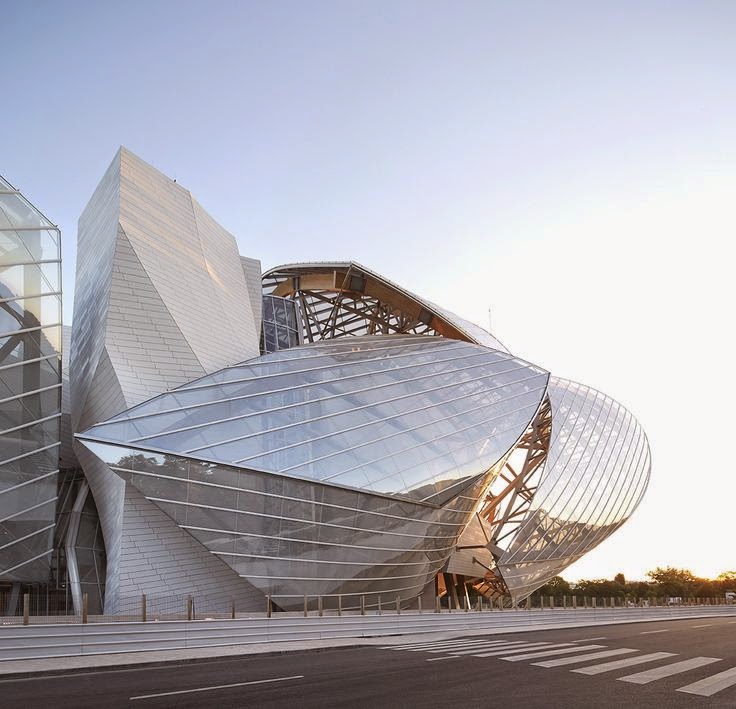
MARK ROTHKO AT LOUIS VUITTON FONDATION PARIS
NOVEMBER 18, 2023 – APRIL 2, 2024

MARK ROTHKO AT LOUIS
VUITTON FONDATION
NOVEMBER 18, 2023 – APRIL
2, 2024
Opening on October 18,
2023, the Fondation Louis Vuitton presents the first retrospective in France
dedicated to Mark Rothko (1903-1970) since the exhibition held at the musée d’Art
moderne de la Ville de Paris in 1999. The retrospective brings together some
115 works from the largest international institutional and private collections,
including the National Gallery of Art in Washington D.C., the artist’s family,
and the Tate in London. Displayed chronologically across all of the Fondation’s
spaces, the exhibition traces the artist’s entire career: from his earliest
figurative paintings to the abstract works that he is most known for today.
“I’m interested only in
expressing basic human emotions.” Mark Rothko
The exhibition opens with
intimate scenes and urban landscapes - such as visions of the New York subway -
that dominate Rothko’s output in the 1930s, before his transition to a
repertoire inspired by ancient myths and surrealism which Rothko uses to
express the tragic dimension of the human condition during the War.
From 1946, Rothko makes
an important shift towards abstraction expressionism. The first phase of this
switch is that of Multiforms, where chromatic masses are suspended in a kind of
equilibrium on the canvas. Gradually, these decrease in number, and the spatial
organization of his painting evolves rapidly towards Rothko’s “classic” works
of the 1950s, where rectangular shapes overlap according to a binary or ternary
rhythm, characterized by shades of yellow, red, ochre, orange, but also blue,
white...
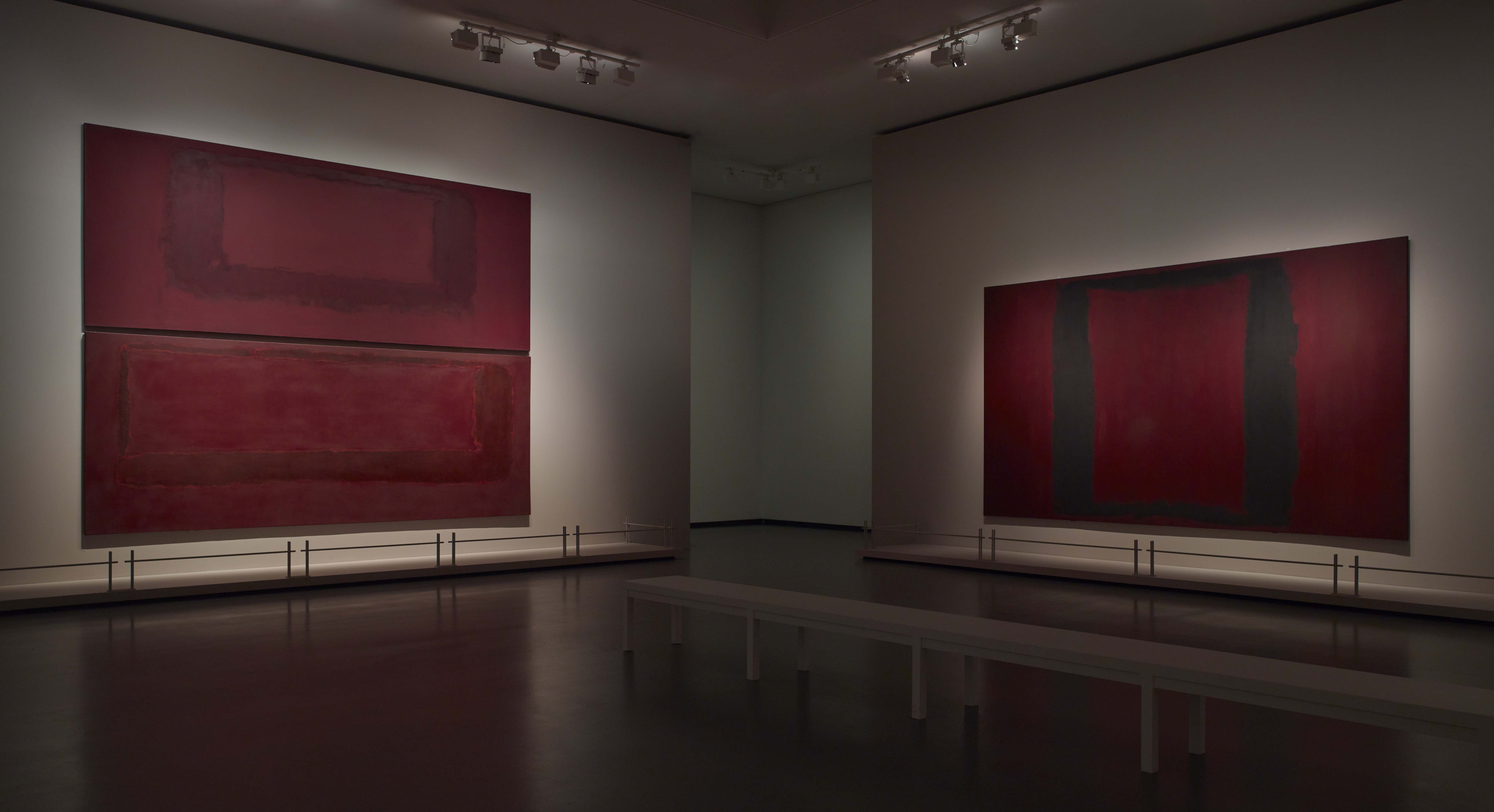
In 1958, Rothko is
commissioned to produce a set of wall paintings for the Four Seasons restaurant
designed by Philip Johnson for the Seagram Building in New York - the
construction of which is overseen by Ludwig Mies van der Rohe. Rothko later
decides not to deliver the paintings and keeps the entire series. Eleven years
later, in 1969, the artist donates nine of these paintings - which differ from
the previous ones on account of their deep red hues - to the Tate, which
dedicates a room in its collections exclusively to Rothko. This series is
exceptionally presented in the Fondation Louis Vuitton exhibition.
In 1960, the Phillips
Collection dedicates a permanent gallery - the first “Rothko Room” - to the
artist. The room is designed in close collaboration with him and is also
featured in the exhibition. In 1961, the Museum of Modern Art in New York
organizes the first major retrospective, an exhibition that subsequently travels
to several European cities (London, Basel, Amsterdam, Brussels, Rome, and
Paris). In the 1960s, Rothko accepts other new commissions, most notably the
chapel founded by John and Dominique de Menil in Houston, which is inaugurated
in 1971 and named the Rothko Chapel.
While Rothko favors
darker tones and muted contrasts since the late 1950s, the artist never
completely abandons his palette of bright colors, as evidenced by several
paintings from 1967 and by the very last red painting left unfinished in his
studio. Even in the case of the 1969-1970 Black and Grey series, a simplistic
interpretation of the work, associating grey and black with depression and
suicide, is best avoided.
These works are displayed
in the tallest room in the Frank Gehry building, alongside Alberto Giacometti’s
large-scale sculptural figures, creating an environment that is close to what
Rothko had in mind for a UNESCO commission that was never realized.
The permanence of
Rothko’s questioning, his desire for wordless dialogue with the viewer, and his
refusal to be seen as a “colorist” are all elements allowing a new
interpretation of his multifaceted work in this exhibition - in all its true
plurality.
Curators: Suzanne Pagé
and Christopher Rothko
with François Michaud
and Ludovic Delalande,
Claudia Buizza, Magdalena Gemra, Cordélia de Brosses

MARK ROTHKO
A major figure of
American 20th-century painting, associated with the artists of Abstract
Expressionism, Mark Rothko made his reputation with a paradoxical singularity:
expressing “basic human emotions” exclusively through abstraction. With him, it
found an unexpected dimension, both timeless and universal, representing “human
drama.”
Born Marcus Rotkovitch in
1903, in Dvinsk, in the Russian Empire, now Latvia, into a cultured Jewish
family, he attended a Talmudic school. At the age of ten, he emigrated with his
family to Portland in the United States. A brilliant student, he attended Yale
before leaving in 1923 to settle in New York. There he fortuitously discovered
his vocation, joining the Art Students League, where he remained until 1930. He
became a naturalized American citizen in 1938, and took the name Mark Rothko two
years later.
While the iconic abstract
works, known as “classic” (1950–1970), form the core of this exhibition, the
overall chronological layout begins in the 1930s, with a group of figurative
paintings. At the entrance, tellingly, the artist’s only self-portrait, a
seeming withdrawal into an inner vision.
In the early 1940s,
believing that he had failed to represent the human figure without leaving it
“mutilated,” he stopped painting and devoted himself to writing a manuscript,
posthumously titled The Artist’s Reality, before exploring new pictorial forms.
Confronted with the turbulent international context, his work evolved. Along
with other painters - such as Gottlieb and Newman - he questioned the subject
in art, seeking to invent new foundational myths. This resulted in paintings
inspired by his reading of Nietzsche and Aeschylus, depicting archaic heroes,
deformed and duplicated, hybrid monsters that soon encountered a certain
fantasy influenced by Surrealism, Gallery 1.
In the years 1946-1948,
Rothko moved decisively toward abstraction, with the paintings known as
“Multiforms,” in which the colored fields - initially overrun with organic
elements - tend toward a more structured composition, Gallery 2.
In the late 1940s and
early 1950s, Rothko’s characteristic, fully abstract “classic” paintings
appeared. Rectangular shapes with undefined contours and radiant colors, they
are arranged in two or three registers. The entire canvas, and beyond, is
permeated by an atmospheric touch. The enlarged formats produce an immersive
effect on the captivated viewer, who surrenders to sensory revelation, Gallery
4 and Gallery 7.
From the late 1950s, his
palette darkened, bringing a new gravity and a more meditative character to his
work, as in the Seagram Murals, Gallery 5, and Blackforms, Gallery 6.
The works of the 1960s,
mark the classic period’s high point, in their format and the complexity of
their chromatic harmony, Gallery 9.
In a space whose
solemnity is enhanced by the presence of Giacometti’s work, the last series,
Black and Gray, is distinguished by its restraint and a certain severity,
thanks to a more austere palette, Gallery 10. Rothko did not, however, abandon
vibrant colors even at the end of his life, Gallery 11.
Evoked at the end of the
exhibition, the Rothko Chapel in Houston, on which the artist worked from 1964,
represents an achievement “beyond what [he] imagined possible.”
GALLERY 1:
URBAN SCENES, SUBWAYS,
AND PORTRAITS
From his beginnings until 1940, Mark Rothko
developed a figurative body of work focused on the human subject and depicted
anonymous figures: nudes, portraits, and urban scenes. He pushed the plasticity
of figures to the limits of representation, moving toward ever greater
reduction and simplification of forms. His expressionist brushwork evolved,
influenced by painters whom he particularly admired, Milton Avery and Henri
Matisse.
At the end of the 1930s,
Rothko abandoned figuration, believing that he had failed to represent the
human figure “without mutilating it”. He stopped painting and devoted himself
to writing a theoretical text on painting, posthumously titled The Artist’s
Reality
MYTHOLOGY AND
NEO-SURREALISM
In the horrific context
of the early 1940s, Rothko returned to painting, and with his friends Adolph
Gottlieb and Barnett Newman, looked to invent a “contemporary myth.” Drawing on
ancient mythologies and certain totemic forms, he attempted to formulate a
universal language in response to barbarism.
His vocabulary was filled
with biomorphic elements thanks to contact with Surrealism - which American
artists had become familiar with since the 1936 exhibition Fantastic Art, Dada
and Surrealism at MoMA, and the exile of its leading representatives to New
York. Peggy Guggenheim promoted the aesthetic in her gallery, Art of This
Century, where Rothko first exhibited in 1944.
GALLERY 2:
MULTIFORMS AND EARLY
CLASSIC PAINTINGS
In late 1946, Rothko
entered an increasingly abstract phase with the Multiforms. While the first
compositions remained dense and organic, from 1948, they became characterized
by a more defined structure, thinner layers, and larger vertical formats. As
early as 1949, distinctive composition of superimposed rectangles and a luminous,
translucent palette appeared. The artist abandoned descriptive titles in favor
of numbering his works.
GALLERY 4:
THE 1950S
THE 1950S In the early
1950s, Rothko’s painting became immediately recognizable: two or three
rectangular, colored shapes superimposed one on another, playing with an
infinite range of tones and values, creating the vibration so typical of his
work. The atmospheric brushwork gives the canvas a mysterious, almost magical
quality. The artist asserted that behind the color, he was looking for light.
The formats became even larger, until they enveloped the viewer.
Rothko was fully
conscious of the sensual hold of his painting but refused to be called a
“colorist”, just as he refuted the apparent serenity of the work: “I have
imprisoned the most utter violence in every square inch of their surface.”
GALLERY 5:
SEAGRAM MURALS
From 1956, Rothko’s
colors darkened and his formats changed, as can be seen in the three groups
brought together on this floor:
- beginning with five
works from 1956 to 1958, whose composition and palette herald the Seagram
Murals, 1958-1959, including No. 9 (White and Black on Wine), 1958, the first
of the series.
- The Tate’s Rothko Room is then presented in
its entirety, with its nine Seagram Murals.
- In the following room,
the exhibition continues with Blackforms, 1964-1967.
In June 1958, Rothko
accepted the commission for a series of murals for the restaurant architect
Philip Johnson was designing for Mies van der Rohe’s new skyscraper, the
Seagram Building. The artist was captivated by the idea of having total control
over a place, and he intended to create a work inseparable from the
architecture.
In a new studio, he
installed scaffolding at the same dimensions as the dining room. Some thirty
works were produced before the artist was satisfied. Rothko restricted his
palette to a duality of colors in each panel, and favored horizontal formats;
altering his composition, he shifted from a closed to an open form, whose
horizontals and verticals could suggest a window or a portal. The paintings
would have had to have been placed high enough to remain visible behind the
diners.
In December 1959,
realizing that the site in no way corresponded to the spirit of the project
that he had conceived, the artist ended the contract. Ten years later, he
selected nine of these panels and donated them to the Tate, pleased with the
idea of their proximity to Turner’s work, which Rothko admired. The paintings
arrived in London on the day of his death and were exhibited in the Rothko
Room. Their presentation here, installed in accordance with the artist’s
guidelines, is an exceptional opportunity to see the works outside the United
Kingdom.
GALLERY 6:
BLACKFORMS
Over the course of 1964,
as he has in the Seagram Murals, the artist experimented with the capacity of
dark panels, bordering on monochrome, to generate their own light. Blending
browns, reds, and purples with black, these paintings, known as Blackforms, demand
that the eye becomes accustomed to them before they fully reveal themselves.
These works coincide with the beginning of Rothko’s reflections for the chapel
in Houston, to which he devoted himself until the end of the 1960s.
GALLERY 7:
THE ROTHKO ROOM AT THE
PHILLIPS COLLECTION
Typical of the classic
period - vibrant colors and sfumato effects from which two distinct rectangles
emerge - the three paintings shown here are from the Phillips Collection in
Washington, DC. There they are presented together in a dedicated space, the
Rothko Room, whose tight dimensions suited the artist, who wanted the works
hung close to the floor, with subdued lighting. He added a simple bench to
encourage contemplation. Inaugurated in 1960, the Rothko Room was the first museum
space dedicated to Rothko, and the only one opened during his lifetime. For
Duncan Phillips, founder of the Phillips Collection, it evoked a feeling of
“well-being suddenly shadowed by a cloud.”
GALLERY 9:
THE 1960S
During the 1960s, Rothko
continued creating individual paintings. Each one offers the viewer an
immersive experience through a “state of intimacy”. This viewer, a co-creator
as Rothko wanted, must “take the risk” of “taking the journey [or] miss the
essential experience.” As always with the artist, the colors are a vector. They
became muted, and denser, with reds, blacks, and browns taking on a greater
importance. Combined with deep blues, they create a contrast that reinforces
the incandescence and accentuates the work’s luminosity.
GALLERY 10:
BLACK AND GRAY,
GIACOMETTI
The Black and Gray
series, 1969-1970, is distinguished by a new composition, two sections,
separated by a continuous line: a black rectangle in the upper area, and a gray
rectangle in the lower area. Each painting, except for one, is surrounded by a
white border, traced with the help of adhesive tape, enclosing the two shapes.
Here we look at the work rather than enter into it. Rothko used acrylic, which
he’d only utilized in his 1967-1968 works on paper. Marked by a certain
severity, these paintings have too often been associated with Rothko’s
declining health and depressive state. A more contemporary reading, supported
by artists, proposes another interpretation, connecting them to Minimalism.
Here, the presence of
Giacometti is a reminder of the monumental painting commission UNESCO proposed
to Rothko in 1969 for its Paris headquaters. The work was to have been
installed close to a large sculpture by Giacometti, to whom Rothko felt an
affinity, and whose paintings, according to Motherwell, inspired those of the
Black and Gray series. Rothko renounced the commission in July 1969, but
continued to work on the series until his death in February 1970.
GALLERY 11:
AND STILL, COLOR
Rothko continued to use
vivid colors - pink, red, orange and blue - right until the end, as can be seen
in the three works in this room.


NO. 21, 1949
Oil on Canvas
Dimensions: 238.8 x 135.6 cm
The Menil Collection, Houston
Acquired in Honor of Alice and George Brown
with support from Nancy Wellin and Louisa
Sarofim
© 1998 Kate Rothko Prizel & Christopher
Rothko - Adagp, Paris, 2023

UNTITLED MULTIFORM 1948
Oil on Canvas
Dimensions: 226,1 × 165,1 cm.
CR 391. Collection Kate Rothko Prizel et Ilya Prizel.
© 1998 Kate Rothko Prizel & Christopher Rothko - Adagp, Paris, 2023.

‘’I have always
maintained that if I should be given an enclosed space which I could surround
with my work it would be the realization of a dream that I have always held.’’
Mark Rothko

Left to right: Mark Rothko No. 8, 1949 Untitled (Blue, Yellow, Green on Red), 1954
No. 7, 1951
No. 11 / No. 20, 1949 No. 21 (Untitled), 1949

NO. 8, 1949
Oil and Mixed Media on Canvas
Dimensions: Overall: 228.3 x 167.3 x cm
© Kate Rothko Prizel & Christopher Rothko - Adagp, Paris
,%201954.jpeg)
UNTITLED (BLUE, YELLOW, GREEN ON RED), 1954
Oil on Canvas
Dimensions: 197.5 × 166.4 cm
© Kate Rothko Prizel & Christopher Rothko/Artists Rights Society
(ARS), New York

‘’I’m interested only in
expressing basic human emotions.’’
Mark Rothko


NO. 7, 1951
Oil on Canvas
Dimensions: 240.7 x 138.7 cm
Yageo
Foundation Collection, New Taipei City, Taiwan
© 1998 Kate
Rothko Prizel & Christopher Rothko - Adagp, Paris, 2023

NO. 11 / NO. 20, 1949
© Kate Rothko Prizel & Christopher Rothko - Adagp, Paris


BLUE, ORANGE,
RED 1961
Oil on Canvas
Dimensions: 229.2 x 205.9 cm
Hirshhorn Museum and Sculpture Garden Collection
© Kate Rothko
Prizel & Christopher Rothko - Adagp, Paris

Left to
right: Mark Rothko Untitled, 1960 Blue, Orange, Red, 1961 No. 14, 1960
“NOT NOTHING ”
(Extracts chosen by the
author, from the exhibition catalogue
Co-curator Christopher Rothko
Prelude: Tabula Rasa
Tabula rasa. A clean
slate, a fresh start, a new beginning. Slough off the old to better observe the
new; unfettered, unencumbered, unbiased, unbeholden to what came before. We
think of such an image when we think of Mark Rothko’s classic, color field
abstractions of the 1950s and 1960s: broad, unblemished, undifferentiated
expanses of near formless color, free of readily observable figures, distinct
marks and distractions. And of content? But this is not necessarily what Rothko
thought of. Tabula rasa. This was certainly the effect when the New York school
finally won notice with their striking new abstractions of 1947-50. These
artists were a fresh wind that blew through the New York art world, and Mark
Rothko was amongst those at the center of the turbulence. Paintbrushes in one
hand and philosophical manifestos in the other, the color field painters -
Gottlieb, Motherwell, Newman, Rothko, Still and many others-produced work that
immediately challenged the relevance of figurative painting and anything that
smacked of the academic or sentimental. Their large, often muscular, forms
pushed away the cluttered pictorial space of the previous generations and
boldly announced their arrival. There was no going back, only forward.
Tabula rasa. We think of
such an image when we imagine the effect these painters had on the art scene
around them, and more broadly on the history of art. Their bold (non-)gestures
resounded through the art establishment, demanding attention and a defense of
artwork that lacked their works’ pioneering modernism. Their new aesthetic
essentially deleted figuration from the discussion. Abstraction became not
simply topical but de rigueur. In the 1930s, when his works still actively
featured the figure, Rothko emphasized the abstraction in his paintings.1 By
the same token, when his paintings had become demonstrably abstract in the
1950s, he claimed that he was not an abstract painter.2 The tabula rasa was not
necessarily what Rothko thought of.
What, then, was on
Rothko’s slate? First, let us remember that we are not speaking of a blank
slate. Tabula rasa means an erased slate. In a world where, as my father would
be the first to remind his viewer, there is nothing new, the difference between
these two understandings is enormous. History is on some level indelible, in
art as much so, if not more, than in other fields. That history consists not
only of marks, but also of the action of making those marks, as well as the
memory of marking and of seeing those marks. No matter how vigorous the
erasing, the remnants remain, both obscurely on the slate and with varying
amounts of clarity in memory: personal memory and cultural memory.
Whether the process
involves the archeological, the anthropological, or the psychoanalytical, those
previous actions and thoughts can always be retrieved - fragmentary, distorted,
and transformed, no doubt, but with lingering resonance. Those archived and
exhumed memories endure on the societal level but also within the individual.
That chalky residue is at once the Jungian collective unconscious and the
personal unconscious, both of which these artists mined in their work, and
experienced as fully present. That residue cannot be divorced from our
understanding of the world. Ask the artist who has drawn the figure for twenty
years to make an abstract drawing. Inevitably, her hand will be influenced - in
some way - by what it has drawn before. It cannot be unlearned.
Why have I persisted with
tabula rasa and engaged in what is arguably no more than an exercise in
semantics? Not least because Rothko’s work is frequently misunderstood as empty,
and his iconic image mistaken for a void.3 I will spend many of the pages that
follow helping the reader fill in that void, but as I have suggested above,
that apparent emptiness is already filled with murmurs and shadows of what came
before and what might be percolating just beneath the surface.
imilarly, that blank
slate which that New York school apparently created with a single gesture at
midcentury would have been unfamiliar to Rothko. My father saw no need to
destroy, no need to erase art history (as the Pop generation was determined to
do, but a decade later). He swept many superficial items away, but he certainly
did not wipe his slate clean. His process was additive, involving an active
conversation with the art of his predecessors. He consumed it whole and birthed
something newly conceived but saturated with both the spirit and much of the
substance of what came before.
Most importantly, I evoke
the notion of the erased tablet because, with its lingering streaks and stains,
echoes and suggestions, it is filled with the recombinant DNA of a Rothko
painting. It is the material we must draw upon, from within ourselves and
within the painting, to actively populate his work and make it personally
present. Newly made and always was. Surprising, yet inevitable. Ultimately, to
find the material in these “voids” involves a journey; a journey to the
familiar by means of the strange and unfamiliar. By equal measure, ours is a
journey to the unknown by means of what we know most intimately.
Substance and Materiality: there is no such thing as good
painting about nothing4
In 1943, Mark Rothko and
Adolf Gottlieb, virtual unknowns outside their small circle of New York
artists, had the audacity not only to rebut their critic, Edward Jewell of the
New York Times, but to do so in the public forums of the Times itself and of
New York arts radio WNYC). Jewell had published a dismissive review of their
recent exhibition, expressing, as much as anything else, his bewilderment at
what he saw on the gallery walls, and his inability to find real, communicative
content in their work. Gottlieb and Rothko were quick to provide some help.
While the exhibition featured Rothko works in a mythological vein, his comments
from the radio broadcast apply equally to his later abstractions.
In fact, more so. As I
discovered consistently when editing his manuscript of philosophical writings
(published in 2004 as The Artist’s Reality), Rothko’s ideas about art, often
expounded early in his career, are indicative of an ideal, one he did not yet
know how to fully express pictorially. A chronological examination of his
career is, in fact, to witness a progression to more thorough, more fluent, and
ultimately more impactful expression of those ideas in his painted subjects. In
their letter to the New York Times, the two artists were emphatic, not only
about the centrality of subject matter in their artwork, but also the high
seriousness of that subject matter: “Subject is crucial and only that subject
matter is valid which is tragic and timeless.”5 Their painting directed the
viewer to those themes common to all human existence, the ideas most central to
our beings but frequently only on the edge of consciousness. For Gottlieb and
Rothko, it was the role of the artist to bring these existential questions into
direct focus, to redirect us from the trivial and help us confront the real.
Thus not only was their work not nothing, it was quite emphatically something,
something of the greatest urgency.
For Rothko, that
somethingness was not only the subject of his work, but it was also central to
his artistic practice, a critical element in making a painting believable, a
work that not only warranted, but demanded, engagement. He emphasized that his
paintings were real, tangible objects - not a depiction or reference to
something else - but substantial items in their own right. Rothko employed
several mechanisms to reinforce the immediacy of his work but one of the most
striking occurred in 1946, the dawn of his abstract, multiform works: he dispensed
with the frame. While at first this appears merely an esthetic maneuver, for
Rothko it transformed the viewer’s interaction with the painting. By
eliminating the frame, he undercut the sense that we were peering into another
place from outside. By dispensing with the (gilded) border, he removed the aura
of presentation, of decoration, or of something to be studied, and instead made
his paintings tangible elements on the wall that we confronted directly. The
“as if ” was struck from the painting-viewer interaction so that we immediately
encountered Rothko’s piece of reality, not a semblance of what might be, once
was, or could be imagined.

A painting is not a picture of an experience. It is an
Experience 6
My father’s well-known
statement makes explicit not only the actuality of his work, but the central
role of the viewer in the work’s purpose. Art is not something being told, a
story related to us about someone else. Art is a process in which the viewer is
engaged in the first person. Art has to be lived, an object/event that, through
the viewing process, we make about ourselves. Not ourselves as the object of
the art; ourselves as the subject of the art, actively finding those common,
most human elements through the conversation with (a) Rothko. To maximize these
experiential factors, Rothko made his paintings as direct and genuine as
possible. As he details in The Artist’s Reality, he will not use illusory
techniques such as linear perspective and foreshortening to create imaginary
spaces that seem large or deep or impressive.
He will not, like
Michelangelo, paint figures that give the visual impression of mass, intuited
through their muscular build, while neglecting to illustrate convincing
“tactile” elements of weight and substance.7 Rothko insists on creating real
spaces that speak to our sense of touch - our first-developed and most
fundamental sense that assures us most readily of the reality of things. This
preoccupation was already apparent in his figurative work at the time of his
writing. Here the flat perspective of the painting and the color maintained
intensity throughout the expanse of the canvas, and the palpable presence of
the figures, whether in the “foreground” or “background”, were all in the
service of the communicative power of the piece, not manipulated to create an
illusory scene or fictive place. Rothko’s abstractions are built from the same
material. He creates a pictorial space that for all its mysteriousness, is
direct and palpable, with color intensity that is maintained throughout and no
sense that the painting is referring to something else (thus to see a Rothko as
a “landscape” or a “window” is to violate its basic function, except insofar as
those serve as metaphoric points of entry into an internal space). A Rothko
painting is an object and it represents its own reality. Indeed, the seemingly
miraculous leap to the classic work of 1949 is certainly not the consequence of
a new embrace of color, and only tangentially related to his simplification of
form. The impact of the fully realized classic image results from my father’s
newfound ability to speak boldly, honestly, unequivocally, in a manner that
became almost impossible to ignore. It is a revolution of communication,
powered by his palpable sincerity.
The viewer can be forgiven
if Rothko’s reality is not immediately perceived. The materiality is clearly
there - he makes no attempt to disguise his media, or to suggest that we are
looking at anything other than a painting. But if he is telling us about the
world we live in, there may be some adjustment required. One key is to stop
looking at the painting. One must look through the painting, Rothko having
created in his classic format essentially a series of portals to foster that
process. The horizontal fields stem from our fields of vision, the artist
creating the most natural possible framework for looking. Starting in the late
1950s, my father made increasing use of reflective surfaces, in part to
distinguish like-colored areas of the painting, but also to alter the relationship
with his viewer. Yes, these canvases remain works to look through, and yet the
y are also mirrors, painted environments in which we can see ourselves. By the
time we reach the Rothko Chapel (a project completed in 1967 but not built
until 1971, a year after the artist’s death), the artist leaves only a hint of
himself, inviting us to journey largely alone.
To find environs we
recognize in a Rothko painting, we must also stop grasping for the familiar.
The world of the painting is indeed our world, “ours” meaning the viewer’s and
Rothko’s. We are seeing his distillation of the world around us. It is his job
to render the familiar as unfamiliar so that we can look at it anew and
recognize elements we may previously have missed. This is not done willfully or
perversely. Instead, he is showing us, for example, the nearby things we do not
see because our focus is consistently distal. A Rothko painting works to
distract us from what we see, so we can entertain an alternate view. Most
importantly, it interrupts our thoughts so we can find what has been there from
the first.
My father spends some
time in The Artist’s Reality praising “Modern Art” (c. 1930-40) for its
honesty:8 it does not pretend to be something other than what it is. Its
techniques and mechanisms are fully on display. Nothing is hidden. It is
perhaps ironic that Rothko would single out these aspects of modern art for
praise, as he himself was accused, later in his career, of being secretive and
guarding his studio methods jealously.9 It is true that my father created his
own paints from dried pigments, using a variety of binders and additives that
in some cases remain obscure. This is hardly unique. He also did not like
people watching while he painted, no doubt creating a persona to some people of
reclusiveness and guardedness. And there is no question that the rapid rise of
the young Pop generation, so shortly after the hard-won, late-life recognition
for the Abstract Expressionists, made him resentful and not especially
welcoming to other artists in his studio.
However warranted his
reputation for secretiveness may have been, I believe there was a much stronger
motivation for Rothko’s reluctance to speak of his technique. Materials,
methods, even titles were a distraction from our experiential absorption in his
art. He just wanted you to look, to be with his artwork. If he were here today,
he would urge you to stop reading this essay, stop reading the wall label, stop
wondering about where he bought his paints, whether or not he wore his glasses
while he painted, or the lighting in his studio. Look at the painting. Look
into the painting. My father does not want you to be preoccupied with how he
made it, he wants you to experience what he experienced when he was making
it.10 He does not want a student and he does not want an observer - he wants,
he needs, a co-creator.
CHRISTOPHER ROTHKO
Christopher Rothko, the
second of Mark and Mary Alice Rothko’s two children, is a psychologist, writer
and for the last thirty years, the custodian of the Rothko legacy in
partnership with his sister, Kate. He is editor of his father’s book of
philosophical writings, The Artist’s Reality. His own book of essays, Mark
Rothko from the Inside Out, was published in 2015 by Yale University Press.
Rizzoli published a new landmark monograph on Rothko in 2022, created by the
two Rothko children. Dr. Rothko has helped prepare more than two dozen Rothko
exhibitions at museums and galleries around the globe. He is Past Chair of the
Rothko Chapel Board and is currently head of the Opening Spaces Campaign,
guiding the restoration of the Chapel and enhancement of its campus.
1. Mark Rothko, The Artist’s Reality, éd.
Christopher Rothko (New Haven: Yale University Press, 2004), p. 28.
2. Notes from a conversation
with Selden Rodman in 1956, in Mark Rothk, Writings on Art, ed. Miguel
López-Remiro (New Haven: Yale University Press, 2006), p. 119.
3. Indeed, Robert
Rosenbloom, one of Rothko’s most dedicated champions describes them
affectionately as “luminous voids.” Robert Rosenblum, Modern Painting and the
Northern Romantic Tradition: Friedrich to Rothko (Harper & Row, New York,
1975), p. 199.
4. Rothko and Gottlieb’s letter to the editor,
1943, in Mark Rothko, Writings on Art, ed. Miguel López-Remiro (New Haven: Yale
University Press, 2006), p. 36.
5. Ibid., p. 36.
6. Mark Rothko, quoted in Dorothy Seiberling,
“Mark Rothko,” in LIFE magazine (November 16, 1959), p. 82.
7. Op. cit., The Artist’s Reality, p. 53.
8. Ibid., p. 110.
9. Unpublished text by Robert
Motherwell, on Rothko, Shakespeare, and related subjects, 1970, p. 3. Courtesy
Dedalus Foundation.
10. Notes from a conversation
with Selden Rodman in 1956, in Mark Rothko, Writings on Art, ed. Miguel
López-Remiro (New Haven: Yale University Press, 2006), pp. 119-20.
.png)

NO. 14, 1960
Oil on Canvas
Dimensions: 290.83 cm x 268.29 cm
San Francisco Museum of Modern Art -
Helen Crocker Russell Fund purchase
© 1998 Kate Rothko Prizel & Christopher
Rothko - Adagp, Paris, 2023


UNTITLED (RED
BLACK WHITE ON YELLOW) 1955
© 1998 Kate Rothko Prizel & Christopher Rothko

,%201958.jpg)
NO. 13 (WHITE, RED ON YELLOW), 1958
Oil and Acrylic With Powdered Pigments on Canvas
Dimensions: 241.9 × 206.7 x 3.5 cm
© 2024 Artists Rights Society (ARS), New York


NO. 9 / NO. 5 / NO. 18, 1952
Oil on Canvas
Dimensions: 294.6 x 232.4 cm
Private Collection
© 1998 Kate Rothko Prizel & Christopher Rothko - Adagp, Paris, 2023


Left to right: Mark Rothko No. 13 (White, Red on Yellow), 1958 No. 9 / No. 5 /
No. 18, 1952 Green on Blue (Earth-Green and White), 1956 Untitled, 1955

UNTITLED 1955
Oil on Canvas
Overall:
267.97 x 236.2 x 5.08 cm
© 1998 Kate Rothko Prizel & Christopher
Rothko
,%201956.jpg)
GREEN ON BLUE
(EARTH – GREEN AND WHITE), 1956
Oil on Canvas
Dimensions: 228,6 × 161,3 cm
The
University of Arizona Museum of Art, Tucson Gift of Edward Joseph Gallagher,
Jr.
© 1998 Kate
Rothko Prizel & Christopher Rothko - Adagp, Paris, 20…[année
d’autorisation]


NO. 8, 1964
Oil, Acrylic
and Mixed Media on Canvas
Dimensions: 266.7 x 203.2cm
National Gallery of Art, Washington DC Gift of The Mark Rothko Foundation, Inc.,
1986.43.139 © 1998 Kate Rothko Prizel & Christopher Rothko - Adagp, Paris,
2023


TIRESIAS 1944
© Kate Rothko Prizel & Christopher Rothko/
Artists Rights Society (ARS), New York.

SACRIFICE OF IPHIGENIA
1942
© Kate Rothko Prizel & Christopher Rothko/
Artists Rights Society (ARS), New York.

Left to right: Mark Rothko Sacrifice of Iphigenia, 1942 Tiresias, 1944
Slow Swirl at the Edge
of the Sea, 1944

SLOW SWIRL AT THE EDGE OF THE SEA, 1944
Oil on Canvas
Dimensions: 191.1 x 215.9 cm
Museum of Modern Art, New York
Bequest of Mrs. Mark Rothko through
The Mark Rothko Foundation, Inc.
© 1998 Kate Rothko Prizel & Christopher
Rothko - Adagp, Paris, 2023


THE FONDATION LOUIS VUITTON

THE FONDATION LOUIS VUITTON
The Fondation Louis Vuitton grounds its commitment to the contemporary arts within an historical perspective. The LVMH Group and its companies opened a new chapter in their history of patronage with the creation of the Fondation. The building itself was inaugurated on 24 October 2014, the result of nearly 25 years of commitment to the arts, culture and heritage.
Driven by its mission to serve the public, the Fondation is committed to making art and culture accessible to all. To promote the arts both nationally and internationally, it hosts temporary exhibitions of modern and contemporary art, presents works held in its collection, commissions artists to create site-specific pieces, and stages events across the cultural spectrum (concerts, performances, conferences, film screenings, dance and more).
“A new space that opens up a dialogue with a wide public and offers artists and intellectuals a platform for debate and reflection".
Bernard Arnault
TO PROMOTE CONTEMPORARY AND HISTORICAL ART
Alongside major modern art exhibitions (“Keys to a passion”, “Icons of Modern Art, the Shchukin Collection”, “The Courtauld Collection: a Vision for Impressionism”, “Icons of Modern Art, The Morozov Collection”), it proposes exhibitions devoted to great figures of art ("Inventing a new world : Charlotte Perriand", "Simon Hantaï. The Centenary exhibition") and offers a vision of art in France and around the world (“Chinese Artists at the Fondation Louis Vuitton”, “Art/Afrique, le nouvel atelier”, “In Tune with the World”, "Crossing Views" and more).
In addition, the Open Space programme, initiated in 2018, invites young national and international artists to create a site-specific piece for the Fondation in response to Frank Gehry’s building.
Meanwhile, in the Auditorium, musicians and artists of all disciplines offer a classical and contemporary repertoire of recitals and performances.
The Fondation invites artists and intellectuals to participate in cultural events that tie in with its exhibitions. These conferences, debates and talks are held at the Fondation and offer a fresh perspective on the artwork exhibited.
THE BUILDING, A DARING AND INNOVATIVE MASTERPIECE
Starting with a pencil sketch on a blank sheet of paper, Frank Gehry designed “a magnificent vessel for Paris that symbolises France’s profound cultural vocation”. The architectural journey retraces the different stages in the creation of this edifice, which has become an iconic landmark of the French capital.
https://www.fondationlouisvuitton.fr/en/fondation
You may visit Louis Vuitton Fondation design by Frank Gehry news to click below link from my blog.
https://mymagicalattic.blogspot.com/2019/07/louis-vuitton-fondation-design-by-frank.html


BERNARD ARNAULT
President of the
Fondation Louis Vuitton
Exhibiting such a broad,
thorough, and representative set of works by Mark Rothko at the Fondation Louis
Vuitton in the autumn of 2023 is the fulfillment of a long-standing personal
wish. Rothko is one of my favorite artists. Yet he is still too poorly known
and acknowledged in France and Europe. I therefore wanted the Fondation to
redress this injustice, to fill an unfortunate gap largely explained by his
under-representation in museums and collections here.
I would like to express
my gratitude to all those who helped to bring this complex and ambitious show
to fruition. The spectacular results - now before your eyes - contribute to our
knowledge as well as our acknowledgment of an intensely rich oeuvre in which
artistic and existential issues confront mystical ones.
I know that Rothko,
despite the apparent simplicity of the shapes he arranged on canvas, was extremely
exacting and precise in conception and invention. Although the shapes
themselves may seem straightforward - to the point where we see only rectangles
or stripes - the colors are elaborated with extraordinary skill. And yet color
seems to have been less important to Rothko than the harmonies generated by the
chosen hues: he had a true sense of music.
Whenever a given color in
one of Rothko’s abstract paintings, lacking any figurative allusion, reminds us
of some other work by him, I’ve noticed that merely bringing them together in
the same room shows us how different they actually are. Each work is absolutely
unique. For Rothko, each one represented an entirely new experience, every
time. They all follow and interact with one another in a constant drive for
creativity, in the urgency and intensity of a moment, one matched only by the
experience familiar to great composers and performers (to return to the sphere
of music). Going to museums in the United States and, less commonly, in Europe,
will give an idea of Rothko’s painting, but rarely will it reveal the oeuvre as
a whole. Whether in New York, Washington, D.C., or many other cities in North
America, or in London or Basel, people who have seen Rothko’s works where they
now hang have been able to experience impressions and feelings that long remain
in the memory. But only a retrospective makes it possible to follow the artist
step by step, to see how his works interact, how they come together and sing in
chorus as Rothko’s unique music resounds.
Rothko realized that his
paintings would create their own space. He needed an architecture that suited
him. So shouldn’t a building conceived by Frank Gehry for the Fondation Louis
Vuitton have to face up, sooner or later, to Rothko’s oeuvre in its entirety? On
several occasions during his lifetime, Rothko had to imagine the future of his
paintings in buildings designed by the greatest twentiethcentury architects:
Ludwig Mies van der Rohe and Philip Johnson for the Seagram building, and
Johnson again for the chapel in Houston devised by John and Dominique de Menil.
The recently restored
Rothko Chapel now enjoys the patronage and commitment of LVMH - to our great
pride. Beyond this show at the Fondation Louis Vuitton, we intend to prove our
deep and lasting attachment to Rothko’s oeuvre as well as to the mission being
carried out by his son Christopher Rothko, and by all those people working to
preserve the Rothko Chapel and to develop the artistic and scholarly activities
associated with it. The Fondation Louis Vuitton had to call on the skills and
energy of everyone on its team in order to pull off a public retrospective of
this sort
The exhibition required a
personal experience of Rothko’s work and the way it should be displayed. The
Fondation’s artistic director, Suzanne Page, brought Rothko’s paintings to the
Musee d’Art Moderne de la Ville de Paris back in 1999 when she was director
there - an exhibition that Christopher Rothko has openly acknowledged as a
crucial experience for him. Furthermore, the plans for our retrospective would
never have come to fruition without our good relations with the heads of major
international museums. I would also like to thank Christopher Rothko for the
intensity and enthusiasm of his commitment - so essential to the dazzling success
of our show - and to the entire exhibition team, constituted over the four
years of preparation, united by the same belief in an undertaking for which
there are few precedents, bringing together all the paintings required to
reveal to everyone the scope and diversity of a highly particular oeuvre. Today
these paintings are being displayed thanks to the generosity of lenders who can
never be adequately thanked. Several have now become the Fondation’s regular
partners, such as the Museum of Modern Art in New York and Tate Modern in
London - who lent us the entire set of Seagram Murals - as well as the Philips
Collection in Washington, D.C., which agreed to provide the Fondation with
three works from the group that Duncan Philips originally assembled. Finally,
we are proud to be able to present to the public the many paintings lent to us
by the National Gallery of Art in Washington, D.C., and by Kate Rothko Prizel
and Christopher Rothko.


NO. 18, 1951
Oil on Canvas
Dimensions: 207 × 177.5 cm
Munson-Williams-Proctor
Arts Institute, Utica, NY, U.S.A /
Art Resource,
NY / Rothko, Mark (1903-1970) © ARS, NY

ALBERTO GIACOMETTI L’ HOMME QUI MARCHE I, 1960
© Succession Alberto Giacometti (Fondation Alberto et
Annette Giacometti, Paris + Adagp, Paris) 20…[année d’autorisation]

GRANDE FEMME III,
1960
Bronze, cast
6/6, inscribed "Susse Fondeur Paris"
Fondation
Beyeler, Riehen/Basel, Beyeler Collection
© Succession Alberto Giacometti (Fondation Alberto et
Annette Giacometti, Paris + Adagp,
Paris) 20…[année d’autorisation]

SUZANNE PAGÉ
Curator of the Exhibition
How to say what cannot be
said and yet is felt so intensely? How can words be used to introduce a body of
work that brought pictoriality, a language irreducible to any other, to its
incandescence? What are these viewers seeking, captivated by what speaks so
powerfully to their eyes, to their heart, to their whole being? What is the
artist himself so relentlessly seeking? Rare photos show him in the studio,
tirelessly scanning the color fields to which he has gradually reduced his
canvases. Why, even today, does this work seem so necessary in the timeless
urgency with which it evokes the human condition, that poignancy1 buried deep
within each one of us, just as Rothko wanted it to be at the heart of his work,
and as it figures constantly in his notebooks?
From the mid-1940s
onwards, Robert Motherwell maintained an ongoing dialogue with the brooding,
moody Rothko, based on a shared and acute metaphysical angst. After his
friend’s death, he described his work as having “a luminescent glow from
within, not the light of the world.” For Rothko, abstract art could draw on an
unsuspected dimension in order to express fundamental human emotions. This is
the very reason why this exhibition is being held today
The first presentation of
Rothko’s work in Paris in 1962, with works from MoMA shown in the basement of
the MAM, was a disaster, and a painful experience for the artist. Dora Vallier
bore witness to this, visiting the closed rooms alone, where the frost had
taken its toll. In 1999, in the same museum, the work received a triumphant
welcome and visitors seemed hypnotized, coming back time and time again to the
paintings. What were they looking for? What did they find?
Our exhibition opens in
Gallery 1 with the artist’s only self-portrait, dating from 1936. This dense,
imposing figure exudes gravitas, his gaze hidden behind dark glasses.
Impenetrable, he seems focused on an inner vision that reveals nothing of the
man or the painter
The sequence ends in
Gallery 10 with a black and gray “Cathedral,” (1969-70) marked out by
sculptures by Giacometti, an artist with whom he shared, in a state of
constant, nagging doubt, both humanism and a mastery of space. At the heart of
the exhibition are abstract works from the so-called “Classic” period - from
the late 1940s onwards - in which a unique colorist asserts himself in the
radiant, mysterious brilliance of color raised to incandescence. This, his
best- known period, will be particularly well represented here - Galleries 4 to
11 - by some seventy works, including two exceptional ensembles, one from the
Phillips Collection in Washington, D.C., and the Seagram Murals from Tate
Modern.
More broadly, this
retrospective aims to present the full extent of his work, from the initial
figurative paintings onwards, and to reach beyond its formal ruptures to the
permanence and depth of that same quest, that same questioning
Born Marcus Rotkovich,
and having left his native Russia at the age of ten after a stint at Talmudic
school, the artist was forever enriching his approach to painting with readings
and reflections on art and philosophy. After leaving Yale, where he had studied
a broad range of subjects (mathematics, economics, biology, physics,
philosophy, psychology, languages), and driven by a permanent sense of social
engagement linked to a constant desire to share his concerns (witness his
diary), it was in the school of life that he next tested himself. He was
briefly tempted by the theater before the chance discovery of painting at the
Art Students League in 1923 inspired him to study there with Max Weber and
become a member (he left in 1930). He became a naturalized American citizen in
1938, and took the name Mark Rothko two years later.
Our broadly chronological
exhibition begins in these years, after a few attempts at landscape and the
pivotal encounter with Milton Avery in 1928.The crisis atmosphere prevailing in
New York at the time is perceptible in a series of figurative canvases in muted
colors, centered on a few nudes, interiors, and urban scenes, notably the
subway, where enclosed, coercive spaces encircle anonymous, solitary figures,
stretched and trapped in architectural space, as if held back. While he
acknowledged the impossibility of expressing what he was trying to say through
the human figure, Rothko’s questing spirit led him to compose the unfinished
text that would be posthumously published as The Artist’s Reality. This text
attests to his constant concern to elucidate, for himself and others, the
purpose of art as the language of the spirit.
In the 1940s, amidst dire
international circumstances, his work evolved significantly. Along with others,
the artist raised the crucial question of the “subject” of painting and of its
tragic, timeless dimension, through unifying myths seen as universal. He was a
great reader of Nietzsche - The Birth of Tragedy - and of the theater of
Aeschylus, which offered him a repertoire with mythological resonance. He
reflected back the distorted image of archaic heroes as monsters with hybrid,
split, dismembered, shredded bodies. For Rothko, haunted by the secret memory
of the pogroms of his childhood, the echo was personal, and soon intensified by
spreading information about the Shoah. The animality and a certain fantasy
expressed in these works also drew on Surrealist influences, perceived through
the intellectuals and European artists who arrived in New York and the works
presented at a landmark exhibition at MoMA in 1936 (including Ernst, Chirico,
and Miró). Some of them also frequented Peggy Guggenheim. Rothko’s paintings at
the time were characterized by greater fluidity of space and vegetal and animal
forms, in which plants and birds, totems and “organisms” drift through
subaquatic spaces whose subdivision into differentiated zones would become a
constant. The titles, which would later disappear, explained contents whose
evolution was driven by the urge toward clarity; toward the elimination of all
obstacles between the painter and the idea, and between the idea and the
observer.
The years 1945-49 saw a
decisive shift toward abstraction, with paintings freed from the easel and
classified as “Multiforms.” Undefined chromatic fields were invaded by
biomorphic elements, with thin layers of color everywhere replacing drawing in
floating, transparent spaces. Then, in the early 1950s, came the so-called
Classic works, icons that have become an integral part of our identity. In a
falsely monochromatic or highly contrasted chromatic field, rectangular shapes
of radiant color with undefined edges are arranged, usually vertically, in a
binary or ternary rhythm. Here, through multiple translucent strata - between
dilation and concentration, opacity and reflection, surface and depth -
infinite variants of tones, values, chords, and dissonances are played out,
kept in motion or skillfully resolved into a flamboyant, chromatic apogee.
Mysterious and magical, an atmospheric touch suffuses the entire space and
generates emotion. For the viewer, getting lost in these works is all the more
delightful an experience because of their monumental, immersive scale. I paint
large pictures because I want to create a state of intimacy. A large picture is
an immediate transaction; it takes you into it.

This was partly the
result of the fascination he, like Avery, felt with Matisse’s The Red Studio,
recently acquired by MoMA, in which a space populated by objects is unified by
monochrome color and flattened along the picture plane, to the point that you
became that color. This is also what Rothko was looking for in the mid-1950s
(1954-57), when he told Duncan Phillips of his wish to present his paintings as
a separate ensemble in his museum, in a dedicated space saturated with ochre
and red mixed with grey, giving his collector the sensation of being absorbed
in a “contentment suddenly darkened by a cloud” (Gallery 7). Fearing that his
works would be perceived as decorative, Rothko even refused to be described as
a “colorist” and insisted instead on the notion of light. Yet he knew that his
art lives and breathes, and Rothko was aware of the sensual power of his works,
which he accepted as a relationship of pleasure with what exists. Likewise, he
acknowledged their emotional grip, but makes a point of clarifying its nature:
I would like to say to those who think of my pictures as serene, whether in
friendship or mere observation, that I have imprisoned the most utter violence
in every inch of their surface.
So what is it that really
grips the visitor, a captive of the irresistible allure of these works whose
reflexive effects help to trap them, even as the artist speaks of wrenching, or
even cataclysm? For this indeed is the depth at which Rothko touches us. It can
be seen at work in the Seagram Murals (1958-59), whose meditative interiority
is served by a darker range of colors. Made as a commission, this ensemble was
intended to satisfy Rothko’s desire to create a place with his works alone, in
a space and set-up of which he was in full control.The set of nine works
presented here - the entire “Rothko Room” at the Tate, and in the artist’s
intended configuration - was originally commissioned for a dining room designed
by Philip Johnson in a building by Mies van der Rohe. Rothko eventually
abandoned the commission, realizing that the context was decidedly at odds with
his aim of recapturing the quality of the space/enclosure of the Laurentian
Library in Florence, which he had once visited
Punctuating the immersive
field, the rectangle disappears in favor of a more or less open sign that some
have read as a portal, others as a threshold or a ring. Color takes on a new
gravity here. A range of reds and maroons takes precedence, with a muted
intensity, while the relationship with architecture is accentuated, creating a
contemplative hold on the viewer. These two parameters attain their
transcendental finality in the Houston chapel. Those who commissioned his work
there, John and Dominique de Menil, were initially attracted by the very
inwards tone of the Seagram Murals. In the end, they agreed with Rothko’s
proposal to create a specific, global space that would engage the architecture
itself, by creating an octagonal plan with filtered natural light. On
completing this project, which occupied him fully for some three years, from
1964 to 1967, when he worked in a huge studio, the artist declared that he had
learned to extend himself beyond what he thought possible
For anyone who has
experienced it the effect is unforgettable. Breaking away from the secular
space, they are initially gripped by darkness, the colors - plum, black, purples
- gradually emerging without revealing anything other than what the visitor
gradually - delightedly - discovers within themself in this encounter of great
intensity.
In this same, much more
austere order, the Black and Gray canvases of Gallery 10, punctuated by
Giacometti sculptures, are shown as Rothko had thought of presenting them with
The Walking Man as part of a commission for the new UNESCO building in Paris.
The overall scale is reduced, with the surfaces delimited by a white border
establishing a certain distance that makes us feel less like burying ourselves
in them and more like looking at them. These turbulent paintings are clearly
structured in two contrasting zones of black, brown, and blue- gray tones,
separated by a continuous line. The restraint and apparent uniformity of these
works, which form a series, met initially with incomprehension. Reconsidering
them again today, the somewhat sketchy biographical interpretations based on
the painter’s health and depressive state now seem outdated. Here, in resonance
with Giacometti’s sculptures, they bestow a density and solemnity as well as a
tension in which the poignancy sought by Rothko seems to reappear in a new
form. A number of contemporary artists have expressed a preference for these late
works, speaking of their esthetic advance, one that, for them, opened up the
radical paths of a minimal art that broke with abstract expressionism.
In contrast, the works in
Gallery 11, next door, have the bright high-keyed colors of his Classic paintings.
These oil and acrylic canvases (1967-70) are enough to dismiss any attempt to
equate Rothko’s colors with his psychological state. Such contrasting and
always intense interpretations are at the heart of the visitor’s personal
experience of this exhibition. What did they come looking for? What have they
found? For the artist, for today’s visitor, what kind of exile does this art
betoken? What kind of quest sealed deep within each one of us? The state of
hypersensitivity exuded on the surface of the paintings and developed through
the works - as if by an excess of beauty - arouses and sharpens both plenitude
and incompleteness. At the same time as sensory rapture blooms so a sense of
expectation deepens, followed by questions about transcendence that these works
seem to authorize. Everyone will find their own words, whether seraphic or
tragic.
Rothko does not choose
between bliss and the nothingness relating to the obsession with morality. If
people want sacred experiences they will find them here; if they want profane
experiences, they’ll find them too.
………………………………………………
Aware of the
responsibility involved in staging a Rothko exhibition today, and of the
difficulty of bringing together rare and extremely fragile works by such an
essential artist, I was keen to involve Christopher Rothko, the artist’s son
and custodian of the Rothko legacy, who expressed particular satisfaction when
he visited the MAM exhibition.2 This collaboration has enabled us both to
fulfil our respective missions. A great deal of thought went into the hanging,
taking into account the artist’s repeatedly expressed wishes and interpreting
them in the space, with the architects and collaborators striving to satisfy
Rothko’s desire to give space the greatest possible eloquence and intensity.
This exhibition of an artist for whom music - Mozart, Schubert - was vital, and
who wanted to raise painting to the same pitch of intensity as music and
poetry, will be marked by an exceptional creation from composer Max Richter,
inspired by Rothko’s work.

Left to right: Mark Rothko Untitled, 1969 Untitled, 1969 Sculptures:
Alberto Giacometti Grande
Femme III, 1960

UNTITLED (BLACK AND GRAY) 1969
Acrylic on Canvas
Dimensions: 236,2 × 193,4 cm
Anderson
Collection at Stanford University, Gift of Harry W. and
Mary Margaret
Anderson, and Mary Patricia Anderson Pence, 2014.1.023
© 1998 Kate
Rothko Prizel & Christopher Rothko - Adagp, Paris, 20…[année
d’autorisation]

UNTITLED, 1969
Acrylic on Canvas
Dimensions: Overall: 177.17 x 158.12 x 5.08
© Kate Rothko Prizel & Christopher Rothko

Left to right: Mark Rothko Untitled, 1969-1970 Untitled, 1969 Untitled, 1969 Untitled,
1969 Untitled, 1969 Sculptures: Alberto Giacometti L’Homme qui marche I, 1960
Grande Femme
III, 1960

NO. 10, 1957
Oil and Mixed
Media on Canvas
Dimensions: 175.9 x 156.2 cm
The Menil
Collection, Houston
© 1998 Kate
Rothko Prizel & Christopher Rothko - Adagp, Paris, 2023

,%201962.jpg)
NO. 1 (WHITE
AND RED), 1962
Oil on Canvas
Dimensions: 258.8 x 228.6 cm
Art Gallery
of Ontario, Toronto Gift from Women’s Committee Fund, 1962
© 1998 Kate
Rothko Prizel & Christopher Rothko - Adagp, Paris, 2023

LIGHT CLOUD, DARK CLOUD, 1957
Oil on Canvas
Dimensions: 167,64 × 156,85 cm
Modern Art Museum of Fort Worth
Museum purchase, The Benjamin J. Tillar Memorial
Trust
© 1998 Kate Rothko Prizel & Christopher
Rothko - Adagp, Paris, 2023


RED ON MAROON,
1959
Oil Paint,
Acrylic Paint, Glue Tempera and Pigment on Canvas
Dimensions: 266.7 x 238.8 cm
Tate, Londres
Presented by the Artist Through American Foundation of Arts, 1969
© 1998 Kate
Rothko Prizel & Christopher Rothko - Adagp, Paris, 2023

‘’Two characteristics exist in my paintings; either their surfaces are expansive and push outward in all directions, or their surfaces contract and rush inward in all directions.’’
Mark Rothko

RED ON MAROON
1959
Oil Paint, Acrylic Paint and Glue on Canvas
Support: 1829 × 4572 × 31 mm
© 2022 Kate Rothko Prizel & Christopher
Rothko/
Artists Rights Society (ARS), New York.

RED ON MAROON
1959
Oil Paint, Acrylic Paint and Glue on Canvas
Support: 1829 × 4572 × 31 mm
© 2022 Kate Rothko Prizel & Christopher
Rothko/
Artists Rights Society (ARS), New York.
Left to right:
Mark Rothko Red on Maroon, 1959 Red on Maroon, 1959 Black on Maroon, 1959

BLACK ON
MAROON, 1959
Oil paint, acrylic paint and glue tempera on
canvas
Dimensions: Support: 2667 × 4572 × 38 mm
© Kate Rothko Prizel & Christopher Rothko -
Adagp, Paris

Left to right: Mark Rothko Red on Maroon, 1959 Red on Maroon, 1959
Red on Maroon, 1959 Black
on Maroon, 1959

NO. 9 (WHITE
AND BLACK ON WINE), 1958
Oil on Canvas
Dimensions: 266.7 cm x 428.63 cm
Glenstone
Museum, Potomac, Maryland
© 1998 Kate
Rothko Prizel & Christopher Rothko - Adagp, Paris, 2023

BLACK ON
MAROON, 1958
Oil, Acrylic,
Glue Tempera, and Pigment on Canvas
Dimensions: 266.7 x 381.2 cm
Tate, Londres Presented by the Artist Through
American Federation of Arts, 1968
© 1998 Kate
Rothko Prizel & Christopher Rothko - Adagp, Paris, 2023

NO. 5 / NO. 22, 1950.
Oil on Canvas
Dimensions: 297,2 × 272,1 cm.
CR 442. Museum of Modern Art, New York, Gift of the artist, 1969.
© 1998 Kate Rothko Prizel & Christopher Rothko - Adagp, Paris, 2023.


STREET SCENE, 1936-1937
Oil on Canvas
Dimensions: Overall: 91.5 x
55.8 cm
Framed: 101.3 x 65.7 x 11.1 cm
© Kate Rothko Prizel & Christopher Rothko - Adagp, Paris

CONTEMPLATION, 1937-1938
© Kate Rothko Prizel & Christopher Rothko/Artists Rights Society (ARS), New York.

Left to right:Mark Rothko, Untitled, 1938-1939 Portrait, 1939 Street Scene,
1936-1937 The Road, 1932-1933 Movie
Palace, 1934-1935 Contemplation, 1937-1938

OCHRE AND RED ON RED, 1954
Oil on Canvas
Dimensions: 235.2675 x
161.925 cm
Credit LineAcquired 1964;
© 2022 Kate Rothko Prizel & Christopher Rothko/Artists Rights Society
(ARS), New York.

ORANGE AND RED ON RED, 1957
Oil on Canvas
Dimensions: 174.9425 x
168.5925 cm.
Credit LineAcquired 1960; © 2022 Kate Rothko Prizel & Christopher Rothko/
Artists Rights Society (ARS), New York.

Left to right:
Mark Rothko Ochre and Red on Red, 1954 Orange and Red on Red, 1957

BLUE AND GRAY,
1962
Oil on Canvas
Dimensions: 193 x 175 cm
Fondation
Beyeler, Riehen/Basel, Beyeler Collection
© 1998 Kate
Rothko Prizel & Christopher Rothko - Adagp, Paris, 2023


UNTITLED 1967
Oil on Canvas
Dimensions: 172.7 x 153 cm.
© Kate Rothko Prizel & Christopher Rothko/Artists Rights Society
(ARS), New York.
%201967%20(2).jpg)
NO. 3 (UNTITLED / ORANGE), 1967.
Oil on Canvas
Dimensions: 205,7 × 196,6 cm.
CR 810. Katharine Ordway Collection, Yale University Art Gallery, New
Haven.
© 1998 Kate Rothko Prizel & Christopher Rothko - Adagp, Paris, 2023.

Left to
right: Mark Rothko No. 3 (Untitled / Orange), 1967 Untitled, 1967

THE OMEN OF
THE EAGLE, 1942
Oil and
Graphite on Canvas
Dimensions: 65.4 x 45.1 cm
National
Gallery of Art, Washington DC Gift of the Mark Rothko Foundation, Inc.,
1986.43.107
© 1998 Kate
Rothko Prizel & Christopher Rothko - Adagp, Paris, 2023

ENTRANCE TO SUBWAY, 1938
© Kate Rothko Prizel & Christopher Rothko - Adagp, Paris

UNDERGROUND FANTASY, VERS / c. 1940
© Kate Rothko Prizel & Christopher Rothko - Adagp, Paris

UNTITLED (THE
SUBWAY), 1937
Oil on Canvas
Dimensions: 61 x 91.4 cm
Collection
Elie and Sarah Hirschfeld, New York
© 1998 Kate
Rothko Prizel & Christopher Rothko - Adagp, Paris, 2023

Left to right:
Mark Rothko Underground Fantasy, vers / c. 1940 Untitled (Subway), 1937 Untitled,
1935 Entrance to Subway, 1938 Untitled, 1938-1939 Portrait, 1939 Street Scene,
1936-1937 The Road, 1932-1933
“IT LIVES AND BREATHES”:
DEPICTING HUMAN DRAMA
(Extracts chosen by the
author, from the exhibition catalogue)
Riccardo Venturi
Critic and historian of
modern and contemporary art
INVADING HUMAN AFFAIRS
In the beginning was a
memory that links the childhood of Markus Rothkowitz (1903-1970) to his
painting, although it is hard to say how accurate it was. His friend, artist
Alfred Jensen, recounted Rothko’s recollection as follows: “The Cossacks took
the Jews from the village to the woods and made them dig a large grave. Rothko
said he pictured that square grave in the woods so vividly that he wasn’t sure
the massacre hadn’t happened in his lifetime. He said he’d always been haunted
by the image of that grave, and that in some profound way it was locked into
his painting.”1 In a lecture given at the Pratt Institute in 1958, Rothko
ironically listed all the ingredients required to make a good painting,
including “a clear preoccupation with death - intimations of immortality.”2 The
centrality of this preoccupation was confirmed by Rothko’s reply to actor and
director John Huston, who asked him - during the Houston chapel period - what
he was painting. “The infinity of death,” he said, and then specified, “the infinite
eternity of death.”3 [...] during his so-called Classic years, he told Dore
Ashton that he “was creating the most violent painting in America.”4 To people
who sought or found serenity in his paintings, he commented, “I would like to
say that they have found endurable for human life the extreme violence that
pervades every inch of their surface.”5 A note in a sketchbook from 1954 reads,
“The manger of my pictures is violence - and the only balance admissible is the
precarious before the instant of disaster... I am (therefore) always surprised
to hear that my pictures are peaceful. They are a tear. They are born in
violence.”6
Rothko was here referring
to his painting’s penultimate quality, as though he had halted just before the
disaster, subdued and filtered by bands of color. This is suggested by a
statement made in 1959 in which he went straight to the point: “Look again. I
am the most violent of all the New Americans. Behind the color lies the
cataclysm.”7
[...]
Rothko did not claim that
a childhood memory was the inspiration behind his paintings. More subtly, he
was haunted by a memory even as he pointed out that he wasn’t certain he
actually witnessed the dreadful event; and this story, whether actually
experienced or reconstructed later, invaded his surfaces of abstract color.
What Rothko wanted to depict and convey to others - what truly interested him,
as man and artist (if the two can be separated) - was human tragedy. That
preoccupation, which remains hard to put into words, ran through his entire
oeuvre, expressed through a painterly approach freed from easel painting and,
from the late 1940s onward, through abstraction alone. Given this ambitious
artistic project, at a historical moment and in a part of the Western world
where painterly abstraction reached its zenith, the question of its execution
remained open. Using the resources of non-representational painting, was it
possible to convey the most violent aspects of the human drama, its most
traumatizing events, whether experienced or invented as a screen memory?
[...]
Such was the watershed
traced by Rothko’s work: either you recognize his paintings’ ability to convey
formless emotions, bringing them to life in Rothko’s own way [...]; or else you
view them as the product - however brilliant it may be - of an obstinate,
fulgurating conviction, to be analyzed with the historical tools of postwar
American art.
5. SENSING PRESENCE
It may seem surprising,
but even an artist we might never associate with Rothko’s world, such as
performance artist Marina Abramovic, has commented sensitively on his painting:
When you see a Rothko
painting, you may not even know what colors it’s made of, but as soon as you
stand in front of it, it acts in a way that you cannot define rationally. A
good work of art should make you turn around when you’re not looking at it, the
same way you can feel somebody looking at you when you’re sitting in a
restaurant. You’re not sure, but you turn round and there is really somebody
there. That energy is really beyond cultures.8
[...]
Abramovic went to Rothko
and Pollock shows in New York in 1999. What struck her was the simultaneous
view of a whole group of paintings by Rothko. “I found him to be a complete
artist. From the beginning he explored different states of consciousness. It
was so luminous. It was such a spiritual experience to see the progression of
this work until its culmination in blackness. It was a kind of fulfillment. You
see how the end of life comes and all that he went through. As an artist, you
have to know how to live, how to die, and when to stop working.”9
How to live, how to die.
Beyond sensibilities, the visual arts sometimes manage to picture the drama of
human existence. Rothko’s work might be compared to Shakespeare’s Tempest, not
in relation to a particular character but in terms of what philosopher Richard
Wollheim called “a form of suffering and of sorrow, and somehow barely or
fragilely contained,” which subtends the play.10 T. J. Clark’s attempt to sum
up Rothko’s oeuvre in a single quip - “The Birth of Tragedy redone by Renoir”11
- is misleading. There is only one way to recognize Clark’s mistake, the way
desired by Rothko throughout his career and his life: to experience his
painting directly. Only then can we grasp the human drama, can we realize that,
yes, we may be standing in front of the Birth of Tragedy - but as painted by
Rothko. He alone, and no one else, could have painted it thus.
Translated
from French by Deke Dusinberre
1. Mark Rothko to Alfred
Jensen, quoted in Budd Hopkins, Art in America 61 (summer 1973), pp. 92-93.
Jensen told this story to Ulfert Wilfe (Diary, October 12, 1962), who repeated
it to Rothko himself, who then confirmed it (Diary, March 6, 1963). See also
James E. B. Breslin, Mark Rothko: A Biography (Chicago and London: University
of Chicago Press, 1993), pp. 17, 326, and 567-68 (note 40).
2. Mark Rothko, Writings on Art 1934-1969, ed.
Miguel López-Remir o (New Haven and London: Yale University Press, 2006), p.
125.
3. Sheldon Nodelman, The Rothko Chapel Paintings:
Origins, Structure, Meaning (Austin: University of Texas Press, 1997), p. 306.
4. Dore Ashton, About Rothko
(New York: Da Capo Press, 1996), p. 38.
5. Thomas Crow, “The Marginal Difference in
Rothko’ s Abstraction”, in eds. Glenn Phillips and Thomas Crow, Seeing Rothko
(Los Angeles: Getty Research Institute, 2005), p. 35.
6. Mark Rothko, unpublished
sketchbook, “The Property of (A. Selzer & Co., Inc.)”, 1954, pp. 34-35,
quoted in Oliver Wick, “’Do they Negate Each Other, Modern and Classical?’ Mark
Rothko, Italy and the Yearning for Tradition”, in ed. Oliver Wick, Rothko, exh.
cat., Palazzo delle Esposizioni, Rome, 2007 (Milan: Skira, 2007), p. 9.
7. Rothko to Brian Corney, 1959, quoted in Chris
Stephens, Mark Rothko in Cornwall (Tate St. Ives, 1996), p. 10.
8. Interview by Bernard Goy
in the Journal of Contemporary Art 3: 2 (Fall/Winter 1990), p. 51, quoted by
Bojana Pejić, “Being-in-the-Body: On the Spiritual in Marina Abramović’s Art,”
in Friedrich Meschede (ed.), Marina Abramović (Berlin: Neuen Nationalgalerie/Cantz,
1993), p. 36.
9. Janet A. Kaplan, “Deeper
and Deeper: Interview with Marina Abramovic [December 3, 1998]”, Art Journal
58, 2 (summer 1999), p. 16.
10. Richard Wollheim, “The
Work of Art as Object,” Studio International 180: 928 (December 1970), reprinted
in eds. Charles Harrison and Fred Orton, Modernism, Criticism, Realism (New
York: Harper & Row, 1984), p. 16, and eds. Charles Harrison and Paul J.
Wood, Art in Theory 1900–2000: An Introduction of Changing Ideas (Malden:
Blackwell Publishing, 1992, 2003), p. 809
11. T. J. Clark, “In Defense of Abstract
Expressionism,” October 69 (Summer 1994), reprinted in T. J. Clark, Farewell to
an Idea: Episodes from a History of Modernism (New Haven and London: Yale
University Press, 1999), p. 387.

SELF PORTRAIT, 1936
Oil on Canvas
Dimensions: 81.9 x 65.4 cm
Collection of Christopher Rothko
© 1998 Kate Rothko Prizel & Christopher
Rothko - Adagp, Paris, 2023


.jpg)


TIMELINE MARK ROTHKO
1903
Marcus Rotkovitch is born
on September 25, in Dvinsk, in the Russian Empire (now Daugavpils, Latvia). The
fourth child of a liberal Jewish couple, he will be the first in his family to
receive a religious education.
1913-1914
In 1913, he emigrates to Portland, Oregon,
with his mother and sister, to join his father and two brothers, who had left
three years earlier. He is enrolled in an elementary school class for migrant
children.
1918-1923
Skips two grades and
begins Lincoln High School. Receives a scholarship to Yale University, which is
not renewed at the end of the first year. In fall 1923, he leaves university
without graduating and settles in New York.
1924-1925
Thanks to a friend, in
January 1924, he decides to take classes at the Art Students League in New
York. In spring, he returns to Portland, where he spends several months
studying theater at the school run by actress Josephine Dillon. In October
1925, he returns to New York and the Art Students League, in the class of Max Weber.
1926
Becomes an official
member of the Art Students League, where he will remain until 1930.
1927
Illustrates The Graphic
Bible. Receiving no credit, he unsuccessfully sues the book’s author and
publisher.
1928
Meets painter Milton
Avery, who will have a profound influence on his work. First group exhibition,
at the Opportunity Gallery in New York.
1929
Begins teaching drawing
to children at the Center Academy of the Brooklyn Jewish Center, which he will
continue until 1952. Meets Adolph Gottlieb.
1932
Marries Edith Sachar.
1933
Over summer, he holds a group show at the
Portland Art Museum, exhibiting drawings and watercolors alongside works by his
students. In November, New York’s Contemporary Arts Gallery presents his first
solo show, with 15 oil paintings, most Mark Rothko High School graduation
portrait.
1934-1935
In February, he is among
the two hundred founding members of the Artists Union in New York. Alongside
Gottlieb and other artists, he takes part in three exhibitions at the Uptown Gallery.
Publishes his first article, “New Training for Future Artists and Art Lovers,”
in the Brooklyn Jewish Center Review.
Joins the Secession
Gallery and with artists Ben-Zion, Ilya Bolotowsky, Adolph Gottlieb, Louis
Harris, Yankel Kufeld, Louis Schanker, Joseph Solman, and Nahum Tschacbasov,
cofounds the independent group “The Ten,” which declares its opposition to the
conservatism of the period’s regionalist artistic trends.
1936-1937
Shows with The Ten at the
Municipal Art Galleries, New York; Galerie Bonaparte, Paris; and Montross
Gallery and Georgette Passedoit Gallery, New York. Works for the Federal Art
Project of the Works Progress Administration (WPA), where he will remain until
1939. 1938-1939
Becomes an American citizen. The Passedoit,
Mercury, and Bonestell galleries in New York organize exhibitions by The Ten.
1940
The Ten disbands. Rotkovitch begins calling
himself “Mark Rothko,” though the change will not be formalized until 1959.
Participates in the creation of the Federation of Modern Painters and
Sculptors. During the year, Rothko and Gottlieb begin researching mythological
themes. Rothko stops painting and dedicates himself to writing a book on his
vision of art. Unfinished, it was found after the artist’s death, and published
in 2004 as The Artist’s Reality
1941
First Annual Federation
of Modern Painters and Sculptors Exhibition at the Riverside Museum in New
York.
1942
Second Annual Federation of Modern Painters
and Sculptors Exhibition at Wildenstein and Company in New York.
1943
Meets Clyfford Still.
Gottlieb and Rothko respond to a harshly critical article by Edward Alden
Jewell in the New York Times. On New York radio station WNYC on October 13, the
two artists explain the reasons for their interest in mythological subjects.
1944
Divorces Edith Sachar.
1945
First Exhibition in America of Twenty
Paintings at Peggy Guggenheim’s Art of This Century gallery; she now represents
him. At this time, his work reflects his interest in Surrealism. Meets his
future wife, Mary Alice Beistle, known as Mell. Annual Exhibition of
Contemporary American Sculpture, Watercolors and Drawings at the Whitney Museum
of American Art in New York.
1946
With the series of
paintings known as “Multiforms,” his style continues to evolve. Joins Betty
Parsons Gallery, where he will show each year until 1951. Annual Exhibition of
Contemporary American Painting at the Whitney Museum of American Art in New
York.

1947
Mark Rothko: Recent
Paintings at Betty Parsons Gallery in New York. In summer, he runs courses at
the California School of Fine Arts (now the San Francisco Art Institute).
Annual Exhibition of Contemporary American Painting at the Whitney Museum of
American Art in New York. Publishes “The Romantics were Prompted” in the
journal Possibilities, edited by Robert Motherwell.
1948
Second solo exhibition at
Betty Parsons Gallery; for the first time, Rothko uses numbers to title his
paintings. With William Baziotes, David Hare, Robert Motherwell, and Barnett
Newman, he founds the Subjects of the Artist school, which he will leave the
following year, shortly before its dissolution.
1949
Third solo exhibition at
Betty Parsons Gallery. Returns to teach at the California School of Fine Arts
in San Francisco. During this period, Rothko’s “Multiforms” are characterized
by large flat areas of thin, diluted color. He sees Matisse’s Red Studio, which
MoMA had acquired that same year
1950
Fourth solo exhibition at
Betty Parsons Gallery. Spends five months with his family in Europe, visiting
Paris, Cagnes-sur-Mer, Venice, Florence (where they admire the Fra Angelico
frescoes in the San Marco convent), Arezzo, Siena, Rome, and London. Birth of
his daughter, Kathy Lynn.
1951
Rothko is one of the 18
artists in the iconic “Irascibles” photo published in Life magazine. Appointed
assistant professor in Brooklyn College’s Department of Design, where he will
teach until 1954. Fifth solo exhibition at Betty Parsons Gallery.
1952
Participates in the
exhibition 15 Americans at MoMA.
1954
American Painters Today, Rothko’s first
exhibition with Sidney Janis Gallery, which now represents him: the gallery
organizes two solo shows, in 1955 and 1958. Meets curator Katharine Kuh from
the Art Institute of Chicago, who organizes his first solo show at a major
American museum.
1955
Newman and Still write to
Sidney Janis criticizing Rothko’s painting as “salon.” Over the summer, he is a
visiting professor at the University of Colorado at Boulder. Reads
Kierkegaard’s Fear and Trembling.
1957
Solo exhibition at the
Contemporary Arts Museum in Houston. Duncan Phillips, collector and founder of
the Phillips Collection in Washington, DC, purchases two of his paintings.
Rothko’s palette begins to darken.
1958
Represents the United
States at the 29th Venice Biennale, alongside Seymour Lipton, David Smith, and
Mark Tobey. On June 25, Seagram distilleries commissions a series of murals for
the Philip Johnson-designed Four Seasons restaurant, in the Seagram Building,
designed by Ludwig Mies van der Rohe, in New York. The artist eventually
renounces the commission.
1959
Second trip to Europe,
where he visits England, Mark and Mell Rothko France, Italy, Belgium, and the
Netherlands
1960
The Phillips Collection
organizes a solo Rothko exhibition and purchases three works; these will become
the first pieces to be permanently installed in a space dedicated to the
artist. 1961
On January 18, his first
retrospective, Mark Rothko, opens at the Museum of Modern Art in New York. It
travels to London, Amsterdam, Brussels, Basel, and Rome, before finishing in
Paris on January 13, 1963. Accepts a commission to paint murals for the new
premises of Harvard’s Society of Fellows.
1962
Leaves Sidney Janis
Gallery in reaction to Janis’s support for Pop Art.
1963
Before delivering the
commission for Harvard University, he exhibits five of the panels at the
Guggenheim Museum in New York. Signs an exclusive contract with Marlborough
Fine Art Gallery. Birth of his second child, Christopher Hall.
1964
First solo exhibition at
the Marlborough Gallery in London.
Begins work on his
Blackforms series of paintings. On April 17, Dominique and John de Menil
commission a series of paintings for the planned chapel of the University of
St. Thomas in Houston. Philip Johnson designs the chapel, but the project will
finally be realized by his associate architects Eugene Aubry and Howard
Barnstone.
In 1968, a new site would be chosen for the
chapel, then under the auspices of the Institute of Religion and Human
Development.
1965
In March, he receives the
Brandeis University Creative Arts Award.
In October, he meets
Norman Reid, director of the Tate Gallery in London, to discuss their acquiring
paintings to be installed in a dedicated room at the museum.
1966
Third visit to Europe,
where he stays in Portugal, Spain (Majorca), Italy, and France. He continues on
to the Netherlands, Belgium, and England. In London, he sees the room in the
Tate Gallery allocated to host his work.
1967
Completes the panels for
the Menils’ chapel in Houston. He is invited to teach at the University of
California at Berkeley over the summer.
1968
Spends three weeks of
April hospitalized with an aortic aneurysm.
His doctor advises him to
not paint canvases over one meter high. He works on paper and uses acrylic
paint for the first time.
1969
Leaves his family and
moves into his studio at 157 East 69th Street.
Signs a contract with
Marlborough Gallery; they will be his exclusive dealer for the next eight
years. Begins a series of large, dark paintings, in shades of gray, black, and
brown, known as Black and Gray. During this period, he considers a commission,
finally unrealized, for the UNESCO headquarters in Paris, where his paintings
would have hung next to a Giacometti sculpture.
The Mark Rothko Foundation
is created in June. Yale University award him an honorary doctorate. Donates
nine murals from the Seagram series to the Tate Gallery.
1970
Mark Rothko takes his own
life in his studio on February 25. On May 29, the Tate Gallery inaugurates its
“Rothko Room,” hung according to the artist’s specifications.
1971
On February 27, the
Rothko Chapel in Houston is dedicated as an interfaith place of worship.

.png)