July 22, 2013

VITRA POLDER SOFA DESIGN BY HELLA JONGERIUS


VITRA POLDER SOFA DESIGN BY HELLA JONGERIUS
A


VITRA POLDER SOFA DESIGN BY HELLA JONGERIUS
In the home country of Dutch designer Hella Jongerius, the word 'polder' refers to low-lying flatlands, typically subdivided into fields serving various agricultural purposes, that have been reclaimed from the sea by means of dykes and drainage canals. With their flat surfaces, low-slung body and horizontal emphasis, both Polder sofas evoke the characteristic features of the polder landscape. 
The large seat cushions of the Polder Sofa and Polder Compact form an extremely comfortable, asymmetrical seating surface that is flanked on both sides by the upholstered body. The shape of the body is what distinguishes the two sofas: a low armrest is integrated on one end of the Polder Sofa, while the other is bordered by an adjoining platform that also serves as a storage surface for magazines, books or trays. The Polder Sofa thus offers plenty of space to stretch out and relax, whether sitting or lying down. The Polder Compact, by contrast, features a body with two armrests in different heights, which demarcate the smaller dimensions of the sofa. The higher armrest also makes it possible to sit comfortably in a sideways position – either for reading or watching television.
With their distinctively asymmetrical structure, both Polder sofas can be optionally configured with the higher armrest on the left or right side, making them adaptable to different spatial settings. Since the platform for the Polder Sofa is separately available, it can also be used as an ottoman.
 
The upholstered cushions and body of the sofas are covered with fabrics in carefully coordinated hues and weaves: shades of green, red, golden yellow or night blue. In place of standard upholstery fabrics, textiles developed exclusively for Vitra by Hella Jongerius are used as cover materials – thereby intensifying the subtle interplay of colours and textures that typifies the design.
A striking detail is added by the buttons, which were conceived by Jongerius as a collage of coloured plastic, aluminium and leather. They not only provide an attractive contrast to the soft woven fabrics, but also facilitate the easy removal of the upholstery covers for cleaning, thanks to a simple fastening device.
You may reach the another design news of Hella Jongerius's Vitra East River Chair to click below link from my blog.
http://mymagicalattic.blogspot.ch/2014/04/vitra-east-river-chair-design-by-hella.html


A
 A


A CONVERSATION WITH HELLA JONGERIUS
Author Louise Schouwenberg

10. January 2009
Louise Schouwenberg: For functionality, we can formulate very concrete quality criteria, but added value is harder to understand. Added value becomes a plaything of marketplace effects, vulnerable to manipulation and illusion. In the course of the 20th century, design increasingly revolved around a hard-to-define added value, and communications and the media became very important. It was not the real products, but their representation in the pages of glossy magazines that convinced customers of their desirability and their market value. That in turn had consequences for what was produced. The media demand strong, iconographic images and a recognizable style from a designer. However, in the last few years, that is no longer enough. In design, as in the fine arts, people are seriously searching for a different kind of added value. Perhaps you could call it an inherent value, added value that has to be found in the physical quality of products, the materials, the manufacturing, and the details. That has produced a curious tension between the illusory image in the media and the physical attractiveness of the product itself. How do you deal with that tension?
Hella Jongerius: For me, it is not such a contradiction. Virtually all my work is about the process of making it and the attention to materials and details. My products literally happen in my own hands, not in my head, as an idea or mental image. Obviously, I am a child of my own times. I too want to define a clearly recognizable line in my work, find my own signature. Clearly, I am aware of the importance of strong images, but all that is contained in the products themselves, both in the concepts that underlie them and in the way they are realized and finished. For the plates I designed for Nymphenburg, I wanted to show the craftsmanship and all the choices and possibilities that the firm traditionally represents. Idea, image and production all come together. Every handmade plate is, as it were, the painter’s palette, with which the manufacturer works. The same thing was true for the Polder Sofa. My image of that piece says something about its different layers, about having diverse options and about the past. You can literally experience that through the different textiles, the nuances in colour, the differences in textures and, for example, the old buttons that we found at rummage sales and secondhand stores.
LS: Products communicate a story or idea and are made with the greatest possible care. That strikes me as a condition for every design.
HJ: That is not as obvious or logical as it seems. I am aware that today, a lot of companies and designers talk about the narrative character of designs. Sometimes it is even literally stated in the commission or assignment that they are looking for an emotional design. These are hollow concepts, and they lead to inflation. But that does not mean that when we first began investigating that, 15 years ago, it did not bring important insights. Design can tell a story. At the same time, you risk the story becoming more important than the product. Here, the media play a more important role. Because of the media, a discrepancy has arisen between the experience of the product in the picture and the experience of the physical product. For a lot of design, the picture is more important than the product itself.


LS: I will answer with the same question again: is it not simply time for products to function well again?
HJ: The answer is still no. It serves no purpose just to look back and regret the loss of functionality. Essentially design is not art but a service profession. That is still the case when you know that a product represents added value that transcends basic functionality. The strict concept of functionality – a chair is for people to sit in, a cupboard to store things in – was undermined over the course of the 20th century. You could say it was unmasked. As far back as modernism, things were not exclusively functional, but were also about something else. The ideology of form following function produced an exceptional number of recognizable icons that we can immediately link to Le Corbusier, Jean Prouvé, to Eileen Gray or Ray and Charles Eames. If their forms had actually simply followed function, wouldn't that be a lot more difficult?
LS: Is the only difference a question of style, with the modernists striving to achieve sober designs and the postmodernists more expressive styles?
HJ: No, you cannot say that. The modernists did have a handwriting of their own, their own sober style, but they always closely allied that sobriety with what they saw as the essence of the profession of design. They had an ideology. Functionality was their most important theme, but they also examined the issue of whether or not something could be reproduced and with what ingenious technical inventions that could take place.
LS: That was their added value. They wanted to design affordable products that functioned well, that symbolized belief in progress by the way they were produced. Do you believe that today, the idea of added value has taken on a life of its own, that it has completely separated itself from the affiliated, functional character of the profession? From the latter half of the 20th century, we see how designers were increasingly designing products that attempt to establish themselves as autonomous works of art. They are narrative, conceptual, sculptural. Have we lost something here?
HJ: Absolutely. Design has to be coupled to the real needs of users, but also to the possibilities that are available for reproducing and manufacturing products. I realize that I am saying something dangerous here. In the last few decades, consumers have felt a need for mountains of knickknacks. If people surround themselves with all those throwaway products, sooner or later, it will have consequences for the way they feel and think about themselves. For them as well, a turning point has been reached. We look around us and see people asking themselves what is really important, in all kinds of areas. Design can take the lead by formulating a vision. But that vision has to remain close to the user. Design cannot only be about a designer’s need to express himself. That is ultimately a dead-end street. As a designer, if you have too much of a desire just to tell your own story, you run the risk of becoming an artist who is missing something.
LS: Now we come to the trend of the limited editions, by now both famous and maligned. They are wild explosions of form that want to attract the attention of the international media and put designers and manufacturers in the spotlight.
HJ: When you do not have to stop and consider reproduction in large numbers, when all you need to do is produce things as one-of-a-kinds or in small editions, you have the freedom to experiment. You can investigate themes without being restricted by production costs or expected target groups. That is unbelievably important. As a designer, you sometimes have to step back and recharge your batteries. But some designers have used limited editions as a goal in itself, not just as an experimental stage in the design process. As a result, existing designs are simply produced in outrageously expensive materials and signed by the designer. 
LS: To come back to your own challenge as a designer, how can you design products that are worth being treasured for a whole lifetime?
HJ: By focusing attention on the physical, tactile qualities of products. Together with all the evil excesses of the limited editions, they have brought the insight that beautiful materials and attentive production methods do add quality to products. They have also brought the insight that we should not just let local traditions disappear. In a globalized world, it is important to know where and how things are made. That does not have to be hidden in craftsmanship or traditional techniques, but can also be coupled with careful industrial production. That is something for which I have developed an increasing love over the last few years. With the limited editions, the fact that products were not produced in large numbers and that they were so outrageously expensive was rationalized because of the production. But as a designer, you can of course accept the challenge to industrially manufacture larger numbers with greater care, by coupling industrial production with hand finishing, for example, by bringing individuality and character into the industrial process. What the world wants are clear signs of care and scrupulousness.
LS: You could summarize that with the word attention. Apparently, there is a new desire for visible signs of attentiveness. Is that a feminine quality? Could we say that your work is characteristic of a female designer?
HJ: That is of no interest to me at all! I have no interest in labeling my work with terms like that. It just pushes it away with a false explanation for any meaning that it really possesses. People want to feel that they can cherish the things that they have around them. You have to give them a good reason for doing that. The attention that you devote to making something is one of those good reasons. Is that feminine? Well, yes, I happen to have breasts, but that is the only thing that I can say about it for certain. 

You may read Hella Jongerius whole conversation with Louise Schouwenberg to click above link of Vitra's web page.


A
 A


HELLA JONGERIUS
Hella Jongerius’ (1963, the Netherlands) work combines the traditional with the contemporary, the newest technologies with age-old craft techniques. She aims to create products with individual character by including craft elements in the industrial production process.
 Jongerius sees her work as part of a never- ending process, and the same is essentially true of all Jongerius lab designs: they possess the power of the final stage, while also communicating that they are part of something greater, with both a past and an uncertain future. The unfinished, the provisional, the possible – they reside in the attention to imperfections, traces of the creation process, and the revealed potential of materials and techniques. Through this working method, Jongerius not only celebrates the value of the process, but also engages the viewer, the user, in her investigation.
 In 1993, after graduating at the Academy of Industrial Design in Eindhoven, she founded the Jongeriuslab studio, where independent projects are developed as well as work for major clients, including the upholstery fabric company Maharam, the interior design of the Delegates’ Lounge of the United Nations Headquarters in New York, cabin interiors for the airline KLM and the installation ‘Colour Recipe Research’ at the invitation of curator Hans Ulrich Obrist for the MAK (Vienna). Since 2012, Jongerius has served as Art Director for the rug company Danskina and since 2007 as Art Director of colours and materials for Vitra.
Recent projects include the publication of the book ‘I don’t have a favourite colour’ for Vitra (2016), the exhibition ‘Breathing Colour’ on her colour research for the Design Museum London (2017) as well as an exhibition and an accompanying publication ‘Beyond the New. On the Agency of Things’ with Louise Schouwenberg for the Pinakothek der Moderne, Die Neue Sammlung Munich (2017).
Many of Jongerius’ products can be found in the permanent collections of important museums (such as MoMA, New York, and Victoria and Albert Museum, London, and Boijmans van Beuningen Museum, Rotterdam).
Since 2009 Hella Jongerius lives and works in Berlin.


A


July 18, 2013

AMERICAN PAINTER MARK BRADFORD


MARK BRADFORD: THE ART OF PRODUCTIVE DISSENT BY SARAH LEWIS


MARK BRADFORD: THE ART OF PRODUCTIVE DISSENT BY SARAH LEWIS
On October 26, 1963, President John F. Kennedy delivered a lyrical homage to the artist’s indispensable model of active citizenship through productive dissent. He began the speech slowly, thanking the community gathered that day in Amherst, Massachusetts, calling out specific honored members and distinguished guests, leaving no segment out. His cadence gained momentum as he soberly acknowledged the state of crisis both on domestic and international fronts. Kennedy then opened into a broad, impassioned manifesto. His voice would crescendo with his stated belief: “If sometimes our great artists have been the most critical of our society, it is because their sensitivity and their concern for justice, which must motivate any true artist, makes him aware that our nation falls short of its highest potential. I see little of more importance to the future of this country than full recognition of the place of the artist.” One of the contributory features of the artist in society, Kennedy observed and lauded, was to “question power.” 1 The poetry of the speech came with Kennedy’s empathic homage to the artists who know their role is not necessarily a popular one but are compelled by a sense of justice to heed the call.
“He’s just said it all,” Mark Bradford told me after I played him Kennedy’s speech in the office of Bradford’s Los Angeles studio.2 Bradford had just been selected to represent the United States at the 2017 Venice Biennale. He was preparing an exhibition that would be both a statement and a societal intervention—a social critique—an extension of his increasingly active landmark community-based work. We listened and sat for a while in silence. We have been colleagues and friends for over ten years. I had never sat with him in a state of pregnant quiet for quite so long. Kennedy does not plead. His voice dips in register when he makes his assured statement about the central function of this particular type of artist on the domestic and international stage.  The speech began as a eulogy of Robert Frost, the President’s inaugural poet. Yet in a draft of the speech, we see that Kennedy cut out any ideas that did not center on his broader, iconoclastic argument about artistry, critique, and citizenship.3 Perhaps he knew that his speech would become one of the central texts on the role of the artist in civic society. Perhaps he knew, too, that it might help to frame the significance of landmark events of artistic achievement around the globe. Around the time of Kennedy’s speech, Alan Solomon, commissioner of the U.S. Pavilion for the 1964 Venice Biennale, traveled to Italy. His aim was to expand the physical footprint of the Pavilion, notably smaller as it was than those of other countries. The project was receiving federal funding and the architect Philip Johnson had offered to redesign the building for free.4 With Kennedy’s assassination, though, the expansion plan came to a halt. Solomon’s ambitious exhibition still required additional space beyond that of the pavilion. He found it by roving, locating space in the recently closed U.S. Consulate. There he would train the Biennale public’s gaze on developments since Abstract Expressionism’s landmark transformation of everyday objects with a group show of American artists including Jasper Johns and Robert Rauschenberg. Before the 1964 Venice Biennale, no American artist had won the grand international prize. That changed with the selection of Rauschenberg that year. Decades later, Bradford’s work for the 2017 Venice Biennale offers an urgent reconsideration of the stakes of Solomon’s actions and Kennedy’s words. This is not merely because Bradford’s work is in dialogue and lineage with Rauschenberg; “I think if Rauschenberg were pulling from the streets now, he and I would be fighting for the billboards,” Bradford once said.5 But Bradford’s engagement with the everyday in his abstractions has a different accent on the social from Rauschenberg’s: he intervenes in public spheres that fall outside the logic of art-world networks, namely in underground economies and underserved communities central to social justice work today. What can come of an artist pushing even further past the walls of the U.S. Pavilion to grapple with the nexus between art and the everyday? What is the contributory function of the artist in society to offer a model of productive dissent? These questions frame the stakes of his work. With Bradford’s selection, the commissioner of the U.S. Pavilion for 2017, Christopher Bedford, found himself like Solomon decades before him, roving outside the pavilion he would co-curate with Katy Siegel. Bradford wanted to look for what he calls “sites of need” beyond the Venice Biennale grounds. Regardless of where he goes, he asks two questions that sound more like what you might hear from a community organizer, a social worker, or a politician: what does the community need and how can I give them access to it? These questions are the filter for his ethical practice.  “I always focus on need. 


Even in my artwork where I take a merchant poster, it really has to do with highlighting need,” he told me. Bradford’s hunt for need led him to train his gaze on Venice’s prison merchant collectives, sustainable cooperatives in which prison inmates make and sell products and artisanal goods.  He might have focused on different topics - “race, Hollywood films, Italian cinema, and visual stereotypes” - yet he felt that the political moment made other statements more urgent: “All of the police shootings started. One after another,” he said, recalling the U.S. context surrounding his being named as the 2017 artist representing America at the Venice Biennale. It felt as if “the center was collapsing, so then it shifted. That’s when my mind went to collapse. Our political, spiritual collapse—AIDS, drugs, the penal system, foster care, the rise of the faith church, rap. It laid so heavy on the center that it just collapsed.” There are twelve prison merchant collectives in Venice; Bradford has adopted one, Rio Terà dei Pensieri. Interested in helping its members transition back into society, he leased a space on behalf of the collective for six years. The project is called Process Collettivo. Bradford’s act—part of what Bedford has called the artist’s ethos of “absolute locality” - can be distinguished from social work, with its dual-pronged aim of intervention and symbolism.6 His goal is to create a social cognate to his realist abstractions, which center our gaze on marginalized communities in the neighborhoods where he finds himself—from South Central Los Angeles to, as a global citizen, communities around the world. 
Bradford’s aim is not proscriptive. “You can do with it what you want. You can do nothing. You can do a little bit. It’s your choice,” he said to me about his expectations for the response to the prison-merchant-collective project. He hopes that it will make viewers reflect on the international penal system and the asymmetries between race and equity that it represents. Over the course of our conversation, he let slip another secret wish: “There are twelve prison merchant collectives in Venice. Wouldn’t it be great if twelve private philanthropists adopted them? Wouldn’t that be great?” he asked hypothetically, letting the idea sit in the air. Then he pulled back: “I’m not going to preach. I’m just going to lay it at your feet. I’m just going to give the art world some suggestions.”  He then paused as if settling in on how best to describe the gesture of his Venice intervention. “I’m just going to create a map,” he said, “a road map.” He left it there. Bradford’s social intervention is a radical way of rethinking cartography—part of the foundational form of his artmaking practice. It is a way to question what we consider proximate to our creative communities. The circumambulation that has been at the heart of Bradford’s painting practice of social abstraction—roving around to find merchant posters and signs of economies that have fallen off the grid in his surrounding community—has made him question the possibilities of his role as a citizen. This is to say, Bradford’s idea of mapping—engaging with the areas of crisis that he has long focused on in his work—has become the conceptual template for his entire practice. If it was ever true that his work was bifurcated between his studio and his social interventions, increasingly now both have one clear animating force: to point to sites of need in communities that have fallen outside the art-world map. The result is work that coheres as the model of critique and counter-statement that Kennedy outlined as the unique visionary contribution of an artist concerned with justice.
Many know of Bradford’s projects of social dissent through his organization Art + Practice, based in Leimert Park, Los Angeles, yet each extends a much longer history of such work. Earlier projects of the artist’s—the maleteros project and The Mark Bradford Project in particular—were steps toward the conceptual merger between his studio and his social interventions, challenging the way in which cultural communities often ignore proximate sites of need. In 2005, Bradford worked with insite, an organization creating collaborative public-art projects in the San Diego–Tijuana border region, to legitimate the work of the maleteros, the unrecognized porters at the U.S.- Mexico border. These porters operate largely without organizing practices for their work—without signs and sites where they can gather and store their wares—shopping carts using to make their labor more efficient in their handling of bags. Bradford’s intervention was to correct that by creating bright yellow-and-black signage to be placed near unionized states anctioned work sites and by carving out places for storage. Years earlier, his work had engaged with the idea of informal mercantile economies, communities that cannot be represented spatially but exist around formal networks, as Michel Laguerre has described in his book The Informal City.7


 The communities of Latino day-laborers in Los Angeles, referred to by the slang name “los moscos,” became the subject of his eponymously titled painting from 2003, in which cubic and rectangular accents of yellow, red, pink, and blue pierce the black paper as if to force an increased visibility for the group. In 2005, with the maleteros project, we see the beginnings of the artist’s dual-pronged practice, his way of inhabiting his paintings through specific social interventions that challenge the boundaries we draw around communities based on economic condition and societal need.  A year later he would start to engage with his merchant posters in his paintings. In 2010, on the occasion of Bradford’s first survey exhibition, organized by the Wexner Center for the Arts in Columbus, Ohio, the artist initiated The Mark Bradford Project, which ran in Chicago during the year before the show traveled to the city’s Museum of Contemporary Art.  From September 2010 through May 2011, Bradford worked with an expanded set of stakeholders in Chicago’s cultural community—the Robert Lindblom Math & Science Academy High School and you media, a digital space for teens based at the Harold Washington Library Center. One student was so taken with Bradford’s focus on mapping communities that she decided to map her father’s journey from Mexico to the United States, depicting him as “a cowboy, a hero,” she said.8 Bradford would say at the time that he saw the entire piece in Chicago—the collaboration with the kids and his survey exhibition—as one large work of social abstraction.
It is tempting to frame Bradford’s community-based projects through the term “social practice.” Yet I would argue that there are two reasons why scholars and curators have come just shy of doing so. I will not dwell here on what is perhaps the most glaring of those reasons: Claire Bishop, in tracing the history of social practice, has argued that many practices since the 1990s have created a binary out of aesthetics and engagement; in the name of participatory action and social engagement, artists have “renounced the vocabularies of contemporary art” for the sake of “micropolitical gestures.”9 But Bradford refuses to adhere to this split. Indeed, as Pablo Helguera notes, the generally favored term “social practice” excludes a reference to artmaking itself.10 It is for a second, more urgent reason that we must challenge the idea of the term “social practice” as applicable to Bradford’s work: his interventions disengage and challenge the model of site-specificity that undergirds the term. Miwon Kwon has provided a historical account of the emergence of site-specific art in the 1960s, tracing the move from consideration of a site as a physical space to an approach that is more “discursively determined”—“one that is delineated as a field of knowledge, intellectual exchange, or cultural debate.”11 The impulse behind this move was manifold, but included an impulse that might at first seem to resonate with Bradford’s work: “a desire to increase the engagement of art with the outside world and everyday life.”12 Yet the type of site-specificity that Kwon adroitly identifies is not, the artist claims, his conceptual genealogy. “When I’m talking about site-specific, I’m actually talking about site-specific,” Bradford told me, modulating his emphasis on the term. “Not site specific. A real site. Walk the neighborhood. It won’t take you long to find need,” he said. “You’ll find it within a . . . well, a five-mile radius is being generous. My god.” Centering his comments around the primacy of very particular physical places that obviate need, Bradford is challenging how we constitute the idea of the constitutive community surrounding sites of culture. “I don’t know what it means,” Bradford said, perhaps facetiously, when I asked him about the term “social practice,” surrounded by part of the vast library in his office. Even the name of his cofounded organization Art + Practice unwittingly calls into question the term appropriate for his interventions. The addition symbol seems to function as a stand-in, even a productive challenge. “Is it about engagement, pushing beyond the studio to find a community,” I began to ask. “Often a poor community,” Bradford said. He left it there.
If Bradford’s work is not a form of social practice, it is a justice-oriented form of productive dissent. Dissent, philosopher Tommie Shelby reminds us, is a means of asserting agency through a public stance, a public symbolic rejection of current policies and practices. Dissent does not seek to sway. It is, however, a particularly crucial act, Shelby argues, when we shift our approach away from systemic inequality to a model of justice that shifts the onus from government to the affordances of citizens.13 Bradford’s dissent is not so much political as it is ethical. Its objective is to alter the narrative embedded in the structure of creative communities where sites of need often fall outside of the conversation. “There are a lot of nonprofit spaces that are very good at giving access to contemporary art. They are in every community,” he said. They’re in the Hispanic community, they’re in the black community, they’re in the Asian community—you know, lots of them. Basically, this whole model of social practice. But where’s need? Where is the need? . . . When the museum talks about arts education, they’re only really talking about the access part. But they’re always saying, “How do we reach more people? How do we make it more dynamic? Why aren’t there more kids involved?” I’m thinking, Well, there’s a whole other side.
That “other side” involves that act of addressing need as a more proximate endeavor. Recently, Bradford mused aloud about what it might mean to let the idea exist in the round. “I think it has to be a new model,” he said. “If you want to move outside of the museum walls, if you want the museum walls to be more animated, you’ve got to start addressing need. The programs that we have in the art world are fine. But if you want to be a little more dynamic, why not . . . you know I’ll be radical here,” he said, then paused to readjust his position in his chair. “Why not carve out a thousand or two thousand square feet and have that part of the institution to address a need in the community? Say a contemporary art center is next to a women’s shelter. Why not say let the museum say, ‘Here is some space that you can use for $25 a year.’ You know what? Why not?”


Art + Practice—cofounded by Bradford, his partner the neighborhood activist Allan DiCastro, and Eileen Harris Norton—is a counter-statement, a physical emblem to counter the idea of distance often built into philanthropy. The organization reconceptualizes how space can address needs in the Leimert Park community, where, it is now well-known, Bradford grew up working in his mother’s hair salon, which he would later convert into his studio. There he would often see young people on the street during daytime hours and learned that they were foster kids. According to recent statistics, after their emancipation from foster care, only 1 percent of foster youth in California will go on to college, 25 percent will be incarcerated, and 36 percent will be homeless.14 The project that started as Bradford cofounding a space to provide foster youth with access to art and media classes has grown in a few years to its provision of fundamental needs for them, such as securing housing and job training. A retail shop and a café are now under construction across the street from a gallery-quality exhibition space with shows run by partners like the Hammer Museum, coupled with an artist-residency program. If Art + Practice is a new model, that is because it reverses what one might call the busing model of culture, the unilateral template that brings a particular community to a cultural center. “What if an art center didn’t require a bus trip? What if art was of the neighborhood, and not outside it?” Bradford said. He was not asking, of course, about transportation, but about the implicit cultural value we assign to socioeconomic communities. “So many ideas are only available to the middle class. Bring culture to this local community and see what they say,” Bradford told me as we drove into his neighborhood, as we had done many times before. What does a community deserve? It is the rhetorical question that Art + Practice Executive Director DiCastro uses as an organizational framework. It began when he was living in Los Angeles’s MidCity neighborhood and noticed that the curbs and hydrants there were never painted, as they were in more affluent sections. When he went down to the Los Angeles Department of Transportation to see if they might launch this improvement work, the clerk questioned why the city would ever paint the curbs and hydrants and added, as a practical reason, that the area has a lot of curbside weeds. DiCastro left. Every weekend for a month, he pulled all the weeds by hand on his street for one mile in either direction. He would put the weeds in dog-food bags in the back of his truck and haul them home. “I called her back a month later. They painted the curbs,” DiCastro said. When I last visited Art + Practice, Bradford and I toured a new space with DiCastro on what has become a multisite campus. The former Brockman Gallery is now part of a complex that serves larger services—public programs and a retail space that will be run in part by foster youth, a condition of any vendor who leases the exquisitely modeled space. Art historian Daniel Widener  states that the Brockman Gallery in Leimert Park, founded in 1967 by Alonzo and Dale Davis, was “the oldest black-owned art gallery west of the Mississippi” by the late 1990s, when it closed.15 In the 1960s, Leimert Park, a planned community laid out by the Olmsted Brothers firm (run by the sons of the nineteenth-century landscape architect Frederick Law Olmsted), shifted from being largely white to becoming the home of a multi sectoral black community sited within and around working-class Crenshaw, but with proximity to what were then known as “black Beverly Hills” areas such as Baldwin Hills, Ladera Heights, and View Park. Widener traces the way in which the postwar era, specifically between 1942 and 1992, saw the arts in Southern California gain primacy as a structural force in a multigenerational movement for social change and for “a wide-ranging critique of American society.”16 The Brockman Gallery functioned as a locus for both exhibitions and artistic exchange. It was a space that pulsated with activity, from exhibitions and courses to federally funded mural projects. Now, this storied former gallery space continues that mission under a new guise. The day I toured the newly opened exhibition space, which then housed a show of the work of the sculptor Fred Eversley, Bradford, DiCastro, and I talked with a guard who, it turned out, had been in the foster-care organization operated by Art + Practice. She now worked in the gallery space, supporting her two children. She had a second job working the graveyard shift. “You know what we need now?” Bradford said. “Daycare.” If there is one artist who functions as a cousin to Bradford in his politics of dissent, it is Rick Lowe, cofounder of the pathbreaking Project Row Houses, in the Ninth Ward of Houston, Texas.  There Lowe has married an artist-residency program with the Young Mothers Residential Program; all share the shotgun houses he purchased so that they might be transformed, with the aim of community revitalization and empowerment. Lowe, whose model is inspired by the work of John Biggers and the social sculpture of Joseph Beuys, serves on the board of advisors for Art + Practice. Yet Bradford’s vision is self-consciously singular, honed in isolation. “ I’m interested in the history of abstraction, of unpacking the ’50s,” Bradford has said. “What does it mean to unpack that moment, when both Jackson Pollock and Emmett Till were on magazine covers? ”17
Few models function as analogues to Bradford’s work because it is conceptually akin to work in another medium, the social-documentary photography of the 1940s and ’50s, being animated by the same impulse of dissent that made the photographer Gordon Parks often use the medium to show racially divided communities in crisis. Like Bradford, Parks trained his lens on signs, what we might call merchant posters of our racial past, which regulated the flow of race and capitalism at the height of Jim Crow segregation. He began by roving, walking around Washington, D.C., in the early 1940s under the auspices of the Farm Security Administration (FSA), where photographers such as Dorothea Lange, Margaret Bourke-White, and Walker Evans had been charged to educate the public about Depression-era conditions in the United States. Parks didn’t know much about Washington so FSA Director Roy Stryker gave him an unusual first assignment: to leave his camera in the office and walk around the city, visiting a department store to buy a coat, a restaurant to get a bite to eat, and a movie theater for entertainment. Parks came back to the office having been denied service or ignored in each establishment. “What do you intend to do about it?” Stryker said. Parks answered with his camera. This roving tour animated the photographer’s signature
work, American Gothic, an image of FSA office-cleaner Ella Watson standing with her broom and mop in front of the American flag. It also informed landmark images such as Department Store, Mobile, Alabama (1956), which documents a “merchant sign” enforcing segregation in the South. Here the neon sign “Colored Entrance” frames a young girl and a woman in sharp profile, both wearing white—heels, earrings, dressed in Sunday best—while also labeling the telescoping view of the street receding behind them, as if to suggest the pervasive practice of segregation in the 1950s in the Jim Crow South. Parks answered the call to dissent with his camera; Bradford answers with his familiar materials and means, reconfiguring our maps, the social abstractions we inhabit daily, to define our cultural community. 


Kennedy could likely never have imagined what an artist such as Bradford would have done in Leimert Park, yet at the conclusion of his eulogy-turned-speech he expressed hope for what can now be found in communities like it. He saw the connection between society’s valuing of community strength and diversity and its ability to “reward achievement in the arts as we reward achievement in business or statecraft.” He presciently laid his hopes for this balance of “power” and “purpose” at the feet of the citizen-artist, maintaining that the critique that comes from art “establishes the basic human truths which must serve as the touchstone of our judgment.”18 The artist’s productive dissent is an affordance of civic society. It is a feature that suggests an alternate possibility. Affordances in architecture allow for dynamism: they anticipate changes in how one interacts with a given space. The same applies to the world of practical design: modularity indicates the full extent of how an object can be used; operation is signaled though visual cues. Bradford’s work operates as just such an invaluable affordance, drawing ever wider boundaries around cultural communities. At times, I have wondered whether Bradford would ever hold office. Yet I realize now that he already has: through his social projects of productive dissent he is redefining and reanimating the office of increasingly global citizenship.
NOTES 1 John F. Kennedy, Jr., “The President’s Convocation Address,” 1963. Reprinted courtesy the John F. Kennedy Library, President’s Office Files, Speech Files, Box 47. Available online at https://www.amherst.edu/library/ archives/exhibitions/kennedy/documents#Final (accessed January 2017).
2 Mark Bradford, interview with the author, December 2016. Unless stated otherwise, all of this essay’s quotations of Bradford are from this interview.
3 Available online at www.amherst.edu/library/archives/ exhibitions/kennedy/documents#Draft (accessed January 2017).
4 For more see Calvin Tomkins, Off the Wall: A Portrait of Robert Rauschenberg (New York: Picador, 2005).
5 Bradford, interviewed for “Paradox,” art 21—Art in the Twenty-First Century, Public Broadcasting Service, November 18, 2007. Transcript available online at www. art21.org/texts/mark-bradford/interview-mark-bradfordpolitics-process-and-postmodernism (accessed January 2017).
6 Christopher Bedford, “Against Abstraction,” in Bedford, Hilton Als, Carol S. Eliel, et al., Mark Bradford, exh. cat. (Columbus, Ohio: Wexner Center for the Arts, and New Haven: Yale University Press, 2010), p. 26.
7 Michel S. Laguerre, The Informal City (New York: St. Martin’s Press, 1994).
8 See The Museum of Contemporary Art, Chicago, The Mark Bradford Project, video, 2011, available online at https://www.youtube.com/watch?v=NjAe8yEN0DQ (accessed January 2017).
9 Claire Bishop, “Participation and Spectacle: Where Are We Now?” in Nato Thompson, ed., Living as Form: Socially Engaged Art from 1991–2011 (Cambridge, Mass.: The MIT Press, and New York: Creative Time Books, 2012), p. 38.
10 Pablo Helguera, Education for Socially Engaged Art: A Materials and Techniques Handbook (New York: Jorge Pinto Books, 2011).
11 Miwon Kwon, “One Place after Another: Notes on Site Specificity,” October 80 (Spring 1997):26.
12 Ibid., p. 91. See also Kwon, One Place after Another: SiteSpecific Art and Locational Identity (Cambridge, Mass.: The MIT Press, 2002).
13 Tommie Shelby, Dark Ghettos: Injustice, Dissent, and Reform (Cambridge, Mass.: The Belknap Press of Harvard University Press, 2016), particularly pp. 265–69 on dissent.
14 See www.therightwayfoundation.org/what-we-do (accessed January 2017).
15 Daniel Widener, Black Arts West: Culture and Struggle in Postwar Los Angeles (Durham, N.C.: Duke University Press, 2010), p. 159.
16 Ibid., p. 3.
17 Bradford, quoted in Alina Cohen, “AIDS, Abstraction, and Absent Bodies: A Conversation with Mark Bradford,” Hyperallergic, December 9, 2015. Available online at http://hyperallergic.com/260045/aids-abstraction-andabsent-bodies-a-conversation-with-mark-bradford/ (accessed January 2017).
18 Kennedy, “The President’s Convocation Address.”


‘’ LOS MOSCOS ‘’, 2004
Mixed Media on Canvas
Dimensions: 125 × 190 1/2 inches
Courtesy Sikkema Jenkins & Co.
© Mark Bradford


GRACE & MEASURE, 2005
Mixed Media Collage on Canvas
Dimensions: 90 × 120 inches
Courtesy Sikkema Jenkins & Co.
© Mark Bradford


SCORCHED EARHT, 2006
Billboard Paper, Photomechanical Reproductions, Acrylic Gel Medium,
Carbon Paper, Acrylic Paint, Bleach, and Additional Mixed Media on Canvas
Dimensions: 241.94 x 300.36 x 5.72 cm
© Mark Bradford
ABOUT THIS ARTWORK

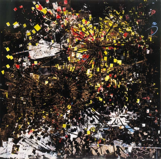
The layers in Scorched Earth create a topography that represents the deep psychological and physical ruins of a disappeared people and another time and place. In this work, Mark Bradford depicts an aerial map of an area that has been blacked out. The blackness of this land mass resonates on many levels: black as in the demographics of this neighborhood in Tulsa, Oklahoma, at one time called “Negro Wall Street,” where many black-owned businesses thrived, until a race riot erupted in 1921 and the violence obliterated this unique area and its history; black, as the title suggests, meaning burnt or scorched; black as in redacted; and black as in nothingness.


‘’ BLACK VENUS ‘’, 2005
Mixed Media Collage
Dimensions: 130 × 196 inches
Courtesy Sikkema Jenkins & Co.
© Mark Bradford


BLACK VENUS ( DETAIL ) , 2005


SAMPLE 2, 2015
Canvas
Dimensions: 157.5 × 121.9 cm
Courtesy of the artist and Hauser & Wirth. Photo by Joshua White
© Mark Bradford


TEMPORARY ( DETAIL ), 2005


DEAD HUMMINGBIRD, 2015
Canvas
Dimensions: 213.4 × 274.3 cm
Courtesy of the Artist and Hauser & Wirth.
Photo by Joshua White
© Mark Bradford


TEMPORARY, 2005
Mixed Media Collage and String
Dimensions: 130 × 196 inches
Courtesy Sikkema Jenkins & Co.
© Mark Bradford


UNTITLED, 2012
Inkjet With Spot Printing and Applied Texture
Dimensions: 35.6 × 27.9 cm
© Mark Bradford


2871 EAST, 2012
Mixed Media Collage on Canvas
Dimensions: 259.1 × 365.8 cm
© 2017 Mark Bradford


2871 EAST ( DEATIL ), 2012


SAMPLE 3, 2015
Canvas
Dimensions: 157.5 × 121.9 cm
Courtesy of the artist and Hauser & Wirth. Photo by Joshua White
© Mark Bradford


‘’ ANALOG ‘’, 2004
Collage on Canvas
Dimensions: 125 × 125 inches
Courtesy Sikkema Jenkins & Co.
© Mark Bradford


GIANT, 2007
Torn-and-Pasted Printed Paper on Canvas
Dimensions: 258.8 x 363.2 cm
Credit: Promised Gift of the Ovitz Family Collection
© 2017 Mark Bradford. Courtesy
Sikkema Jenkins & Co., New York.


DISAPPEAR LIKE A DOPE FIEND, 2006
Mixed Media Collage on Canvas
Dimensions: 47 3/8 × 61 1/8 inches
Courtesy Sikkema Jenkins & Co.
© Mark Bradford


BURN BABY BURN, 2002
Mixed Media on Canvas
Dimensions: 72 × 84 inches
Courtesy Sikkema Jenkins & Co.
© Mark Bradford
A
A
POTABLE WATER ( DETAIL ), 2005
A
A
POTABLE WATER, 2005
Mixed Media Collage
Dimensions: 130 × 196 inches
Courtesy Sikkema Jenkins & Co.
© Mark Bradford
A
A
POTABLE WATER ( DETAIL ), 2005


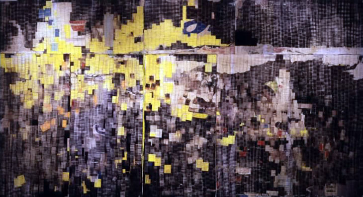
THE DEVIL IS BEATING HIS WIFE (DETAIL ), 2003


THE DEVIL IS BEATING HIS WIFE, 2003
Billboard Paper, Photomechanical Reproductions, Permanent-Wave end Papers,
Stencils, and Additional Mixed Media on Plywood
Dimensions: 335.3 x 609.6 cm
© Mark Bradford
 Z

Mark Bradford’s abstractions unite high art and popular culture as unorthodox tableaux of unequivocal beauty. Working in both paint and collage, Bradford incorporates elements from his daily life into his canvases: remnants of found posters and billboards, graffitied stencils and logos, and hairdresser’s permanent endpapers he’s collected from his other profession as a stylist. In The Devil is Beating His Wife, Bradford consolidates all these materials into a pixelised eruption of cultural cross-referencing. Built up on plywood in sensuous layers ranging from silky and skin-like to oily and singed, Bradford offers abstraction with an urban flair that’s explosively contemporary.


MARK BRADFORD: THE ART OF PRODUCTIVE DISSENT


'' I may pull the raw material from a very specific place, culturally from a particular place, but then I abstract it. I’m only really interested in abstraction; but social abstraction, not just the 1950s abstraction. The painting practice will always be a painting practice but we’re living in a post-studio world, and this has to do with the relationship with things that are going on outside."
Mark Bradford


MARK BRADFORD: THE ART OF PRODUCTIVE DISSENT


STRAWBERRY ( DETAIL ) 2002


 STRAWBERRY 2002


STRAWBERRY ( DETAIL ) 2002


HORRIBLE SHARK , 2011
Mixed Media on Canvas
Dimensions: 260 x 366 cm.
© 2017 Mark Bradford


ON A CLEAR DAY I CAN USUALLY SEE ALL THE WAY TO WATTS, 2001
Mixed Media on Canvas
Dimensions: 72 × 84 inches
Courtesy Sikkema Jenkins & Co.
© Mark Bradford


WHITE PAINTING( DETAIL ), 2009


WHITE PAINTING, 2009
Mixed Media, Collage on Canvas
Dimensions: 259 x 366 cm
© Mark Bradford
 Z

Mark Bradford’s abstractions unite high art and popular culture as unorthodox tableaux of unequivocal beauty. Working in both paint and collage, Bradford incorporates elements from daily life into his canvases such as remnants of found posters and billboards and hairdresser’s permanent endpapers. In White Painting, Bradford uses paper exclusively to replicate the effect of paint. Scratching and sanding through the layers to reveal strata of colours and embedded images, his palimpsest surface draws connotations to both abstract expressionism and street art, recontextualising the sublime traditions of high art with an urban flair that’s explosively contemporary.


WHITE PAINTING( DETAIL ), 2009


UNTITLED (MB 9693), 2009
Mixed Media Collage
Dimensions: 55.9 × 71.1 cm
© 2017 Mark Bradford


CIVIL BRAND, 2005
Mixed Media Collage on Canvas
Dimensions: 72 × 85 inches
Courtesy Sikkema Jenkins & Co.
© Mark Bradford


ELGIN GARDENS, 2015


WINDOW SHOPPER, 2005
Mixed Media Collage on Canvas
Dimensions: 48 × 60 inches
Courtesy Sikkema Jenkins & Co.
© Mark Bradford


BACKWARD C ( DETAIL ), 2005


UNTITLED, 2002
Acrylic, Burnt Paper Collage on Paper Laid on Canvas
Dimensions: 41.6 × 46.5 cm
© Mark Bradford


BACKWARD C, 2005
Mixed Media Collage on Canvas
Dimensions: 84 × 120 inches
Courtesy Sikkema Jenkins & Co.
© Mark Bradford


LOS MOSCOS, 2004
Mixed Media on Canvas
Dimensions: 125 × 190 1/2 inches
Courtesy Sikkema Jenkins & Co.
© Mark Bradford


REBUILD SOUTH CENTRAL, 2015
Canvas
Dimensions: 109.2 × 243.8 cm
Courtesy of the Artist and Hauser & Wirth. Photo by Joshua White
© Mark Bradford


UNTITLED, 2007-2009
Mixed Media Collage on Paper
Dimensions: 71.1 × 55.9 cm
© 2017 Mark Bradford


A WITCH IN A BOTTLE, 2012


A WITCH IN A BOTTLE ( DETAIL ), 2012


WHEN WE RIDE, 2006
Mixed Media Collage on Canvas
Dimensions: 46 3/8 × 62 1/4 inches
Courtesy Sikkema Jenkins & Co.
© Mark Bradford


 RIDIN ‘ DIRTY ( DETAIL ) - 2006
Mixed Media Collage on Paper; 78 panels,
Dimensions: 109 × 336 inches
Courtesy Sikkema Jenkins & Co.
© Mark Bradford


LIGHTS & TUNNELS, 2015
Canvas
Dimensions: 213.4 × 274.3 cm
Courtesy of the artist and Hauser & Wirth. Photo by Joshua White
© Mark Bradford


EXODUS, 2006
Mixed Media Collage on Canvas
Dimensions: 48 by 60 in. 121.9 by 152.4 cm.

© 2017 Mark Bradford


A
MARK BRADFORD
Known for his expansive multi-layered collaged paintings incorporating materials found in the urban environment, Mark Bradford’s work addresses spontaneous systems and networks that materialise within cities, such as alternative economic exchange, itinerant communities, and other socio-political pathways.
Visually complex and often cartographic in form, Bradford’s paintings incorporate elements of the everyday – from end papers used for perming hair (associated with his background in hairdressing) to remnants of billboard posters, polyester cord, caulking, bleaching agents and carbon paper. Using such materials gathered within the locale of his studio in South Central Los Angeles, Bradford's paintings are ostensibly abstract in a formal sense, but referential in content. At first glance, the work corresponds with that of ‘Affichiste’ artists such as Raymond Hains and Jacques Villeglé; yet Bradford is less concerned with a commentary on consumerism, than with the specific conditions that shape communities. This is most clearly identified in the works featuring what he terms as ‘merchant posters’ found in his immediate neighbourhood. Affixed to cyclone fencing, erected around buildings left derelict after the 1992 Los Angeles riots, these billposters advertise, in bold graphics, services targeted directly at local inhabitants. The topics – ranging from foreclosure and paternity testing to loan credit and pest control – coalesce to form a narrative of desolation and, as Bradford has observed, reveal 'the invisible underbelly of a community'. In ‘A Thousand Daddies’, for example, multiple billboards advertising child custody services provide the foundation, with the letters broadly outlined in cord, over which layers of other posters and paper are pasted before being sanded back in part. This process of décollage or accretion reveals glimpses of luminous colour from the notices buried within.
Bradford’s practice also encompasses video, prints and sculptural installations. For the 55th Carnegie International in 2008, he created an installation for the rooftop of the museum. In reference to the stranded victims of Hurricane Katrina, he spelled out the words ‘HELP US’ in white stones, which was only visible from an aerial viewpoint. Later that year, Bradford created ‘Mithra’, regarded as one of the most iconic works of the ‘Prospect: New Orleans’ biennial. A three-storey ‘ark’ made from stacked shipping containers positioned on a vacant plot in the Lower Ninth Ward, the sculpture’s immense surface was covered in battered poster boards and advertising found around the city in the wake of the disaster. As one commentator noted, it could be simultaneously read as ‘a monument to futility or a symbolic cry for salvation’.
Mark Bradford was born in 1961 in Los Angeles, where he lives and works. He has exhibited widely, including groups shows such as the 12th Istanbul Biennial (2011), Seoul Biennial (2010),  the Carnegie International (2008), São Paulo Biennial (2006), and Whitney Biennial (2006). Solo exhibitions include, Aspen Art Museum (2011),  ‘Maps and Manifests’ at Cincinnati Museum of Art (2008) and '‘Neither New Nor Correct’ at the Whitney Museum of American Art (2007). In 2009, Mark Bradford was the recipient of the MacArthur Foundation ‘Genius’ Award. In 2010, ‘You’re Nobody (Til Somebody Kills You), a large-scale survey of his work was presented at the Wexner Center for the Arts, Columbus, before travelling to the Institute of Contemporary Art, Boston; Museum of Contemporary Art, Chicago; Dallas Museum of Art; and San Francisco Museum of Modern Art.